Coverflow in your history?
Apple's starting to go slightly over the top with the coverflow now i think
I gotta say, I don't user cover flow ANYWHERE. I don't use it in iTunes (I like my text lists) and I don't use it in Finder (I do most of my heavy file management via the command line, it's just the kind of boring guy I am). I find that these features are mostly for the "cool" factor and don't really improve my work.
Cover flow history, on the other hand, is really nice and practical. Why? Because as someone who uses text when I click and hold my back button in my browser, it's not very useful if some page I'm going through has the same title over and over or some really long title prefaced with: "Domain.com — Home of all things Domain.com Related: Now viewing... <the part of the title I cared about>"
And sometimes titles aren't even helpful. This is not a feature I would use even daily, but when I'll want to use it I'll be all too happy it's there.
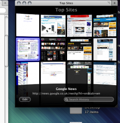
In other news they've changed the tab positioning to be like Chrome's. I don't know how happy that makes me, but it doesn't bother me either. It'll just take some getting used to. The have a new "top sites" feature which is like Opera's thing and the first thing I did was turn it off. (I feel like a cranky old man. I have my homepage and that's all I need!)
They've also integrated the "add bookmark" button into the address bar. This is really, really annoying for the minimalist in me because I know how to use command + D and now I have a button frozen up there. On the upside they've integrated the stop/reload button into the right of the address bar. I like the change, though I don't know that I would have noticed it if someone here hadn't pointed it out.
There is a new "Open in Dashboard" feature I haven't played with at all yet. I haven't a clue what I would use that for.
The new history shown as you type in the address bar is much improved. It breaks things into categories.
For the web geeks out there, they've modified the document inspector (Safari's answer to Firebug) and while I have only glanced at it thus far it looks like an improvement in the way it's integrated now.
With the exception of the integrated bookmarks button and my lukewarm feeling about the tab placement (I don't love it, I don't hate it) I like what I've need in the first 10 minutes.
Now here's to hoping version 4 is more stable than version 3 and is less prone to giving me the beach ball. Version 3 wasn't terrible, but it gave me problems often enough to gripe about, especially with sites containing crappy JavaScript.
looks like a complete Google Chrome rip off now

Yeah, because a browser is defined entirely by the placement of the tabs.
)


