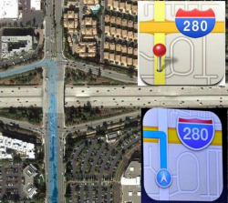
Somewhat off-topic (as unfortunately quite a few posts in this thread are), but there's really nothing wrong with the Apple Maps icon. You do literally have to make a left turn (at a stoplight) at an intersection to get onto I-280 (North) there. Sure, the icon didn't exactly draw the slightly adjacent entrance lane where you would turn to before you merge onto the highway, but to try to make some sort of a point based on that when in fact it's basically right is...well...just plain silly.

If you drew the same kind of direction highlighting on the Google Maps icon that was used before, it would look the same, given that even that icon doesn't really isolate the highway on/off-ramps (not that something like that would even be needed on an app icon). Like I said, just silly.
Last edited: