Become a MacRumors Supporter for $50/year with no ads, ability to filter front page stories, and private forums.
Big when someone calls you or somewhere else? If when someone calls you, that's by design...or at least it was. Depending on how you add the photo you could have it either appear as a small icon or as a full screen picture (as many actually want). Now, it seems like only the small icon option is available.

Exactly. Before if you had a Face, or just a simple wallpaper for a contact, it would show in the whole screen, and it wasn't blurred... Now even when the tiny icon on the right, and tiny tiny icons to answer and decline, the whole screen is blurred, empty. I can't believe the won't change this back to the way it was, think its a big mistake.
 
i have 2 questions: 1) is the facetime icon different? if yes plz a picture if you can
and second question- when somebody is calling you is now available the button to reject the call like in ios6? because in ios7 till present 0.4 when you are receiving a call and your phone display was turned off, you cannot reject unless you press 2xsleep/wake button. Still you have a reject button if someone calls you while you are using your iphone

You do know that in iOS 6 on the lock screen, there was no decline button either?!
 
Am I the only one that has always wanted a row, or optional row of numbers along the top of the keyboard?
 
PLEASE just fix the following:
  • Allow me to delete my voicemails
  • Fix the fingerprint reader
  • Prevent Safari from crashing

PLEASE?!?!?

What are you even talking about with the fingerprint reader? 3 people in my family have the 5S and it works flawlessly and immediately for all of us. Get your fingers looked at.
 
You do know that in iOS 6 on the lock screen, there was no decline button either?!
There was a little "phone" icon/button that when dragged up would reveal more options, including a decline option.

2068iA27E64D4A6EECA34


2070iCFB97AB6E672E412
 
Big when someone calls you or somewhere else? If when someone calls you, that's by design...or at least it was. Depending on how you add the photo you could have it either appear as a small icon or as a full screen picture (as many actually want). Now, it seems like only the small icon option is available.

Call with the phone locked: Image

I read before in the past when you add it from the contact app in OS X it would appear small and I think it would appear bit but I could never get it to appears small for the life of me until now
 
I'm disappointed in the lack of contrast, and white on medium grey is no better. That delete key looks terrible. Why can't they just bring back crisp, clean designs that have visual texture and depth? Viber is an example of an app that has resisted the switch to an iOS 7 appearance because their current design is near perfect. Clean, crisp and tasty.
 
Am I the only one that find these new "Increase contrast" option really helpful? I've got "Reduce Transparency", Darken Colours and "Reduce White Point" all enabled and it improves upon the whole white and darn bright feel of iOS 7 a whole lot. It doesn't burn my eyeballs out any more while using my phone in dark places and the transparency doesn't really have anything going for it as it's not transparent enough to anything other than a rather irritating effect which does not benefit the whole "flat and minimalistic" design. Added transparency and simplistic, flat and minimalistic design doesn't go hand-in-hand if you ask me.

What this "darken colours" actually do I don't really know...
 
Am I the only one that has always wanted a row, or optional row of numbers along the top of the keyboard?

Get an hp touchpad. :)

A top row is great on a tablet. But too many keys on a phone. I wish landscape mode keys were smaller so I could actually see more than one line of writing. The best thing would be to have small numbers on the qwerty line in one corner from 0-9 so you hold and get the numbers
 
This is just me nitpicking but I'd honestly like it if Apple would make the battery icon green even when off the charger and of course have it turn red when under 20% like up to iOS 5, I know it was only in the menus but still, I like that and then when fully charged have the lightning bolt turn back into a plug, like I said just nitpicking

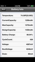
I don't know about it turning green all the time but it would be nice to have the plug back to see when it is sort of probably fully charged. The only way to know for sure is for me to go I to battery detective and see when it is finally starting to drain a little then I know it's done charging. It was kind of like this before on ios 6 but at least then it showed a plug once it was up to full capacity. Now it shows 100% even before it hits the full capacity. It will sit on 100% for up to 35-45 minutes till it's done trickle charging. When I wait this long after the supposed 100% fully charged I always have longer battery life.
 

Attachments

  • image.jpg
    image.jpg
    106.8 KB · Views: 113
I read before in the past when you add it from the contact app in OS X it would appear small and I think it would appear bit but I could never get it to appears small for the life of me until now
Odd, I could always do it either way, and preferred full screen, but now even the full screen versions are being displayed as small icon versions--seems like everything was changed to that by default (either due to some bug or by design for some reason).
 
Can we get a report on how the iPad is running / changes with the new beta?? The ipad has had many more problems like animation lag and respringing back to the apple logo.
 
Definitely LOVING all this small changes here and there.

The only thing I hate is the keyboard; skinny text and borders is the new thing but people with poor eyesight complain so Apple is making everything bold again...

Remember the "slide to unlock" text on 7.0 beta 1? That was sexy :(
 
What are you even talking about with the fingerprint reader? 3 people in my family have the 5S and it works flawlessly and immediately for all of us. Get your fingers looked at.

Does not work flawlessly. Three 5S' in the house. All have the same finger (for different people) programmed on their devices. Each finger takes up all 5 spots. Works 60% of the time. And 30% you have to scan twice.
 
I don't know about it turning green all the time but it would be nice to have the plug back to see when it is sort of probably fully charged. The only way to know for sure is for me to go I to battery detective and see when it is finally starting to drain a little then I know it's done charging. It was kind of like this before on ios 6 but at least then it showed a plug once it was up to full capacity. Now it shows 100% even before it hits the full capacity. It will sit on 100% for up to 35-45 minutes till it's done trickle charging. When I wait this long after the supposed 100% fully charged I always have longer battery life.
Can't say that I've noticed any really noticeable effect from unplugging soon after it gets to 100% to doing it an hour or more later.
 
i know that, i was just saying instead of having the battery black or white, have it green at all times

No. Green signifies the condition is good/improving. Having it green at 21% battery life is misleading. Having it on a contrast color like black or white signifies being drained, while Red conveys the message that the battery is running out of power.

You could go all kinds of color scaling to signify different levels, but that also becomes distracting and gives less options for color-matching themes.
 
Odd, I could always do it either way, and preferred full screen, but now even the full screen versions are being displayed as small icon versions--seems like everything was changed to that by default (either due to some bug or by design for some reason).

Yeah, I do strike that as odd but I can get use to it but not sure about others
 
Definitely LOVING all this small changes here and there.

The only thing I hate is the keyboard; skinny text and borders is the new thing but people with poor eyesight complain so Apple is making everything bold again...

Remember the "slide to unlock" text on 7.0 beta 1? That was sexy :(
It's slightly bolder, but it's not a huge change (not nearly as much as the bold option does, for example).
 
Anyone with audiobooks on their devices know if the Music app's ability to handle chapters is back? Please, I hope so!
 
Big when someone calls you or somewhere else? If when someone calls you, that's by design...or at least it was. Depending on how you add the photo you could have it either appear as a small icon or as a full screen picture (as many actually want). Now, it seems like only the small icon option is available.

Call with the phone locked: Image

Thats simply disgusting. Empty, even a once wallpaper looks ugly like that. What the hell are they thinking???
 

Attachments

  • IMG_3539.PNG
    IMG_3539.PNG
    362.5 KB · Views: 336
Somebody please tell me the music app has been overhauled. That is my only complaint about iOS 7. The music app is terrible.
 
Register on MacRumors! This sidebar will go away, and you'll see fewer ads.