Become a MacRumors Supporter for $50/year with no ads, ability to filter front page stories, and private forums.
The phone and message apps appear to not have as bright of a green:

Before
View attachment 455160

After
View attachment 455161

I knew that was going to happen since they changed the in-call bar at the top of the screen to that same muted color, FINALLY. I had complained and complained to Apple that that bar was just impossible to read. In 7.1 b2 they fixed the bar, and now they've fixed the apps to match.
 
Can someone post a screen comparison with the "reduce white point" turned on and off in the accessibility setting?
 
I wonder if this fixes the Reminders app. It's the bane of my iOS7 usage alongside exchange. Killing me right now.

I have been enjoying my iP5 jailbroken with all sorts of mad tweaks, so 7.1 better be amazingly convincing to move up to.
 
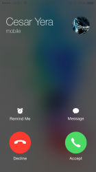
Those new round buttons are an abomination. I can see them being especially irritating when I am trying to answer a call while driving.
 
Those new round buttons are an abomination. I can see them being especially irritating when I am trying to answer a call while driving.

Simple. Don't use your phone while driving and you won't have this issue. The button are fine, there is just no pleasing some people.
 
Yeah, THIS particular Apple promotion material truly looks good. But pick any other picture and you end up being completely unable to read the caller name, right? You either let a full, unaltered picture fill the screen but with the risk that it completely ruins legibility, or you focus on legibility. I think Apple is going in the right way with this one.

Not to mention that the new slider looks much better, imho One of the greatest things of the old iOS slider was that it really felt good to slide it across, wasn't it? Somehow it was visually luring: "slide me across". :D They brought back this feeling with this round shaped button.

Seriously? If you have the whole face of somebody in the screen, you really need to see the name? Not that u can't see it, because u can always see it, but if you have the big pic of the contact in your screen, how hard it is to know the name, even if you don't have it. Notice the pic has a dark shade in the top, thats how u fix the name problem.

The new slider is also horrific. It add a whole new deal of contrast (ugly by the way) to the screen. Squares and lines are modern, as the whole system is. Round shapes, it makes it look old. Thats why it does not fit there, because it does not have anything to do with the whole system. Circles are fine, they don't need the rest. The old slider felt good as well the new felt good. Period. Is the same thing, just slide to unlock, why put that inside a rectangle again? (with round edges)...

And add ANY pic to a contact, even a regular wallpaper, not a face. It would still look a lot better, a LOT better than a blurry empty screen with a tiny circle in every corner... Even the "alarm clock" looks hideous... they wanted to separate from real life objects... and they put a alarm clock in the reminders sections... C'mon Apple!!!
 
Last edited:
Apple really really needs a better keyboard. They could easily do a swpye based keyboard and it would be so much better. Having the ability to hold enter numbers and characters with long press instead of switching keyboards would be nice also. Not sure why Apple is so late to the game on this when it is clearly far superior
 
New shuffle and repeat buttons.

Please tell me they have an option now that will simple "shuffle" particular albums. I hate selecting a particular album, hitting shuffle, only to have it shuffle all songs from every album from the artist.
 
There's a new animation now when dialing. When you hit dial, the new, green, round dial button rotates 180 degree into the red, round, hang-up button. It's actually a very nifty animation. I'm a fan.
 
While I am a fan of the old call answering screen, I think most people on this thread need to dial down the amount of f**ks they give. It's one screen, which while it may not be perfect, it's not awful. So put it in perspective.
 
There's a new animation now when dialing. When you hit dial, the new, green, round dial button rotates 180 degree into the red, round, hang-up button. It's actually a very nifty animation. I'm a fan.


Was just about to post this same thing! Very cool, kind fun. :)
 
It's not that I'm not a fan of these changes (it's a beta and Apple are mucking about), it's that many of them are in areas of the OS that need the least work. It's bizarre. I guess they're saving the big areas for iOS 8 then.

No, What you guys wish is that she was really calling you!:)

That was the implied joke...
 
Was wondering what the Messages bubble look like? Is it still that awful green with white print? Is there an option to change print to black?
 
You don't have to be...

... a graphic designer to see which design tell u more...
 

Attachments

  • IMG_0001.PNG
    IMG_0001.PNG
    1.1 MB · Views: 133
  • IMG_3538.PNG
    IMG_3538.PNG
    322.7 KB · Views: 139
There's a new animation now when dialing. When you hit dial, the new, green, round dial button rotates 180 degree into the red, round, hang-up button. It's actually a very nifty animation. I'm a fan.

So are animations considered flat or skeuomorphic? :D
 
... a graphic designer to see which design tell u more...

I like the background on the first one better, but the round buttons on the second one better. That's what they should do.
 
So there is still someone with at least some basic visual taste left at Apple! And that mysterious hero survived the eye-ripping first contact with iOS 7 and now started his or her long quest to bring this abomination back to the sweet land of common sense.

Good. Thumbs up.

Not nearly enough.

It's really telling just how poor this GUI change is and how lacking in professional GUI design Apple currently is. Or how wrong headed and influential Ive is at Apple right now. The arrogance of releasing iOS 7 looking and operating like it does...

"Button shapes" should be on by default and shouldn't look like an afterthought in accessibility options. The fact that "reduce motion", several contrast adjustments new to iOS 7, and "button shapes" were added to iOS 7 in the updates... this alone shows how much of a mistake iOS 7 GUI design really is. They're trying really hard to not admit to having made a mistake while still trying to fix some of the more egregious GUI failures quietly on the sides... This is the attitude that will ruin the accomplishments of Apple over the last ten years.
 
Turn on battery percentage
i don't know about it turning green all the time but it would be nice to have the plug back to see when it is sort of probably fully charged. The only way to know for sure is for me to go i to battery detective and see when it is finally starting to drain a little then i know it's done charging. It was kind of like this before on ios 6 but at least then it showed a plug once it was up to full capacity. Now it shows 100% even before it hits the full capacity. It will sit on 100% for up to 35-45 minutes till it's done trickle charging. When i wait this long after the supposed 100% fully charged i always have longer battery life.
 
Register on MacRumors! This sidebar will go away, and you'll see fewer ads.