Apple Releases iTunes 12.4 With Design Tweaks [Updated]

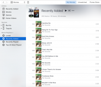
Am I the only one who liked the sidebar better the way it was before? I liked how it was always there in Music but not for other media types.

In the new version, when I'm in Movies, Audiobooks, or TV the sidebar is still there and its completely useless, just taking up space. I know it can be disabled but I'm not going to do that every time I change media types.

Yes, it is not entirely thought through. They basically removed the view picker on the right-hand side in favour of the sidebar, but completely overlooked that you can hide the sidebar and do not have anything anymore to switch between views. With iCloud purchases they were prudent enough to give options for each media kind, but they did not do this for the sidebar.

Somehow they made it even worse. Two sidebars now instead of one, and instead of a single click to change media modes (music, movies, etc.), it's one click to drop down the menu and another click to get to the media type.

What a joke.

What do you mean with two sidebars? And you can technically switch between media kinds with just one click. Just press and hold, move the pointer to the category and release.
 
The 2 sidebars is only for the artist view and make sense there. The album view doesn't have it and that's a good thing because it doesn't make any sense there.

The fact that you now need to select the media type from a dropdown menu is indeed a step back because it now takes 2 clicks instead of one. Now, it would also have made more sense if they'd had an additional entry in the menu called "iOS devices" where you could browse your iOS devices. It's now a separate menu as before but selecting an iOS device will hide the media type menu and thus there is no easy way to change media (you can hit the "done" button and return to where you were). Luckily one can still use key combos to switch quickly which seems to solve both issues.

The navigation is now more odd than before because they did a bit too little.
 
I like the new view/column picker. The old one required the user to open the menu for each column they wanted added or removed. Now all changes can be done at once.

Overall, I'm pleased with the tweaks. Time to fix Apple Music.
 
Looks like internet radio is on the way out. They disabled by default in the drop down. That means its gone next time unless people complain.
 
Anyone else notice that when you click on an album in Albums view, the artwork is non-retina? The thumbnails look sharp, but when you click to see the specific album it's low-res.
 
Anyone else notice that when you click on an album in Albums view, the artwork is non-retina? The thumbnails look sharp, but when you click to see the specific album it's low-res.

Yes, it has always been this way. Annoyed me for years, smh.
 
iTunes resume playback available? Such essential feature to resume iTunes playback of long song lists once you quit iTunes and open it again, or after rebooting Mac, was available in SoundJam MP 2.5.3 in 2001 (15 years ago!!!), from where iTunes was developed.
 
I for one is glad that they removed those god awful small media buttons at the top, which there weren't space for anyway. And I quite like the new sidebar, as I can customize it completely to my liking. The only thing I can't figure out, is how to remove Genious from the sidebar. Any ideas?

Yes, I do consider this a good update! But then again, iTunes 12 couldn't get much worse.. :p

A small step forward, in the quest for a good iTunes UI overhaul. If they just brought back the general trends from iTunes 9, I would be happy.
 
A nice change but I still cross my fingers in hopes we get a suite of Apple applications that each have their own function

iBooks
Movies
Shows
Apple Music
iTunes (local music & podcasts)
I hope this never happens, I have no need for one million small apps on my Mac. I've used iTunes to organise my media since it first surfaced and absolutely do not want more iOS on my Mac experience.

Just my 2 cents.
 
The made huge mistakes in the past with iTunes by changing what was good about it and now they are bringing back the good UI elements again. I applaud this but wonder what they were thinking in the first place.
Sadly, they are not. The sidebar isn't half as useful as it used to be.
 
Who cares? I stopped using iTunes a couple of years ago when it "lost" a 300+ collections of CDs I'd ripped to my Mac.
You obviously care, otherwise you would not have posted.
The one time I lost a library after an update took me 2 minutes to start the recovery process from one of my backups.
 
Anyone having a problem where the album pictures are disappearing when you play the track ? It is weird I'm seeing the artwork but when I start playing the music the icon disappears !
 
Movies > Movie playlists > Recently Added: just my regular "Recently Added" playlist.
 

Attachments

  • Screen Shot 2016-05-16 at 12.33.46 PM.png
    Screen Shot 2016-05-16 at 12.33.46 PM.png
    855.9 KB · Views: 266
Ffs what have they done to the media picker. Now it takes two clicks to switch between categories. How are Apple being so useless?

You can still do it in one (long) click: Click and hold the mouse down, then move down to select the item you want and release the button.

FYI, this is standard behavior for any kind of pop-up menu or list on a Mac.
 
Scrolling the list of movies on the iTunes score is greatly improved on my rMBP. Much smoother.
 
Register on MacRumors! This sidebar will go away, and you'll see fewer ads.
Back
Top