Become a MacRumors Supporter for $50/year with no ads, ability to filter front page stories, and private forums.
No, please no. I don't care if my music is local or not when I want to listen to something. It would be completely illogical to have to open separate apps for those situations.

I totally agree. I have tons of libe concerts that are not available for purchase anywhere. But, I definitely want them alongside all my other music, including my subscription.

Clearly, this bothers some people. I know everyone has different music situations. But, I'd hope Apple could clear the confusion for those users without another app. Perhaps a switch?

I can't imagine wanting to listen to something and having to decide which app to open. What a step back that would be! What if I want to listen to an artist in my collection, but I don't own all their records? Wouldn't I want the ability to explore the catalog I don't own?

I just never understood separating the two. In fact, it's the reason I was eager to switch from rdio/Spotify to Apple Music: To combine my live collection with my subscription service.
 
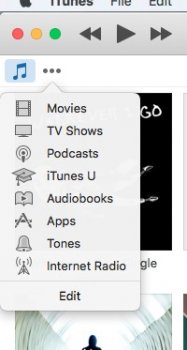
Alright lets review what's actually happening with that pull-down menu:

iTunes 12.3
1. Aim pointer at section you want and click

iTunes 12.4
1. Aim pointer at pull-down and click it once or click-and-hold
2. Drag up or down mouse pointer to the item you want
3. Click mouse on item you want, or release mouse button, depending on what you did on step 1

This is tedious and ridiculous compared to the previous way.

Oh and btw that pull-down menu is a moving target and not static/fixed as before:

SXTF66E.png


kX5uzrz.png


So the user has no muscle memory advantage here, moving target hinders usability when compared to the previous UI where sections where always fixed in position.

Right. One click (not two) like I said. It's cleaner. I have no problem with that or find it challenging in the slightest. I understand you or others might.
 
Right. One click (not two) like I said. It's cleaner. I have no problem with that or find it challenging in the slightest. I understand you or others might.

In your usage sure, it's one click, but it's not cleaner, there are more steps involved than before. The previous UI was 'cleaner', it was just 1 aim/click, done. Now it's aim/click, browse/drag, then release.
 
In your usage sure, it's one click, but it's not cleaner, there are more steps involved than before. The previous UI was 'cleaner', it was just 1 aim/click, done. Now it's aim/click, browse/drag, then release.

Depends what you want out of a UI. I appreciate good design, and excellent management of what otherwise is visual clutter most of the time. The editable dropdown does that, hiding options until one needs to make a media change. For me that's a lot cleaner.

I understand you or others might find navigating that difficult or challenging, and as you expressed earlier, an "iTunes FAIL." I certainly don't. Once click...

The previous UI was editable too, and you could just put the sections you wanted. So by your rationale the previous UI was just as 'clean' but it also won in the interaction simplicity requiring just one aim/click, rather than the current's multiple steps.
 
The previous UI was editable too, and you could just put the sections you wanted. So by your rationale the previous UI was just as 'clean' but it also won in the interaction simplicity requiring just one aim/click, rather than the current's multiple steps.

The old way was so much better. I believe this was how it was structured in iTunes 11, and the move to those convenient icons was actually one of my favourite parts of iTunes 12. I wish there was an option to have them back.
 
The previous UI was editable too, and you could just put the sections you wanted. So by your rationale the previous UI was just as 'clean' but it also won in the interaction simplicity requiring just one aim/click, rather than the current's multiple steps.

Not at all. Depends how many choices one wants to have access to.

The difference speaks to UI language and human interface guidelines. Apple usually recommends hiding information not frequently accessed; in a drop down, or an app menu bar for example.

App UI design that runs amok clutters with having a lot of choices always visible. Some think that gives the user more power - I see a lot of that in Windows apps, for instance. Clean design hides elements when not needed and quickly offers choices when the user needs to make a choice, and, just as quickly gets out of the way.

It was not a casual or random decision to hide iTunes media choices in a dropdown.
 
Speaking of which I miss color icons, Apple is placing more emphasis on minimalism for fashion sense rather than functionality. A bunch of monochrome icons are harder easily glance and identify, than colored ones.
 
App UI design that runs amok clutters with having a lot of choices always visible. Some think that gives the user more power - I see a lot of that in Windows apps, for instance. Clean design hides elements when not needed and quickly offers choices when the user needs to make a choice, and, just as quickly gets out of the way.

You used to be able to essentially have it as a drop down menu if you wanted as shown in the attached photo -

The old way was better and essentially allowed users who wanted a drop down menu to have it or for people who prefer the convenience of a quick way to swap between sections on iTunes, also to do that.

Given how much I swap between those things, clicking a bloody drop down menu is annoying, just like the flawed iOS music app.
[doublepost=1463453815][/doublepost]
It was not a casual or random decision to hide iTunes media choices in a dropdown.

That doesn't make it any less of a highly annoying move...
 

Attachments

  • Screen Shot 2016-05-17 at 12.51.22 PM.jpg
    Screen Shot 2016-05-17 at 12.51.22 PM.jpg
    27.7 KB · Views: 104
  • Screen Shot 2016-05-17 at 12.53.32 PM.jpg
    Screen Shot 2016-05-17 at 12.53.32 PM.jpg
    13.3 KB · Views: 90
Not at all. Depends how many choices one wants to have access to.

The difference speaks to UI language and human interface guidelines. Apple usually recommends hiding information not frequently accessed; in a drop down, or an app menu bar for example.

App UI design that runs amok clutters with having a lot of choices always visible. Some think that gives the user more power - I see a lot of that in Windows apps, for instance. Clean design hides elements when not needed and quickly offers choices when the user needs to make a choice, and, just as quickly gets out of the way.

It was not a casual or random decision to hide iTunes media choices in a dropdown.

So a media selector isn't frequently accessed? Of course it's frequently accessed, how else do users switch media? And that's exactly the issue here, since it's a UI that's frequently accessed, having 3 steps now for every time a user switches media is a far more inefficient and tedious UI.

And please, I hope you were joking that Apple follows the "human interface guidelines" Apple has been arbitrarily doing inconsistent UI that follows no guidelines for several years now. Just to give you an example, this new iTunes pull-down, has no blink effect, you know, when you use a menu or any other pull-down menu, and release mouse button it should blink once. New iTunes has some weird custom pull-down.
 
There are two things that I'm not fond of.

1) When viewing a playlist, I used to have a place to click within the banner of the playlist to switch how I view the playlist (as a playlist or as songs or albums, artists ,etc.) Now that is gone and I have to go up to the menu and then to views and then to the view I prefer for that playlist. I don't see why they removed a quick access button to change my view options.

2) What has never functioned is the forward and back swipes within Apple Music. It works within the iTunes store, I can two finger swipe forward and backward through my browsing experience. But within Apple Music, the swipe is not functional. This makes for a confusing browsing experience. Why does it work in one part of the iTunes experience and not in another?

For me, iTunes seems to be the ugly stepchild that nobody at Apple really takes seriously.

Apple keeps making things more difficult and cumbersome and calling it simplification and progress.
 
Last edited:
  • Like
Reactions: trifid
Has anyone figured out how to make it look the way it used to; no album art, just a list view?
You now have to go up to the "View" menu, then "sort by" then songs or artists, etc.. Bummer that they have removed the button in the playlist banner to switch views. Why apple removes things and calls it progress is beyond me. Apple seems to think that giving us choices takes away their ability to CONTROL the experience.
[doublepost=1463455190][/doublepost]
Also, they brought back the icon to repeat tracks

Woohoo!!!
 
It's 1000x easier to add a song to a playlist now... can just select through the menus and add without clicking until the end where choosing playlist... hard to explain but those who have been frustrated with it will know what I mean.
 
  • Like
Reactions: trifid
So a media selector isn't frequently accessed? Of course it's frequently accessed, how else do users switch media? And that's exactly the issue here, since it's a UI that's frequently accessed, having 3 steps now for every time a user switches media is a far more inefficient and tedious UI.

And please, I hope you were joking that Apple follows the "human interface guidelines" Apple has been arbitrarily doing inconsistent UI that follows no guidelines for several years now. Just to give you an example, this new iTunes pull-down, has no blink effect, you know, when you use a menu or any other pull-down menu, and release mouse button it should blink once. New iTunes has some weird custom pull-down.


It isn't frequently accessed, relative to what you're clicking on within a particular media category. Unless you don't know what you want to do. In other words, when I'm listening to music I might click through a lot of artists or songs. I won't be jumping often between Music and Movies, or Audiobooks. I might make a hundred or many more click choices within Music before deciding I want to watch a Movie many hours later or the next day.

Sounds like you rapidly and often choose between Music, Movies, and Audiobooks when you use iTunes. I suspect most people who open iTunes to listen to Music, pretty much leave it there while clicking Music/Artist choices. Ditto for other categories.

Menu choice blink confirmation are used in app Menu Bar choices, because when you let go of the mouse and the menu springs back there is otherwise no menu choice confirmation - if not careful you may have made a choice in error and not know it.

A dropdown shows the choice on the face of the dropdown - confirming your choice - within milliseconds of letting go and staying there until another choice is made. No blink is necessary, needed, or wanted.
 
  • Like
Reactions: ErikGrim
Menu choice blink confirmation are used in app Menu Bar choices, because when you let go of the mouse and the menu springs back there is otherwise no menu choice confirmation - if not careful you may have made a choice in error and not know it.

A dropdown shows the choice on the face of the dropdown - confirming your choice - within milliseconds of letting go and staying there until another choice is made. No blink is necessary, needed, or wanted.

Dropdowns on OSX have the blink effect, iTunes is the only app that has this kind of custom dropdown that is not consistent with the native OSX API. It breaks AHIG period. And by the way if it were up to me I'd kill the blink effect system-wide, or make it a setting, like classic Mac OS. But it has to be system-wide, not inconsistent like iTunes.

You argument that it's not frequently accessed is debatable, but even if it wasn't, you still can not justify the dropdown as a replacement for the alternative UI. On the previous iTunes version, it was objectively superior since it requires less steps, it's equally 'clean', and it's fixed in position, whereas a dropdown requires more clicks/drags and is a constant moving target which hinders muscle memory.
 
Last edited:
All good points. the only issue I actually have with Apple (again, I'm not aware of what other companies are doing these days) is the cost. $800 once a year for an iPhone, $700 a year for an iPad, and every 2 years I update my MacBook Pro or iMac so that's $3,000 USD every 2 years to update one of my computers. I don't have to upgrade but I usually find it's a sweet spot for re-sale. I can sell my devices usually at 65% of what I paid so I just sold my late 2013 iMac for $1800 (it was $2400 new). My iPhone usually sells for $550 of the $800 I paid. So no I don't pay full price but I"m always amazed at how much the well equipped Apple hardware is compared to the other manufacture counterpart. Considering everyone uses ARM / X86, I don't always see why the iMac is $3K versus competition.

I could't imagine switching to Windows though.

The resale value is great. I agree, I do the same thing as you do. Except I think I rotate my laptops yearly as well; with releases that make sense anyway, recently not so much as there are no true updates.

I think it was easier for me to switch to windows because I do so much Windows/.NET development anyway and always in both platforms. I just had to change my daily driver and honestly, still pretty happy about it. Win 10 changed everything IMO.

Except the phone. Both OS and hardware suck right now. But anniversary edition of Win10 will integrate with Android. So they open up the door to quite a lot.
 
  • Like
Reactions: adamjackson
Dropdowns on OSX have the blink effect, iTunes is the only app that has this kind of custom dropdown that is not consistent with the native OSX API. It breaks AHIG period. And by the way if it were up to me I'd kill the blink effect system-wide, or make it a setting, like classic Mac OS. But it has to be system-wide, not inconsistent like iTunes.

You argument that it's not frequently accessed is debatable, but even if it wasn't, you still can not justify the dropdown as a replacement for the alternative UI. On the previous iTunes version, it was objectively superior since it requires less steps, it's equally 'clean', and it's fixed in position, whereas a dropdown requires more clicks/drags and is a constant moving target which hinders muscle memory.

Sure, if you frequently/constantly switch between Music/Audiobooks/Movies/Podcasts/TV Shows/Apps/etc, you may be one of the few who can make a case for the extra visual clutter being beneficial.

I'd rather have a clean design without the clutter as I infrequently make Media choice changes relative to content choice clicks within a particular Media category.

I also have no physical difficulty working with dropdown menus. If you do, then sure, you can make a case for the unnecessary visual clutter in the app window appearing 100% of the time.

As I said, a blink confirmation does absolutely no good or provide any useful information on a dropdown. What extra information is it giving you? Within milliseconds you'll know if you made the correct choice as it will be displayed on the dropdown. Much much better that a quick blink.

What you consider an "iTunes FAIL," I see it as a much cleaner design.
 
  • Like
Reactions: ncrypt and ErikGrim
Sure, if you frequently/constantly switch between Music/Audiobooks/Movies/Podcasts/TV Shows/Apps/etc, you may be one of the few who can make a case for the extra visual clutter being beneficial.

I'd rather have a clean design without the clutter as I infrequently make Media choice changes relative to content choice clicks within a particular Media category.

I also have no physical difficulty working with dropdown menus. If you do, then sure, you can make a case for the unnecessary visual clutter in the app window appearing 100% of the time.

As I said, a blink confirmation does absolutely no good or provide any useful information on a dropdown. What extra information is it giving you? Within milliseconds you'll know if you made the correct choice as it will be displayed on the dropdown. Much much better that a quick blink.

What you consider an "iTunes FAIL," I see it as a much cleaner design.

What visual clutter? In the previous iTunes version you could customize with as many or as few categories as you wanted. There is no clutter, but most importantly there is no extra UI space taken, since it sits exactly at the same spot where the current dropdown menu is.

What you seem to be advocating is hiding stuff, or making things seem simpler or cleaner for the sake of minimalistic fashion or your aesthetic preference but it actually has a cost in usability. Like hiding sidebars in the previous version, which actually led to more confusion, more clicking, more UX mess.

Same with Apple Music, it's a mess, it's no coincidence. With more than 15 years being the masters of iPod and the music experience, having to deal with these trivial issues in 2016, to me it does indeed scream "iTunes fail".
 
Last edited:
What visual clutter? In the previous iTunes version you could customize with as many or as few categories as you wanted. There is no clutter, but most importantly there is no extra UI space taken, since it sits exactly at the same spot where the current dropdown menu is.

What you seem to be advocating is hiding stuff, or making things seem simpler or cleaner for the sake of fashion or your cosmetic preference but it actually has a cost in usability. Like hiding sidebars in the previous version, which actually led to more confusion, more clicking, more UX mess.

To me this is just another example of "iTunes Fail" Apple has no clue what they are doing. Same with Apple music, it's no coincidence.

Absolutely... Except what you call fashion or cosmetics, I call clean design - something I and many others place a high value. Unless you're changing Media categories every 5-50 clicks, I see no cost in usability. Sounds like you click between Media Categories really often, say, bouncing between Music and Audiobooks. And are challenged by operating a Dropdown having to put extra thought into the action. In fact, since you were initially referring to this action as taking two clicks, perhaps you didn't know until now it can be really one click if you learn how it's done.

Infrequently made choices are hidden all the time, for the sake of clean design. That's why app Menu Bars work the way they do. Make an infrequent choice out of a list of a dozen choices, say Safari's View menu, and it springs back hiding what was there that otherwise be visual clutter.

Imagine if Menu Bar menus didn't exist in Safari and all of the otherwise hidden options were on the face of the window all of the time as clickable buttons.

No thanks.
 
It's 1000x easier to add a song to a playlist now... can just select through the menus and add without clicking until the end where choosing playlist... hard to explain but those who have been frustrated with it will know what I mean.
I've always just dragged and dropped or right click > add to playlist. How is it any easier now?
 
Looks like an improvement but... Consolidate Files seems to have gone? I was moving some .aac files from an external drive and after putting them in iTunes, there no longer seems to be an option to copy them into the iTunes media folder.
 
Register on MacRumors! This sidebar will go away, and you'll see fewer ads.