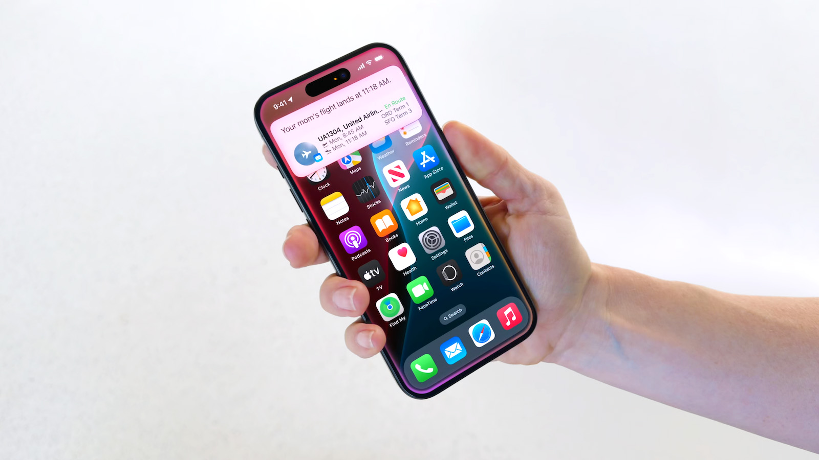
I’m not really looking forward to a visual refresh. The added bling is a distraction and fashion trends that add a lot into a UI always age badly, always.
Simple clean graphics never age bad.
I completely agree.
Some "simple clean graphics", like the Windows 95 style, are "timeless" in that they started out at rock bottom attractiveness upon release and can't get any worse as they age.
Say what you will, but it was functional and worked.
Ever since they shifted to this flat design (iOS 7, was it?) their UI has been horrible. Even to this day it is difficult to tell which elements are actionable. And if it's an obviously actionable item, it's buried in some stupid ellipsis menu even though there's plenty of room on the screen.


