That iPad must have something confusing on the screen. Maybe colors other than white, dark white, medium white, grey, dark gray, etc. Maybe an icon that took more than 2 minutes to create. I wonder a little but but care not a lot.
Got a tip for us?
Let us know
Become a MacRumors Supporter for $50/year with no ads, ability to filter front page stories, and private forums.
Apple's Former Design Chief Jony Ive to Speak at WIRED Event Next Week
- Thread starter MacRumors
- Start date
- Sort by reaction score
You are using an out of date browser. It may not display this or other websites correctly.
You should upgrade or use an alternative browser.
You should upgrade or use an alternative browser.
It's an awesome photo and I'm grateful for this man.
Wow. Some very weird posts in this thread. I wonder where some of these people came from lol.
Wow. Some very weird posts in this thread. I wonder where some of these people came from lol.
I was thinking colors white, bright white, brighter white, brightest white, grey, pale gray, paler gray, palest gray.That iPad must have something confusing on the screen. Maybe colors other than white, dark white, medium white, grey, dark gray, etc. Maybe an icon that took more than 2 minutes to create. I wonder a little but but care not a lot.
As for the MacBook Pro, Apple seems pretty clear on the segment separation. Want a thin-n-light? Get a MacBook Air. The MacBook Pro shouldn’t be aiming to become a MacBook Air in the first place.
I am hoping that between this MBP design and the effort they put into the 2019 Mac Pro, Apple has realized their true Pro customer is not the same as their up-market customer that buys a higher-end Mac for the label. The division of those that are praising the new design and those that are bellyaching over half a millimeter and half a pound pretty much seals that argument…
I’ve seen worse.LOL. Not even a “contact us”. This is the most useless company website I’ve ever seen. There is really nothing to be done here. 😂
Yeah but with some serious mental issuesThat picture looks like a nursing home resident confused by technology.
iOS7 was a trend in design, even many apps were migrating months ahead even first runors appeared.Something I've been so curious about coming next at Apple is iOS - Ive made iOS7, now that he's gone, how will that change?
Is like saying apple envisioned color screens in phones.
And that trend is quite old, it is just previous iOS interations where already “old fashion” as they emulate real world because tech allowed that for fisrt time in phones, but once the eye saw that, smart design come over.
Ive, please come back. These FatBook Pro’s are ugly as hell. I am also currently being treated for back problems after carrying the 16” FatBook Pro all day in my bag.
LOL. Not even a “contact us”. This is the most useless company website I’ve ever seen. There is really nothing to be done here. 😂
If you are trying to look for his contact details, then you are not part of his target audience. His clients (like Apple) know how to reach him.
It is called „just white“. The most simplified design of a clock.he is so minimalist he doesnt even have a watch face.
No no no. No more Macbooks with the fan not connected to anything, or iPhone cases full of holes. Enough is enough. Ive needs a person like Jobs that could explicitly decide what goes and what doesn't. Ive on its own is purely form over function. Unless you like $10000 gold Apple Watches. Ive on his own is like an elite fashion designer making clothing just for the catwalk, not for people to actually wear.Ive, please come back. These FatBook Pro’s are ugly as hell. I am also currently being treated for back problems after carrying the 16” FatBook Pro all day in my bag.
As my wife, an interior designer said of my new 14” MBP…Unpopular opinion: I’m not a big fan of Apple’s design language after Ive left. The new MacBook Pro’s are thick and ugly. And the old ports are overhyped. Photographers have already moved past SD card and HDMI 2.0 is on its way out to make way for HDMI 2.1
The MagSafe is great though.
“It’s fat and ugly. What’s the point of buying a Mac if it’s ugly?”
Haha. Got to admit I agree. I spose if it was a kid you would politely call them “cute”.
I reckon he was taking a photo.That iPad must have something confusing on the screen. Maybe colors other than white, dark white, medium white, grey, dark gray, etc. Maybe an icon that took more than 2 minutes to create. I wonder a little but but care not a lot.
There’s the MacBook Air. Apple’s segmentation is quite clear this time. If looks are more important, MacBook Air fits the bill.As my wife, an interior designer said of my new 14” MBP…
“It’s fat and ugly. What’s the point of buying a Mac if it’s ugly?”
Haha. Got to admit I agree. I spose if it was a kid you would politely call them “cute”.
Well you don’t have to use it if you don’t need it but I welcome the sd card reader.Unpopular opinion: I’m not a big fan of Apple’s design language after Ive left. The new MacBook Pro’s are thick and ugly. And the old ports are overhyped. Photographers have already moved past SD card and HDMI 2.0 is on its way out to make way for HDMI 2.1
The MagSafe is great though.
Many of us photographers still use it.
Use the thunder bolt port if you need hdmi 2.1.
HDMI is there for convenience say at a conference room and you need to plug up to the monitor. So many times we hunt for dongles that don’t work.
IMHO Jony Ive alongside Dieter Rams are the best tech industrial designers, that produced functional designs that allow our lives to enhanced by beauty.
New Apple “functionalist” designs were also produced by Ive: iPhone 12/13 is iPhone 5 with a functionalist double thick bump camera;
New MBP are almost literally first unibody 2008 MBP, with functionalist notch.
For those who don’t get, Lovefrom, website is a statement.
If you’re looking for their portfolio or contact you’re not a potential client😔
He looks like a old man who just woke up.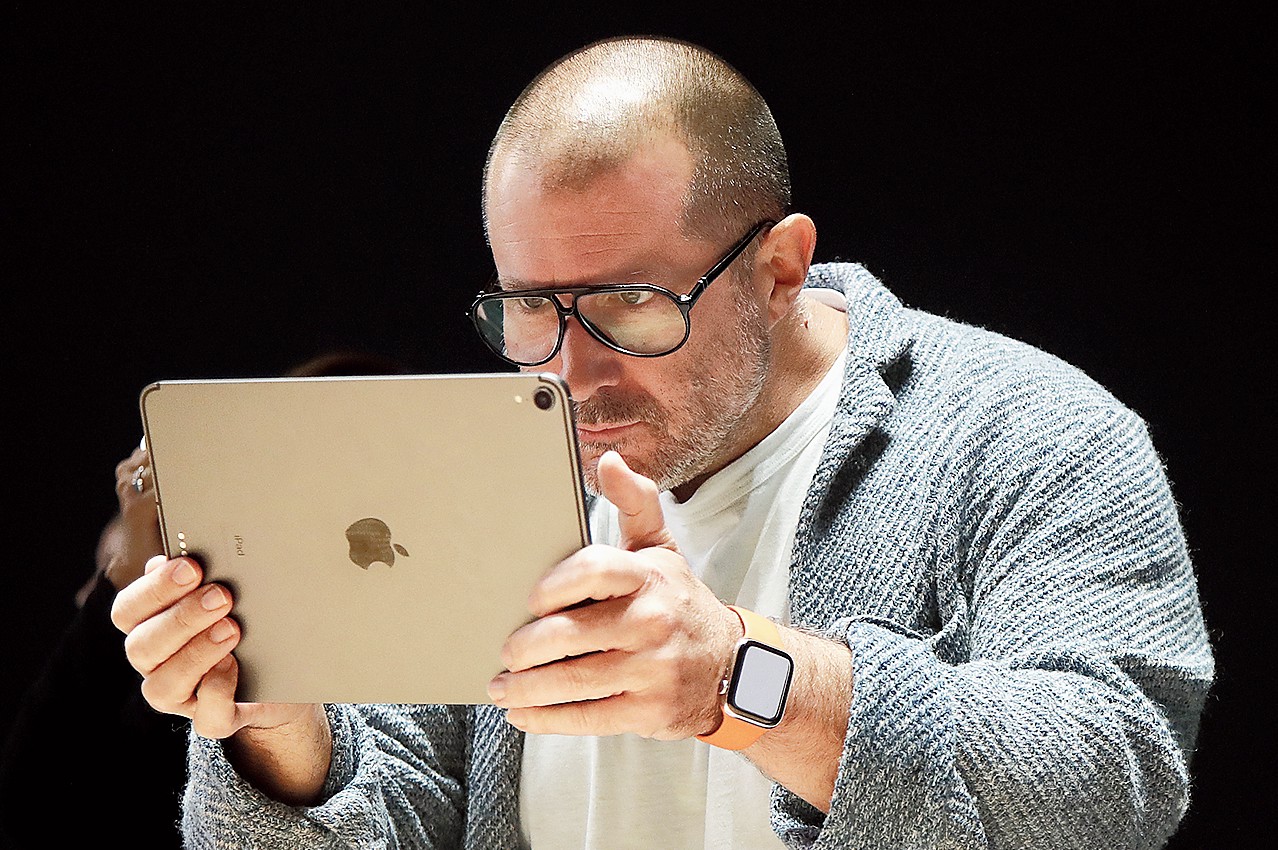
"Where the F is the notch?"
Good riddance, Ive. Some thin-obsessed bootlickers may miss him, the majority of Pros does not. Function > Design.
These new MBPs are finally Pro again in almost every aspect, affirmed by every review, and a small minority complaining about 'design issues' won't change anything about this fact")
Indeed, unpopular. These new books aren't much thicker (the 14" is thinner than the 13") and certainly not 'ugly' when you experience them in real life. And you don't decide what is 'overhyped' either. SD is still by far the most popular memory card. Not only used in cameras. But also drones, GoPros, game consoles, receivers, synthesizer, drum machines, DJ-gear, etc. Why do people always ignore that? Finally, HDMI 2.1 offers zero benefit for its intended purpose: having the convenience to quickly connect a TV at home/hotel or projector/monitor at office without a dumb dongle, and there is no need for 8k/120Hz there. For your professional home studio monitor, you use TB with power delivery anyway, just like before.Unpopular opinion: I’m not a big fan of Apple’s design language after Ive left. The new MacBook Pro’s are thick and ugly. And the old ports are overhyped. Photographers have already moved past SD card and HDMI 2.0 is on its way out to make way for HDMI 2.1
These new MBPs are finally Pro again in almost every aspect, affirmed by every review, and a small minority complaining about 'design issues' won't change anything about this fact
Last edited:
Everybody is entitled to his/her "alternative facts", but the rest of us is not forced to swallow it.Maybe this washed-up guy can reflect on why he got himself fired from Apple.
We want Jony BACK at Apple!!!
The design team now is a mess, they have no sense of style, beauty and art.
The design team now is a mess, they have no sense of style, beauty and art.
Most want function over form.We want Jony BACK at Apple!!!
The design team now is a mess, they have no sense of style, beauty and art.
This may come as a shock to you and the post your are responding to, but providing you with some deep conversation is not really what the internet is all about. No one has to justify any opinion, no one has to provide any proof. It is just the way it is. I would say if you are looking for some deeper conversation the internet is not going to provide that for you really no matter where you go on it.Well said. Out of interest...and sad I know but I looked at many of those who just slate Ive for what seems like following the crowd. It turns out that the vast majority, above 90% joined MacRumors in 2015 onwards. Now, I don't mean to use a sheep dip approach here but based on that figure, it's possible to make an educated guess that many have no idea about Apple's history and what Ive brought to the table. He was one of the pillars that brought Apple to where it is today.
And the funniest thing....all those complaining are using the exact products that Ive designed and have his legacy written all over them!
Some apps may have been going that way, but iOS7 was a fundamental shift, and Ive was providing UI/software design oversight and was the primary driver in updating iOS.Yeah but with some serious mental issues
iOS7 was a trend in design, even many apps were migrating months ahead even first runors appeared.
Is like saying apple envisioned color screens in phones.
And that trend is quite old, it is just previous iOS interations where already “old fashion” as they emulate real world because tech allowed that for fisrt time in phones, but once the eye saw that, smart design come over.
The amount of hate towards this guy on this forum is ridiculously over the top.
1) The product design and manufacturing pipeline is so long there is a good chance he was involved in many of Apple's current products while still at Apple.
2) His new company's first customer was Apple. He still consults for them.
3) All of the designs people are praising Apple for after he "left" are direct callbacks to HIS designs over the past decade plus.
Did Apple fly too close to the sun in the name of "thinness"? Yes. Did it influence the entire consumer electronics industry in doing so? Yes! Design outpaced technology and form surpassed function and it's good Apple is course correcting, but give me a break with how much you despised "his designs". You all bought the thin and light products and the majority of Apple fans defended all those compromises until the chickens came home to roost. Stop acting like you never liked his work because as an "Apple fan" you most certainly did.
Really? Explain the iMac puck mouse. Explain the Cube. Explain the Trashcan. Hell, explain the original Mac and it's custom painted manufacturing equipment. Pretty sure Jobs leaned more to form than function.When you look at Apple products released following the death of Steve Jobs, it is very clear that Jony was Form and Steve was Function. Jony went for pure elegance, his designs were beautiful and elegant, but Steve could edit and make sure just the right amount of practicality remained to create magic. I mean Steve made his share of flubs, but the man understood there was a fuzzy line between people believing in magic and pure frustration.
My long standing theory has been that after Steve's passing there was no one on the executive team with the relational authority to edit the mad genius designer that had worked and reported only to Steve Jobs for so long.
Ive is one of the most influential designers in the past 100 years. Like the man or not, have to respect his legacy.
Register on MacRumors! This sidebar will go away, and you'll see fewer ads.