I only see that the calculator got changed. Am I missing the rest?
I think they're thinking the icons got tweaked because of the background. The background is making the shades of the icons look slightly different. Otherwise I see no differences.
No he is right! WOW, VERY GOOD attention to detail!

Look VERY closely, every app is tweaked a little bit, and it is NOT just the background wallpaper that makes them appear that way!
For example:
-Calendar, the black line separating the red top bar and the white.
-YouTube, the little speaker grill in the bottom center is much more pronounced.
-Weather, the suns rays are sharper.
-Notes, the page tear towards the top bar is different.
-Clock, no more white outline around the icon, and the seconds hand is more pronounced.
-Calculator, obviously different, but it is funny that they change that icon with every update pretty much haha.
-Mail, the fold shadows in the letter are not near as dark.
The others are sharper and slightly tweaked as well but it is harder to see.
Detail people, detail!

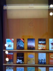
Oh and even though it is on the iPad, I'll give you an exclusive that I haven't seen anywhere that I found while playing with one today for the first time!

In iBooks, if you pull down on the shelf quite a bit, there is a secret Apple logo hidden up under the top menu bar!


