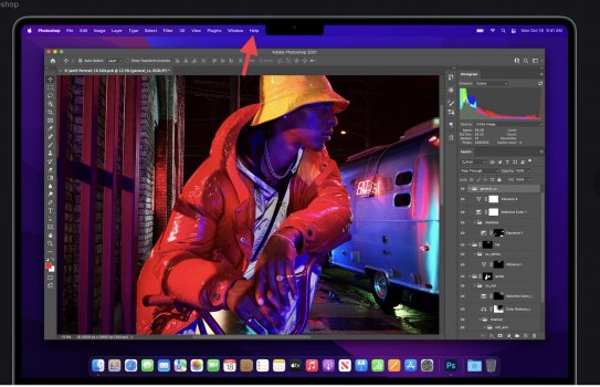
It wouldn't stop me buying one (I don't need a new laptop right now - waiting for the 5k iMac or Mini Pro - but if I did I'd be reaching for the credit card) but I think the dreaded notch is introducing extra technical and visual complexity while not adding much.
OK, so let's accept that we haven't lost space to a notch, we've gained space in the form of "ears" that would otherwise just be bezel... but it looks like all you gain is that, in desktop mode, you get back the space that would have been taken by the menu bar... although, not as much as it may seem because it looks like they've had to make the menu bar bigger so that it fills the ears.
You can already get the menu bar space back by either (a) running apps in full screen mode or (b) choosing the "automatically show/hide menu bar" so... so what?
What's going to happen if there are more menu headings than will fit on the left-hand ear? What's going to happen in "more text" scaled mode (presumably the menu bar stays at the same height rather than getting slimmer....)
Also, it's pretty obvious that this was designed by someone who prefers "dark mode" where the notch just disappears. In light mode it will always stand out like a sore thumb.
I think it's telling that - apart from the bit where they show you how it works - you hardly ever saw it in the video because they were using dark mode, fullscreen apps or a backdrop with a dark top. If you have to go out of your way to hide something in the launch presentation that introduces it then something is not right.


