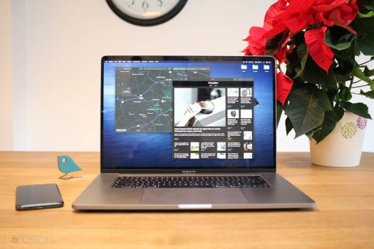
Not entirely thrilled with the notch but accepting it. I'm much less worked up having seen it in the videos than I was over the weekend. That said I think they could have hidden the notch more, as they are doing in full screen apps. I'm getting the concept of using the area that would ordinarily be a bezel for the menu bar. That does give you extra working real estate. But I would have just made that whole menu bar black to have it seamlessly blend in. And I would have hidden it on the login window. So you really never see it. Maybe they will make these improvements in future software updates.
Got a tip for us?
Let us know
Become a MacRumors Supporter for $50/year with no ads, ability to filter front page stories, and private forums.
Do You Prefer Notch or No Notch?
- Thread starter imdog
- Start date
- Sort by reaction score
You are using an out of date browser. It may not display this or other websites correctly.
You should upgrade or use an alternative browser.
You should upgrade or use an alternative browser.

Precisely why I like it.It doesn't eat into the screen at all. It allows ADDITIONAL screen either side of it.
It doesn't eat into the screen at all. It allows ADDITIONAL screen either side of it.
Precisely why I like it.
But wouldn't you rather have both?
The iPhone notch mostly fits within the MacBook's newly thin bezels. The iPhone has had 1080p front-facing video for years, and it has even MORE sensors packed into that small area.
Don't let Apple gaslight you into believing the notch was necessary here. It was not. In a few years, they will shrink it by 20% and call it a "Revolutionary" achievement.
So what you are saying is that you rather have the top of the new screen inaccessible for anything. I accept it, and I understand that some find the notch obstructive, but to me, it doesn't seem that some fully understand the options.The iPhone 12 notch is less than 2mm taller than the newly-thin bezels on the MacBooks, and the iPhone takes 1080p video as well and has even MORE sensors packed into that space. I totally understand the argument for increased screen real estate, but isn't there a point of diminishing returns? At just 1.8mm of vertical space it's barely handful of pixels at that point. If I'm going to give up part of my screen, i'd rather it be a thin strip of pixels across the top rather than a sizable chunk taken from the middle.
It will certainly be intrusive to apps that have enough menu items to reach the middle of the display. And that's not even taking into account how visually intrusive it will be, at least to some users. Plus, it doesn't really "give you back" any space because in fullscreen apps, that area is still inaccessible.
There is no reason to justify the notch in my opinion. I believe that Apple introduced the notch because marketing is more important than the user experience to them. They wanted to add the MacBook Pro to their family of iconic notched devices.
But overall who cares? I was interested go online to see reactions about this new machine, and everybody talk about a notch, who cares?
Attachments
Last edited:
The notch does not seem to infringe on any useful screen space, on my current MBP that top center of the menu bar is vacant anyways. I suppose if I had a ton of extra loaded icons it might be different.
Who knows, maybe Apple is planning to "own the notch" and keep them around in the iPhone as well.
Who knows, maybe Apple is planning to "own the notch" and keep them around in the iPhone as well.
The reason I don’t mind the notch is that the aspect ratio of the screen (extra screen) accounts for it. With proper UI it won’t be very noticeable with the black background. Correct me if I’m wrong.
How in the world did you get that from my post? I'm not even sure what part you're confused about, so I don't know how to clarify it for you.So what you are saying is that you rather have the top of the new screen inaccessible for anything.
Yes, I love it! Because it matches my iPhone!
I understand this is a made-up excuse so you don't have to spend several grand on a laptop, but that's fine. I and others are happy since less people in line = shorter waiting times 🙌I signed up just to vote 'no notch'. I hate it.
Completely ruins the rest of the amazing laptop.
If you like it that is all that matters! For me, I don't personally want to spend that much money (Which I was more than happy to spend providing there was no notch) when it has a feature like that I don't like. Just my personal opinion.I understand this is a made-up excuse so you don't have to spend several grand on a laptop, but that's fine. I and others are happy since less people in line = shorter waiting times 🙌
I feel obligated to say, that I personally dislike people spending a lot of money on luxury things, such as the most expensive iPhone max (unless you are a photographer). The only reason I'm perfectly fine with these Macbook prices is that I use these so many hours per day and per week and they are much more valuable to me than every other expensive tech I own combined, really. And it is competitive prices. So that's why I'm buying and am super happy about it, but if that wouldn't be the case I would not spend so much money on things.If you like it that is all that matters! For me, I don't personally want to spend that much money (Which I was more than happy to spend providing there was no notch) when it has a feature like that I don't like. Just my personal opinion.
Last edited:
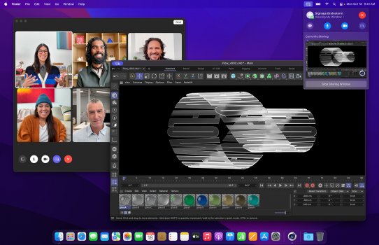
And I have some software that has a couple more dropdowns than Photoshop. So what would that look like if, taking your screen shot as an example, if there are two more drop downs after "Help"? This is a valid concern with the new systems where not having a notch would have prevented this concern. And if it shifts to the RIGHT of the notch, so now there is a risk of it interfering with my Creative Cloud, Dropbox, OneDrive and other status icons?Yes….. The menu bar is taking up that space with the notch anyway so it’s not being intrusive to the screen
YES IT'S A DISASTER...And I have some software that has a couple more dropdowns than Photoshop. So what would that look like if, taking your screen shot as an example, if there are two more drop downs after "Help"? This is a valid concern with the new systems where not having a notch would have prevented this concern. And if it shifts to the RIGHT of the notch, so now there is a risk of it interfering with my Creative Cloud, Dropbox, OneDrive and other status icons?
Last edited:
I hate the notch
Which one did you buy? Or are you just voicing an opinion with no skin in the game at all?
Like many have said... given the choice of much thicker bezels or the notch. I voted with my wallet and ordered one.
Sounds like these are workhorse laptops for people doing work. Seems about right.No notch all day every day
At a cursory glance, I dont like just about any of the design decisions
-Thicker which is fine but it seems substantially thicker which is something I appreciate about my Air coming even from a 2016 Pro.
-hideous feet not even rounded and subtle like on current and previous Mac laptops. looks tacky and inelegant even in stock photos.
-Notch
-black border keyboard mat surrounding the black keys, contrast disparity between it and the chassis is nullified.
-3 USB-C TB4 ports? There was 4 on the Toucbar Macs. I'm fine with 2 on my Air, but one less port for 'higher throughput'?
-3.5 lbs. Ouch.
a whomping 4.7/4.8 lbs for the 16" too. That's terrible. That's like a gaming laptop that never leaves the desk.
I think the hype surrounding return to ports is kinda meh. Glad to see Magsafe return but mind boggling why it ever went away. And cant be too excited about something that was the status quo forever until Tim's reign.
They couldn't have gone HARDER on the space grey too? I want a saturated black MacBook like the 13" polycarbonate days. Otherwise, silver.
BTW the 16” MBP is only 0.6mm thicker. Deal with it.
Yes, and those other laptop cameras are all terrible. This is Apple trying to give us the better zoom cameras we kept asking for.It doesn’t even have faceID so it’d be easy to fit the camera system into a thin bezel. Many laptops do it
Personally, if you take the raw power of the new MacBook Pros, RAM capability, up to 8TB storage, and all for the starting price of $1999 and $2499, I wish people would quit complaining. Plus Pro Motion 120Hz! I thought Apple would charge way more and they didn't. They won my respect big time on this one. I don't even buy very many Apple products anymore, and certainly not the iPhone.But wouldn't you rather have both?
The iPhone notch mostly fits within the MacBook's newly thin bezels. The iPhone has had 1080p front-facing video for years, and it has even MORE sensors packed into that small area.
Don't let Apple gaslight you into believing the notch was necessary here. It was not. In a few years, they will shrink it by 20% and call it a "Revolutionary" achievement.
I don't really get the hate for the notch. It is literally dead space. The options were either a huge black horizontal border at the top like every MacBook literally ever or a notch covering a small part of unusable screen space and a larger screen. I'm sitting here typing on a MacBook with a giant black border, it is silly, I would rather have an edge-to-edge screen as much as possible.
Even if you use full screen, it will create the black bar to make it disappear, so it really is no big deal.
Even if you use full screen, it will create the black bar to make it disappear, so it really is no big deal.
Yeh, if you are super happy then that's great and that is all that matters to you. My point was that they lost my sale as soon as I saw the notch design. For me it just ruined the whole laptop, which is a shame considering the amount of innovation and technological advance in the rest of the laptop.I feel obligated to say, that I personally dislike people spending a lot of money on luxury things, such as the most expensive iPhone max (unless you are a photographer). The only reason I'm perfectly fine with these Macbook prices is that I use these so many hours per day and per week and they are much more valuable to me than every other expensive tech I own combined, really. And it is competitive prices. So that's why I'm buying and am super happy about it, but if that wouldn't be the case I would not spend so much money on things.
I didn’t buy one, because there’s a notch. I’m using an M1 iMac as my primary device, I will either wait for a MacBook Pro without a notch & an external display; or I will wait for the larger iMac and go with a MacBook AirWhich one did you buy? Or are you just voicing an opinion with no skin in the game at all?
Like many have said... given the choice of much thicker bezels or the notch. I voted with my wallet and ordered one.
I’m pretty sure lots of those cameras are 1080p lol, wasn’t Apple notorious for having a potato camera compared to other laptops?Yes, and those other laptop cameras are all terrible. This is Apple trying to give us the better zoom cameras we kept asking for.
Where is the "I couldn't care less" response?Would you rather have the botch or no notch?
Register on MacRumors! This sidebar will go away, and you'll see fewer ads.