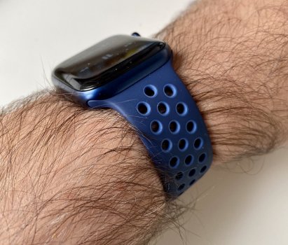
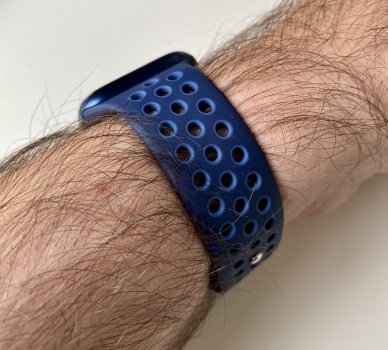
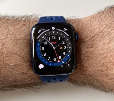
Hmm, looks less of a navy-type color than it does in the photos. Might have to see this one in person but I really want to get one of these braided bands just for the comfort factor.
Got a tip for us?
Let us know
Become a MacRumors Supporter for $50/year with no ads, ability to filter front page stories, and private forums.
Every Apple Watch band Apple released. Ever.
- Thread starter choreographics
- Start date
- Sort by reaction score
You are using an out of date browser. It may not display this or other websites correctly.
You should upgrade or use an alternative browser.
You should upgrade or use an alternative browser.
It’s all subjective but Clover just looks like a more saturated green. That’s about it. Pine green at least has its sand green vibe going.Yeah it definitely is! I used to like Pine but now it looks kinda bad next to Clover. LOL.
Reminds me when everyone gushed over Capri blue like it was the best thing ever because it was so saturated. There’s more interesting blues though.
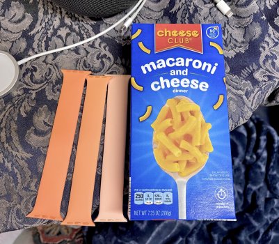
Threw this up the other night…marigold is less saturated, less warm than kumquat (left). Cantaloupe on the right, which feels similar in hue to Marigold (middle). I’m glad kumquat and marigold are different sizes.Does anybody have a kumquat and marigold to compare?
Attachments
It’s a bit lighter than a navy.Hmm, looks less of a navy-type color than it does in the photos. Might have to see this one in person but I really want to get one of these braided bands just for the comfort factor.
Some of us are tired of the same boring, muted shades over and over again. It’s rather UNinteresting to have yet another muted blue or green.It’s all subjective but Clover just looks like a more saturated green. That’s about it. Pine green at least has its sand green vibe going.
Reminds me when everyone gushed over Capri blue like it was the best thing ever because it was so saturated. There’s more interesting blues though.
(Even more) Maize
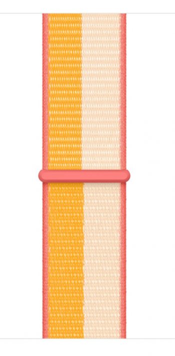
holy.. maize and gold 🥰 and again.. (*hitting the buy button*)... im so weak.
Last edited:
Some of us are tired of the same boring, muted shades over and over again. It’s rather UNinteresting to have yet another muted blue or green.
I agree. They’re all mostly muted. Even the Nikes are drab compared to past Fall seasons.
I like the unmuted ones like Maize braided and Magic Ember Nike, but this one just seems out of place for fall, like it would be a better summer band (apologies to fans of the half-stripe..it‘s actually not a bad combo of colors, but the half-and-half bugs me.)Some of us are tired of the same boring, muted shades over and over again. It’s rather UNinteresting to have yet another muted blue or green.
Attachments
Last edited:
I don't like the half-and-half design, either. This is the first entire set of Apple Sport Loops I haven't liked. Unfortunately, I don't like this year's Nike bands either, so this is a no Sport Loop year for me.I like the unmuted ones like Maize braided and Magic Ember Nike, but this one just seems out of place for fall, like it would be a better summer band (apologies to fans of the half-stripe..it‘s actually not a bad combo of colors, but the half-and-half bugs me.)
Clover in reality is the color Cyprus Green was pretending to be in the official Apple images last year. Thanks for sharing these pics.Received Clover sport today! I feel like it's kinda hard to photograph color comparisons due to lighting (mind you, I'm using an iPhone 12 Pro Max LOL), but I wanted to show some comparisons to other greens I have.
Clover is by far their best green IMO. If I had to only pick one, it would be this one.
In all photos, it's L - R
Mint - Spearmint - Clover - Pine - Cactus
View attachment 1840837
View attachment 1840839
View attachment 1840840
View attachment 1840841
Clover in reality is the color Cyprus Green was pretending to be in the official Apple images last year. Thanks for sharing these pics.
I agree, and you're welcome!
Oops. I ordered both the English Lavender and the Marigold sport bands. Reason is I just couldn't decide between the two and it gave me a headache. Will do reveals when I receive them. 


Anyone’s Clover SB has already gone “shiny”? I got both Clover SB and English Lavender SB and it’s only been like a week and the Clover SB is already showing wear? Light use of both, they’ve only been out for like two weeks. The English Lavender SB looks fine.
Thinking it might be a quality control issue. I don’t recall doing anything different with this SB than with any of my other SBs. It’s my first SB with this problem, like some sort of coating is peeled off.
Hard to capture without a flash; this is taken with a flash.

Thinking it might be a quality control issue. I don’t recall doing anything different with this SB than with any of my other SBs. It’s my first SB with this problem, like some sort of coating is peeled off.
Hard to capture without a flash; this is taken with a flash.
Last edited:
That looks like the UV coating is coming off. I had that happen to a Nike band last year, and they replaced it for me. Definitely return it!Anyone’s Clover SB has already gone “shiny”? I got both Clover SB and English Lavender SB and it’s only been like a week and the Clover SB is already showing wear? Light use of both, they’ve only been out for like two weeks. The English Lavender SB looks fine.
Thinking it might be a quality control issue. I don’t recall doing anything different with this SB than with any of my other SBs. It’s my first SB with this problem, like some sort of coating is peeled off.
Hard to capture without a flash; this is taken with a flash.
View attachment 1846486
Good decision ☺️Oops. I ordered both the English Lavender and the Marigold sport bands. Reason is I just couldn't decide between the two and it gave me a headache. Will do reveals when I receive them.


Thanks. I’ll try and get it replaced, just a bit tricky cause we’re in lockdown and they are only open for pickup orders so I can’t walk in to return.That looks like the UV coating is coming off. I had that happen to a Nike band last year, and they replaced it for me. Definitely return it!
Has anyone compared the new Olive Gray/Cargo Khaki Nike Sport Band to Spruce Fog/Vintage Lichen, yet?
I‘m utterly curious as to how similar those two look…
I‘m utterly curious as to how similar those two look…

What are you guys doing for the watch color picker on Watch OS8? Are you just checking all of the colors? I didn’t realize that it’s broken down by release year now and picking a color is not as easy as before.
It’s the worst. I have been enabling colors I own and a few others that are nice complimentary accent colors. But I either have to guess and then check on the main screen to see if I got the right color or use Bandbreite to find the release season for the color I’m looking for. Horrible user experience either way.What are you guys doing for the watch color picker on Watch OS8? Are you just checking all of the colors? I didn’t realize that it’s broken down by release year now and picking a color is not as easy as before.
I’m really not sure what Apple was thinking when they redesigned the color picker like this. Only the most die hard bandaholics (I count myself in that group) know/keep track of what season their bands came from. If I find this UX to be bad, how must the average Apple Watch user be feeling about it? I just don’t understand the logic behind this change.
Register on MacRumors! This sidebar will go away, and you'll see fewer ads.


