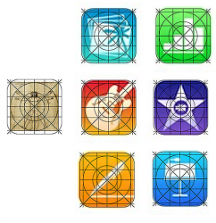
I know I'm beating a dead horse but...
Image
How can anyone think the iOS 7 icons are an improvement?
The only positive to the new icons is they fit in better with the other horrible iOS 7 icons.
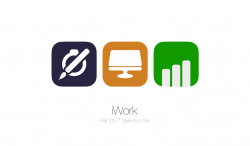
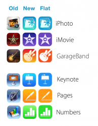
Thank you for creating this comparison. I liked the old style much better. In particular on the iLife apps. The new iWork apps are ok but I still like the old ones better.