Got a tip for us?
Let us know
Become a MacRumors Supporter for $50/year with no ads, ability to filter front page stories, and private forums.
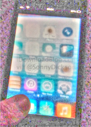
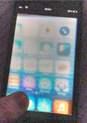
Image of 'Flat' Redesign From Early iOS 7 Build Reportedly Leaks
- Thread starter MacRumors
- Start date
- Sort by reaction score
You are using an out of date browser. It may not display this or other websites correctly.
You should upgrade or use an alternative browser.
You should upgrade or use an alternative browser.
I'm so glad Apple is putting their major focus on the looks of icons. Because if there is one big glaring issue with iOS it is the look of the icons. I mean, they shouldn't waste time on notification center or interapp operability. Let's make the grid of icons look better.
Thank you. Even something like "fast" app switching is archaic compared to competitors. Double pumping the home button, then selecting the app is too many steps to be considered "fast".

You wont see sweeping changes to the UI in IOS 7. While we may like them, Apple will not isolate the majority of its "normal" users by making them relearn a new UI. They will do it gradually, as they have introduced change in the past, despite what the "power user" would like to see.
True, but a new completely new skin that matches Passbook's design aesthetic without actually moving anything would likely be a passable compromise.
Why do these undercover leaked photos always have to look like they were taken with a potato?
One thing I actually hope they remove in iOS 7 is that weird striped background in the Settings app. It looks like a holdover from a similar design element in some earlier release of OS X, before they switched to the Aqua UI or whatever it is.
One thing I actually hope they remove in iOS 7 is that weird striped background in the Settings app. It looks like a holdover from a similar design element in some earlier release of OS X, before they switched to the Aqua UI or whatever it is.
It may be a real photo but that screen image isn't from the phone that's being held. The screen is of a different perspective than the phone that's being held. As someone mentioned earlier, the image doesn't line up with the screen. It's been pasted in. Why, I don't know? It's definitely two separate images.
Last edited:


I don't get it. Why would you take a picture of your phone on which a picture is being displayed? If it is to zoom in on the part you want to show, just show the original picture and zoom in on it. Don't do this crap.
I call fake. Also because it's on the 4(s). I expect they'll do some tests on these older devices, but most definitely more tests on the iPhone 5 or newer hardware.
I call fake. Also because it's on the 4(s). I expect they'll do some tests on these older devices, but most definitely more tests on the iPhone 5 or newer hardware.
If you assume that he's swiping between the home screens, there's an angle at the top and right side of the screen, and one on the bottom that make the home screen a trapezoid.
Also, there's quite a distance between the top bar and the home screen itself.
Also, there's quite a distance between the top bar and the home screen itself.
Last edited:
obviously apple wont change much about the grid view but im praying that apple opens the notification center for devs to add "widgets". the notification center looks especially pathetic on the iPad as of right now and dear god let me decide how many apps i can put in a folder and get rid of this silly limit. i honestly dont need 4 "games" folders filling up my screen

Same water background by default. Whew! I was terrified we'd lose that.
Awesome! But can you print it out, and then take a photo? Here's the key: photograph the BACK of the printout, with a bright light on the other side so the image shows through.
Photocopy the result in black and white. Then scan as line art. That's what we want to see.
Awesome! But can you print it out, and then take a photo? Here's the key: photograph the BACK of the printout, with a bright light on the other side so the image shows through.
Photocopy the result in black and white. Then scan as line art. That's what we want to see.
Why do these undercover leaked photos always have to look like they were taken with a potato.
So true, and very funny

Thank you. Even something like "fast" app switching is archaic compared to competitors. Double pumping the home button, then selecting the app is too many steps to be considered "fast".
As opposed to holding down the home button for a second or two on an S3 or 4 and scrolling your open apps list to switch to a different one.
It looks fake, because why would they use an older iPhone and why would they have three bars of coverage? Shouldn't it have five if it was a "testing room"?
Do you really think a company like Apple, iPhone 4 Antenna Gate aside, really tests their OS only on one main device and doesn't test their OS at all on older devices? While I fully believe it is fake, Apple isn't dumb. They will test their OS fully on every device that is supported. "Ok, it works on the latest phone it will work perfect on the older devices that we are supporting."
Also do you fully believe Apple doesn't test their phones out in real world use with the signal. "Ok it works perfect with 5 bars of signal it will work perfect everywhere."
But yes, I fully believe it is fake. Nothing about it screams real to me. I could take a picture like that of iOS6 and say it is the new iOS7 and everyone would think it is a rumor and a leak.
Why does the screen not align with the frame of the phone?
That's what I was wondering too.
Register on MacRumors! This sidebar will go away, and you'll see fewer ads.