Lazily I will admit I haven't reported this but yeah I've noticed this since the first beta like come on surely someone somewhere responsible for iOS 26 development knows by now..After each beta update, the celluar option would always switch back to 5G Auto, even if I have always set it to 4G only, strange.
Got a tip for us?
Let us know
Become a MacRumors Supporter for $50/year with no ads, ability to filter front page stories, and private forums.
iOS 26 Beta 8 ― Bug Fixes, Changes, and Improvements
- Thread starter Banglazed
- WikiPost WikiPost
- Start date
- Sort by reaction score
You are using an out of date browser. It may not display this or other websites correctly.
You should upgrade or use an alternative browser.
You should upgrade or use an alternative browser.
- Status
- The first post of this thread is a WikiPost and can be edited by anyone with the appropiate permissions. Your edits will be public.
Are you using photo shuffle?Anyone know how to fix the wallpaper being dark? I’ve tried the toggle on the home screen where you change icons but that barely does anything. Sometimes it’s bright like it used to be on 18 but most of the time it’s dimmed
its a bug introduced from beta 6.
The only way is to use shuffle on tap instead of auto shuffle by lock/hour/day
No, just that.Don’t believe it just because of glass design. Must be more then that
I’ve been through lots of marginal products—like the G5 iMac that would reliably cook its video card every 12-18 months—but I’ve never been backed into a corner with ugly.
The biggest features of 26 seem to be related to calling and texting and because I live in Mexico where WhatsApp is the standard tool for communication, they’re meaningless to me.
Hopefully an iOS 26.1 feature. Too late in the game for 26.0. Happy to see Apple showing classic options for the phone app, shows their listening while still making changes.Sure it’s possible. Just give us a slider that allows the user to adjust to more liquid glass or more frosted. Problem solved.
Tried that and no issues here like that. Using an iPhone 15 Pro here.When you tap and hold on the Home Screen and tap "edit pages", then immediately tap "done", the screen locks up. Can anyone else confirm?
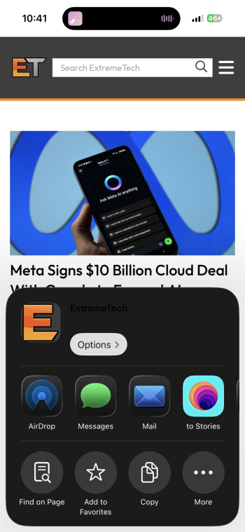
The share sheet isn’t readable clearly if you have Reduced Transparency set to on with Dark Mode enabled in safari. Also, signing into an app using Apple is the same. Turning off Reduce Transparency or dark mode fixes this bug atm.
I’m not a fan of the glass, so I tuned Reduced Transparency on. Images attached show it without the bug and one with it as you may see. Noticed this since b6 or b5. Reported to Apple.
I’m not a fan of the glass, so I tuned Reduced Transparency on. Images attached show it without the bug and one with it as you may see. Noticed this since b6 or b5. Reported to Apple.
Attachments
Just going to install the new update onto my 16 Pro. Seems to be a lot of people still complaining about things… 🙈😀

In my opinion it’s fine, go for it 😊Just going to install the new update onto my 16 Pro. Seems to be a lot of people still complaining about things… 🙈😀
View attachment 2540944
On public beta 5 now.In my opinion it’s fine, go for it 😊
Pleased to see that the app animation is still really fast, even a hair faster when loading the content within the app.
Thats all I can say atm
Yeah I don’t know what’s left of Apple, design is actively grotesque with the iPhone 17 / iOS 26No, just that.
I’ve been through lots of marginal products—like the G5 iMac that would reliably cook its video card every 12-18 months—but I’ve never been backed into a corner with ugly.
The biggest features of 26 seem to be related to calling and texting and because I live in Mexico where WhatsApp is the standard tool for communication, they’re meaningless to me.
I'll tell you what isn't fixed. The third party keyboard integration. There's some extra space there. It looks like an abomination.
Exhibit A. SwiftKey versus stock keyboard.
I drew an outline around the extra space. This was not an issue before iOS 26. All keyboards fit nicely into the keyboard "area".
View attachment 2540867
View attachment 2540866
Third party keyboard need to be updated to be compatible with iOS 26 using the new Xcode. This can only happen after iOS 26 is officially released.
Ohh thank you for that, now I know how to adjust my expectations. So the ball's on Microsoft court.Third party keyboard need to be updated to be compatible with iOS 26 using the new Xcode. This can only happen after iOS 26 is officially released.
I would say similar to the Beta 7, the battery holds up very well.
Nope call screening works on iPhone 12 (my test iPhone) don’t think it requires carrier support just language and region settingsRegion setting must match language setting. iPhone 14 or newer. Ai dependent and carrier must support the feature.
I think they mean the effects from the iMessages app, like Memoji’s face filters, the cartoon filter, etcYou mean the Photo Booth app? It's still there on the iPad and was never on the iPhone.
Yeah, it’s not happening. Problem is I’m not even confident they will resolve them with the upcoming updates either. The low quality and the lack of attention to the details are striking.Good luck with that
Last edited:
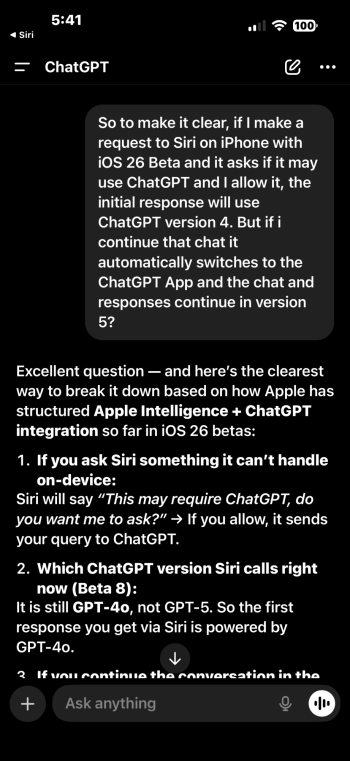
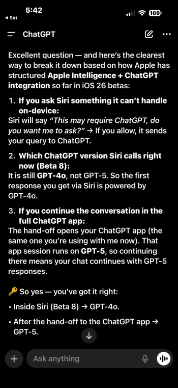
Same hereTo answer about ChatGPT. It just answered model 4.
I believe you with iOS.26 is infinitely better than those two. These are graphical glitches but they’re smaller and subtle and the average user will ngaf. The speed up in animations? A fresh design language? Better keyboard? These are things users will see and appreciate
I will likely install it - new toys! - but then regret not waiting for the first major point release, like always.
It’s macOS I’m worried about, where it feels like an afterthought and just not fully worked out.
I’m very likely sit on upgrading that until the first point release.
For a company with legions of engineers and ux people, it feels often like they’re struggling to cash their own cheques.
Maybe spend less on Apple TV+ - which must be running at a huge loss - and more on engineers & ux people? Just a suggestion Apple.
The keyboard in iOS 26 is way better than iOS 18 imo.
Faster and more precise typing with no lag for me, with better predictive text & auto correction which is great.
Not everyone is happy but I really don’t have any bad things to say about iOS 26.
Performance boost ☑️
Super fast animations ☑️
Super smooth across iOS ☑️
Gorgeous new design visuals ☑️
More customisation ☑️
Solid battery life even on betas ☑️
Last edited:
I’d honestly prefer worse battery life than all these visual bugs.
And you know those visual bugs will NOT be fixed by the time iOS 26 goes live publicly.
And you know those visual bugs will NOT be fixed by the time iOS 26 goes live publicly.
I’m starting to think we either get a beta 9 next week or maybe a RC1. Then potentially a RC2 post event. It seems Apple has some work to do.
Maybe you have the MacRumors page saved in your Reading List?View attachment 2540997These titles keep popping up on random websites and I can’t figure out how to turn it off. Anybody have this?
There were many visual inconsistencies on my iPad before I reverted to 18.I’d honestly prefer worse battery life than all these visual bugs.
And you know those visual bugs will NOT be fixed by the time iOS 26 goes live publicly.
Further, there were additional inconsistencies when I chose “Reduce Transparency”, suggesting that Liquid Ass is your NEW LOOK even if you want to attenuate it.
I haven’t mentioned it before but the sizing of elements was catawampus. In Mail, the text was too big and consequently, the left pane navigation overwhelmed the message pane on the right. The same in many apps. This with the size slider all the way to smaller.
On my 26 test iPhone, side by side with the identical iPhone running 18, 26 was grainy and fuzzy.
Why should anyone put up with this nonsense? Just to have the “new”?
Register on MacRumors! This sidebar will go away, and you'll see fewer ads.


