Become a MacRumors Supporter for $50/year with no ads, ability to filter front page stories, and private forums.
Wow. I can tell this is going to really add productivity to my busy lifestyle.
 
Well, I believe most good companies have a single leader running the ship, steering it into definite direction. I think Apple will in the end run on autopilot for a while, then be slashed up and sold piece by piece.

From the last years scheme of innovations, we see mostly corporate moves rather than farming new behaviours for end users. Yes, Apple converted from 3D to flat, which mimicked the world of Googles Android. Instead of slowly peeling of the skin from yesterday, they took a u-turn, leaving the Apple brand and trademark bleeding. The problem is that the new look is tasteless, but effective. It no longer turns head, it gets things done. The specifications are greater than ever. Surfing the web, except for the crashes, is smoother than ever because of the new processor in Apples mobile portfolio.

One thing is still missing, and that is identity. Jony Ive seem to have a signature, but certainly lack the impression that used to glow from the very first touch. I don't expect anything from my Apple products anymore, other than faster specifications, because I no longer believe they have the power to astound their audience anymore through software aesthetics.

You read my mind completely. It is inevitable based on what we've seen the last couple years, that they are going to stagnate, and crash within the next 20 years.
 
You read my mind completely. It is inevitable based on what we've seen the last couple years, that they are going to stagnate, and crash within the next 20 years.

Nope.

If everyone is busy making everything
How can anyone perfect anything?
We start to confuse convenience with joy
Abundance with choice
Designing something requires focus
The first thing we ask is
What do we want people to feel?
Delight. Surprise. Love. Connection.
Then we begin to craft around our intention
It takes time
There are a thousand no’s for every yes
We simplify. We perfect. We start over
Until everything we touch enhances each life it touches
Only then do we sign our work
Designed by Apple in California
 
What are you talking about?! There was nothing vintage about iOS 6.

iOS 6 felt 3-dimensional, it felt real. I didn't have to guess what was a button and what was just a plain text, or what was selected and what wasn't.


Hey, guess what! We can disagree of which interface works better based on a million differences in the way we form opinions! You know, because we're different!

I didn't have a problem with iOS 6. But the second I started using iOS 7, I liked it better. I like the way it looks, I like the way it feels. I love the move from physical-object-skeuomorphism to a more ethereal, depth oriented skeuomorphism. It works very well with what I want from a mobile OS. I'm sorry it doesn't work for you. I hope you can find some solace in being able to still interact with physical things from time to time.
 
What are you talking about?! There was nothing vintage about iOS 6.

iOS 6 felt 3-dimensional, it felt real. I didn't have to guess what was a button and what was just a plain text, or what was selected and what wasn't.

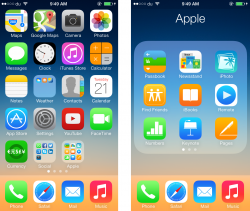
Look at this mess and try to figure out:

What do you see in the first column, Paid apps or Top Grossing apps?

Image


How about now:

What do you see in the first column, Paid apps or Top Grossing apps?

Image

Excellent post! Thanks for the pictures—they really drive home the fact that it's hard to immediately tell what is what. Also, you are correct that there was nothing "vintage" about iOS 6. In fact, the flat-design of iOS 7 is copying the vintage visual style of Microsoft and Android by using many muted colors. Those muted colors are typical of faux vintage things.
 
Why in iOS7 does the dock disappear when opening a folder?!? :confused: The zoom animation should obviously respect the dock (Mr. Ive said iOS7 is consistent throughout, didn't he?). Mockup attached.
 

Attachments

  • screenshot.png
    screenshot.png
    727.3 KB · Views: 149
Why in iOS7 does the dock disappear when opening a folder?!? :confused: The zoom animation should obviously respect the dock (Mr. Ive said iOS7 is consistent throughout, didn't he?). Mockup attached.

The doc disappears because the interface is based on layering. The focus when you click on a folder is supposed to be the contents of the folder itself, hence the "zoom" animation taking you into a deeper layer where the dock in this metaphor would be at a different layer or "depth".
 
Guys.. it's 7.1. Every beta is meant to refine or complete the ideas they officially decided to put in 7.1.

Just because they change something minuscule doesn't mean they just decided to randomly. They probably had a schedule and while they are searching and squashing random bugs, they are also adding little tidbits that were lower priority.

Trust me, stability and overall speed will increase a ton. On the plus side, you'll get some new UI changes that will probably signal what to expect from iOS 8, more minor UI changes and new features.

It's just a phone, stop complaining.

Thanks.

----------

Why in iOS7 does the dock disappear when opening a folder?!? :confused: The zoom animation should obviously respect the dock (Mr. Ive said iOS7 is consistent throughout, didn't he?). Mockup attached.

Because when you zoom, you are moving closer to the folder so you can visually see the icons larger and easier to tap. It's not really a zoom if you don't move all the other screen items as well. Plus, it looks kinda bloated that way.
 
The doc disappears because the interface is based on layering. The focus when you click on a folder is supposed to be the contents of the folder itself, hence the "zoom" animation taking you into a deeper layer where the dock in this metaphor would be at a different layer or "depth".

The translucent dock clearly indicates that it is not part of the background but a layer in front of it. While clicking on the the folder the resulting animation zooms in both the folder and background, as well as the dock !?! Wrong, you want to look inside the desktop, but not the dock.

And from a information point of view, why folders have priority over the dock? And why folders have even more priority than the desktop it contains them (desktop does not hide the dock)?

Hey man, take it up with apple, I'm just laying out what was explained in one of the wwdc session videos.

It's not a matter of priority, when you open a folder on your desktop, the focus zooms into the folder. If you notice carefully you can see a slight zooming in of the wallpaper. Obviously tapping a folder you were looking for something, so your focus has shifted from the desktop as a whole, to a particular folder. The zooming and disappearance of the dock means your focus has drilled down a level and the focus is within the folder that you selected.

Its all about focus and layering depth throughout iOS, I can't explain it fully but the WWDC videos do a great job of laying out all the though in the UI metaphors that drive 7's look and feel.
 
Last edited:
Hey man, take it up with apple, I'm just laying out what was explained in one of the wwdc session videos.

Sorry, I din't mean to be rude whatsoever. It is just that this thing really pisses me. I really love iOS7, seriously (iOS6 had the same issue by the way). In addition to that, why folders do not have own icons?! Why do I have to always read the small titles?! There is something clearly wrong with folders. Jailbreaking solves that issue but I do not want to go that way.
 
Sorry, I din't mean to be rude whatsoever. It is just that this thing really pisses me. I really love iOS7, seriously (iOS6 had the same issue by the way). In addition to that, why folders do not have own icons?! Why do I have to always read the small titles?! There is something clearly wrong with folders. Jailbreaking solves that issue but I do not want to go that way.

There's nothing "wrong" when it comes to UI decisions. If Apple chose to approach UI as a hodgepodge of widgets that all have different design metaphors behind them then you'd have a much less consistent experience.

It's clear from everything I've watched in the developers section on iOS7's design language and metaphors that everything has a reasoning to it, even the implied physics that certain animations create for the user (ex. thudding bounce for "heavy" elements vs airy soft bounces for "light" elements).

Not everything in the design is 100% intuitive compared to other offerings, but it is extremely (possibly obsessively) adhered to the driving metaphors. It's truly an amazing undertaking that everything is so thought out, but I really don't think everyone will understand the amount of attention to detail that went into this unless they are nerdy enough to sit through developers videos :eek:

Adhering to a single metaphor could be as stupid as admirable. Just like every analogy has a flaw, every metaphor simply can't be large enough to cover all nuances of UI. A metaphor may work for a while especially on primitive systems (which iOS was for a long time) however complex systems require complex UIs and trying too hard to implement all UI features using the same metaphor will inevitably create stupid compromises.
 
It's 7.1 beta... compare 7.0 to all of 7.1's enhancements. It's faster, smoother and more complete.

I don't know what you mean by smoother, but according to this site, there are still a lot of random reboots, resprings on iOS 7.1 Beta 4.
 
It's clear from everything I've watched in the developers section on iOS7's design language and metaphors that everything has a reasoning to it, even the implied physics that certain animations create for the user (ex. thudding bounce for "heavy" elements vs airy soft bounces for "light" elements).

I am pretty sure that Apple has tested thousands of possibilities (including the one I am suggesting). Obviously it strikes me that they chose what they chose. Let me add something else: when unlocking the iPhone, desktop zooms out, icons fly/zoom in synchrony, but dock slides in from the bottom, it does not zoom out.
 
I don't know what you mean by smoother, but according to this site, there are still a lot of random reboots, resprings on iOS 7.1 Beta 4.
It's been out for about 12 hours and there are already a lot of reports if random reboots and resprings in the beta that was released just earlier today? Where?
 
I am pretty sure that Apple has tested thousands of possibilities (including the one I am suggesting). Obviously it strikes me that they chose what they chose. Let me add something else: when unlocking the iPhone, desktop zooms out, icons fly/zoom in synchrony, but dock slides in from the bottom, it does not zoom out.

It's not that they picked and chose different things in testing, its that everything was a derivative of the original over arching UI metaphor: A modern and minimalistic "desk"top (quoted for emphasis). The dock is "slow" and moves "heavily" because the dock is where the user's most important icons ("documents") are. The speed and not flying in is supposed to represent the importance of these "documents", they have more gravity to them.
 
The dock is "slow" and moves "heavily" because the dock is where the user's most important icons ("documents") are. The speed and not flying in is supposed to represent the importance of these "documents", they have more gravity to them.

Then, why is the dock zooming in so "fast and lightly" when opening a folder?! It should then "slide out" and "heavily and slowly". That's a clear inconsistency that the eye immediately catches.
 
Most of the article seems to be more about iOS 7 (as in 7.0) in general than 7.1 or the latest beta specifically, even it's mentioned in the beginning. Nor that there is a lot of that happening in the latest beta even if there have been some reports already.

It doesn't really seem there are many or barely any reports of that still happening with the most recent beta here at MacRumors or other larger Apple sites. So something to keep an eye on.

And even if there are still some crashes/reboots, overall it seems that things should still be better than in 7.0.x for the most part, which is still a good improvement, even if it turns out that it's not all perfect. (It's "interesting" how that blog post says that "nothing has been adressed".)
 
Register on MacRumors! This sidebar will go away, and you'll see fewer ads.