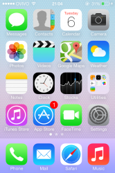
In the app store the the indicator for iap has changed. The price still has a little plus icon but its smaller and theres no boarder around it now.
Got a tip for us?
Let us know
Become a MacRumors Supporter for $50/year with no ads, ability to filter front page stories, and private forums.
iOS 7 Beta 5 Tidbits: Icon Settings Redesign, New Control Center Options
- Thread starter MacRumors
- Start date
- Sort by reaction score
You are using an out of date browser. It may not display this or other websites correctly.
You should upgrade or use an alternative browser.
You should upgrade or use an alternative browser.
No more blur on iPad 3 as well
Well it was a bit slow. I hoped it would be fixed in the release version. Maybe they didn't manage to make it faster. It's still slow though even without blur lol
The Safari icon is still very bad designed and that's an understatement. I also don't understand why Apple goes in the direction which Windows Vista has abandoned, transparent windows. It feels very old fashion, out dated even and especially not new-ish.
Come on Apple, where is the inventive designs you're famous for??
Come on Apple, where is the inventive designs you're famous for??
That was introduced awhile back
im really slow apparently lol ...
i hate what they did to the music player app.
when are they going to add back in the scroll alphabetically bar on the right side of the music player app? i have a very large library. one artist has over 250 albums (including lots of live albums). i don't need to see every track for every album listed. show me the albums and then when i find the one that i want i will click on it to display only those tracks.
when are they going to add back in the scroll alphabetically bar on the right side of the music player app? i have a very large library. one artist has over 250 albums (including lots of live albums). i don't need to see every track for every album listed. show me the albums and then when i find the one that i want i will click on it to display only those tracks.
Did anyone notice that the Default 'space' wallpaper preview is different then the actual wallpaper, in the wallpaper settings?
Think Google has something to sell you...
Not really the point I was making but sorry iOs 7 is iOs 6 mostly playing catch up on simple features that already existed on Android and other platforms along with a winterboard theme with a lot of ugly icons.
Not that there is anything wrong with it. I just find it interesting how so many in here are saying it will save apple and it revolutionary. It's not.
Both google/android and apple/ios/osx are great platforms both do some things better than the other. My biggest concern is iOs doesn't play in other sandboxes.
They really need to put more work into icloud.com make it more like dropbox/google drive. Let me store any kind of file in the cloud not just apple docs that no one in the real business world uses.
Add cloud versions of iTunes and iPhoto/photo stream on icloud.com. iMessage on iCloud especially if it had sms and mms integration.
I don't think these are crazy asks if Google can do it the old apple under Jobs would do it better!
Quick access control centre and the ability to pull down notification in lock screen are playing catch up. They also did it less intuitively than Android which so not apple. Better than not having it though.
I'm using iOs 7 on a iPhone 5 and I've owned a S3 and these are my opinions. I'm a apple and mac guy at heart but in my opinion they have fallen behind and are playing catch up on most fronts.
This is my biggest complaint with iOS 7, was really hoping they would make the song lists collapsed until you click an album.. starting to get worried that this feature wont be added.i hate what they did to the music player app.
when are they going to add back in the scroll alphabetically bar on the right side of the music player app? i have a very large library. one artist has over 250 albums (including lots of live albums). i don't need to see every track for every album listed. show me the albums and then when i find the one that i want i will click on it to display only those tracks.
really out of patience to get my hands on the iOS7, but i can say one thing about it even without using it, that it's the BEST OS in the world, really addictive and interactive.
i hate what they did to the music player app.
when are they going to add back in the scroll alphabetically bar on the right side of the music player app? i have a very large library. one artist has over 250 albums (including lots of live albums). i don't need to see every track for every album listed. show me the albums and then when i find the one that i want i will click on it to display only those tracks.
Not sure what you are referring to?
I can still scroll alphabetically using the letter bar on the right side...
Anyway to make my screen clearer? Just updated, hard to see the fonts/time/date on the screen now
Change your background?
Change your background?
It's the default one for iOS7. Why should I have to change it?. It's been ok for the last 4 Beta's, now Apple's screwed it up
There the designers go, overdoing minimalism. The original icons in white space are better. I think they are over-thinking user identification via color, etc. For frequent usage, such separations just add visual clutter and are completely unnecessary, IMO
I disagree. I think this makes the settings app more uniform because you have the third party app icons below and now you have an app looking icon next to the built in settings as well. It's cohesive.
Oy, that wallpaper! Almost made me chuf up my lunch.
Ha I like it, hasn't been on there to long though. I like how it looks with the transparency and blur too. To each his own tho.
Does it drive anyone else nuts that they got rid of the bars displayed in the status bar for the signal? I can't stand looking at these dots.
I'd suggest a mild dose of Trazadone. Perhaps 100mg PO BID. 8a & 8p.
Always consult with a physician first.

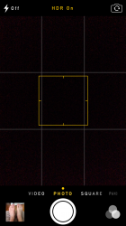
While iOS 7 is "growing" on me, I really dislike the camera app. The interface it horrible. There is a cool tweak for JB'en iOS devices that makes the camera interface transparent, allowing transparency to be lessened or greatened.
Attachments
Register on MacRumors! This sidebar will go away, and you'll see fewer ads.


