Become a MacRumors Supporter for $50/year with no ads, ability to filter front page stories, and private forums.
Really? I LOVE the swipe down to the spotlight. Now when im ANYWHERE on my homescreen i can search for something.

You just live in the past. Nothing wrong with it. Just people like you hate change.or you say you love change but then hate it when it changes.

What about notification center? Stocks used to be nice and concise. Weather didn't take up the whole screen and actually provided info. And couldn't you post to Facebook/twitter?

The app switcher is now pointless too. It shows less apps and scrolls at variable speeds. Before, it showed more app icons, and you could scroll between them a screen at a time very quickly. I have no need to see an image of the current state of the app either. It's more functional to see what app I'm in. For example, maybe I want to switch over to email to copy something to insert here. But once I go to app switch mode, I can forget just what I was doing. But with the app still above in ios6, I can stay on task.

Also much preferred the app switch to get the volume controls. With a full coverage case, I can't get control center to pop up, since I can't access the area off screen to swipe up onto screen.

Ios7 shows well, but just isn't as functional in so many ways.
 
These guys are wussing out! Those blue icons looked sharp. Now we have those boring rounded corner icons again :mad:
 
The oversimplification that has been done with the icons was ridiculous. I find myself spending more time reading the text than choosing the icon.

Finally, DO NOT punish your users by removing things that have become natural to them. Going left on the home screen MUST, send you to "spotlight"/search iPhone. Why make everyone angry about something that is useful and everyone is used to?
There is no inovation in sliding from the top, it is just someone's fit out of lack of innovation. Wake up!

Actually there is since you don't have to return to the first screen to access search. Also, the springboard is used to present only apps, having spotlight there was wrong.
 
Twitter - The Twitter icon has been redesigned. Rather than a white bird on a blue background, it now depicts a blue bird on a white background.

So, what do we think was the explanation for this? Designer drunk? High? Replaced by work experience child?

It looks frigging terrible.
 
Wallpaper photos are still massively zoomed in when trying to choose one. This started in Beta 4.
 
I dunno if this was there on beta 4, but now the homescreen icons move too with the parallax effect. It's much more "real" feeling now (or maybe they just made it work better on the 4s).
 
I think it looks fantastic. The minor pop of color actually makes a difference. At a glance, it was a bit jarring on the eyes to mess with settings with everything black/white/blue. Not so much anymore.

I see a lot of similarities with Windows Phone, I really do. No so much in execution as in looks, colors, etc. Makes sense, since both proudly claim minimalist designs. Curious to see if more people start checking out Windows Phone as a result.

You have a point but i doubt people will look into windows phone 8 because of iOS 7, remember WP8 has been on the market long before iOS 7 was introduced at WWDC. But still i dont rule that option out either
 
View all MMS pics in a messaging thread (Select the 3 lines on the lower right hand corner when viewing a mms pic)...
 

Attachments

  • photo.JPG
    photo.JPG
    289.4 KB · Views: 2,020
What about notification center? Stocks used to be nice and concise. Weather didn't take up the whole screen and actually provided info. And couldn't you post to Facebook/twitter?

The app switcher is now pointless too. It shows less apps and scrolls at variable speeds. Before, it showed more app icons, and you could scroll between them a screen at a time very quickly. I have no need to see an image of the current state of the app either. It's more functional to see what app I'm in. For example, maybe I want to switch over to email to copy something to insert here. But once I go to app switch mode, I can forget just what I was doing. But with the app still above in ios6, I can stay on task.

Also much preferred the app switch to get the volume controls. With a full coverage case, I can't get control center to pop up, since I can't access the area off screen to swipe up onto screen.

Ios7 shows well, but just isn't as functional in so many ways.

Agreed 100%. It's now form over function. I never, ever look at what I was doing in the app I switched from. All I want to do is switch to the app. End of story. The screenshot of where it was at is 100% irrelevant.
 
Still a huge amount of emotion around the new icons, clearly a love hate relationship in the making.

What iOS 7 really needs is a settings sub menu which activates custom icon packs, custom icon packs which are available off the AppStore.
 
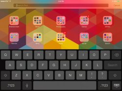
So I have a question. I update my ipad mini 32gb att black, and now I'm seeing this keyboard on the home screen image.jpg dark and non transparent, which I don't think I've ever seen before, but the white keyboard in safari and other places. Anybody else seeing this behavior?
 
Control Center - Control Center’s settings now allow the function to be turned off while in apps, preventing Control Center from being accessed from the bottom of the screen while playing games or otherwise using apps.

This was a big contention for me, and I'm pleasantly surprised it was addressed along with icons. It is very rare that Apple makes such changes well in the middle of beta testing.
 
Agreed 100%. It's now form over function. I never, ever look at what I was doing in the app I switched from. All I want to do is switch to the app. End of story. The screenshot of where it was at is 100% irrelevant.

Yep, iOS 6 was faster. No animation and you could see more apps
 
I dunno if this was there on beta 4, but now the homescreen icons move too with the parallax effect. It's much more "real" feeling now (or maybe they just made it work better on the 4s).

They always did, its just smoother now
 
What about notification center? Stocks used to be nice and concise. Weather didn't take up the whole screen and actually provided info. And couldn't you post to Facebook/twitter?

The app switcher is now pointless too. It shows less apps and scrolls at variable speeds. Before, it showed more app icons, and you could scroll between them a screen at a time very quickly. I have no need to see an image of the current state of the app either. It's more functional to see what app I'm in. For example, maybe I want to switch over to email to copy something to insert here. But once I go to app switch mode, I can forget just what I was doing. But with the app still above in ios6, I can stay on task.

Also much preferred the app switch to get the volume controls. With a full coverage case, I can't get control center to pop up, since I can't access the area off screen to swipe up onto screen.

Ios7 shows well, but just isn't as functional in so many ways.

Very well explained. I never thought iOS would regress in function but somehow it did.

The notification centre in iOS7 has no icons, reams of text to read for the weather opposed to icons and a useless calendar with space everywhere you have to scroll up and down to find your next appointment
 
So I have a question. I update my ipad mini 32gb att black, and now I'm seeing this keyboard on the home screen View attachment 426973 dark and non transparent, which I don't think I've ever seen before, but the white keyboard in safari and other places. Anybody else seeing this behavior?

Oy, that wallpaper! Almost made me chuf up my lunch.:D
 
Register on MacRumors! This sidebar will go away, and you'll see fewer ads.