Become a MacRumors Supporter for $50/year with no ads, ability to filter front page stories, and private forums.
It sounds like you might have the "Increase Contrast" setting turned on. Go into Settings > General > Accessibility and turn off "Increase Contrast"

Nope, increase contrast gets rid of transparency totally.

EDIT: Can someone tell me if the iPad 4 has the same lack of blur?
 
Last edited:
Nope, increase contrast gets rid of transparency totally.

EDIT: Can someone tell me if the iPad 4 has the same lack of blur?

No, the 4 has it; both on Notifications and Control Center. I suspect it's just older devices.
 
This new calendar is completely useless. I had to download CalenMob.
I live by my calendar and was totally comfortable with the old version.

I don't have iOS 7 beta. What's wrong with the Calendar?
Can you explain?
Thank you.
 
Anyone notice that we finally get a banner notification when a message fails to send along with the text message sound?

Edit: Nevermind.
 
Last edited:
So this is what Apple has come to: form over function.

Tinkering with presentation and icons. No significant functional improvement.

Apple is doomed. ;)

I for one, welcome Apple's attention to detail. Presentation matters.
 
Anybody?

Does anybody agrees with me on search bar coming down with lag when pulled down for the "first time" in "a while"?

This has been present straight from beta 1 to 5
 
Does anybody agrees with me on search bar coming down with lag when pulled down for the "first time" in "a while"?

This has been present straight from beta 1 to 5

Yep, I've noticed this. It's annoying. People here have said "you can access search from ANY screen", but in the old OS, you could simply press the home button which would take you to your first home screen, then press home again, and it would show search. I think the functionality to search from the first home by hitting home should have stayed.
 
Yep, I've noticed this. It's annoying. People here have said "you can access search from ANY screen", but in the old OS, you could simply press the home button which would take you to your first home screen, then press home again, and it would show search. I think the functionality to search from the first home by hitting home should have stayed.

I very much so disagree. It's much, much better how it is now. It was so bad before, I would never use spotlight. Now, I use it regularly.
 
Something new

Well I just found that if you turn off short names in the contacts/mail settings then it goes to full names.

But if the name is long it changes the top left menu button to Back instead of iMessages.

Interesting. Just to be able to fit the longer name.
 
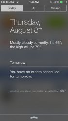
Notification Center's "Today" tab now shows a message at the bottom saying "Weather and stock information provided by Yahoo!", with direct links to both Yahoo's weather and stock websites.
 

Attachments

  • image.jpg
    image.jpg
    86.7 KB · Views: 115
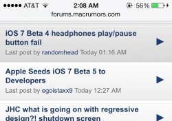
Headphone buttons now actually work again! Unlike iOS 7 Beta 4 where they were unresponsive :)
 

Attachments

  • image.jpg
    image.jpg
    81.8 KB · Views: 100
For the naysayers that think this is just a coat of paint. Get in a room with another iOS 7 user and turn Airdrop on.

I am floored by the fluid, fast, simplicity of sharing.
 
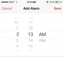
The menu to select date, time, etc. now blurs out the other options and focuses on the one you want to select. (The middle line)
 

Attachments

  • image.jpg
    image.jpg
    31.9 KB · Views: 107
The oversimplification that has been done with the icons was ridiculous. I find myself spending more time reading the text than choosing the icon.

Finally, DO NOT punish your users by removing things that have become natural to them. Going left on the home screen MUST, send you to "spotlight"/search iPhone. Why make everyone angry about something that is useful and everyone is used to?
There is no inovation in sliding from the top, it is just someone's fit out of lack of innovation. Wake up!

Personally, though I've had every iPhone since day 1, I could still never get used to spotlight on the left and I HATED how if I pressed on the home button one too many times when I just want the home screen it would take to the spotlight and i have to press it again or swipe again to go back...I love the spotlight on the top! :D
 
New calendar bug

I'm experiencing a nasty bug in the calendar when displaying birthdays:
I've added birthdays to some of my contacts. Those birthdays are displayed in the special "birthday calendar". Now there are two problems:

1. Most of the birthdays are displayed one day late in the calendar, although they are displayed correctly in contacts.

2. The birthdays that are displayed correctly in the calendar are only correct, because the related information in the contacts was AUTOMATICALLY changed to one day earlier!!! Changing the birthday back to the exact date will work for some seconds, but it will eventually change to one day earlier again.

I've already switched off the automatic time zone support. No chance.

Is somebody experiencing the same problem?
 
Yep, I've noticed this. It's annoying. People here have said "you can access search from ANY screen", but in the old OS, you could simply press the home button which would take you to your first home screen, then press home again, and it would show search. I think the functionality to search from the first home by hitting home should have stayed.

Got to disagree.

How can:

1. Press home button.
2. Swipe right or press home button.

Be better than:

1. Swipe down.

----------

The menu to select date, time, etc. now blurs out the other options and focuses on the one you want to select. (The middle line)

This is actually one of the things that for me goes against the grain of iOS7. It retains a skeuomorphic effect, i.e. the rolodex, which then has blurring. If it had neither, it would be much clearer.
 
Yes, it lags for me to, on the first pull.

Does anybody agrees with me on search bar coming down with lag when pulled down for the "first time" in "a while"?

This has been present straight from beta 1 to 5


----------

I'm experiencing a nasty bug in the calendar when displaying birthdays:
I've added birthdays to some of my contacts. Those birthdays are displayed in the special "birthday calendar". Now there are two problems:

1. Most of the birthdays are displayed one day late in the calendar, although they are displayed correctly in contacts.

2. The birthdays that are displayed correctly in the calendar are only correct, because the related information in the contacts was AUTOMATICALLY changed to one day earlier!!! Changing the birthday back to the exact date will work for some seconds, but it will eventually change to one day earlier again.

I've already switched off the automatic time zone support. No chance.

Is somebody experiencing the same problem?

When I updated to IOS7, all my calendar items were imported "a day late". After a reboot, all the events settled back to where they were supposed to be. I personally don't like the new calendar design. I keep my life organized in my calendar and was very happy with the old look and feel.
 
i dig it, it's much more ummm... enjoyable, it's good to see a big change in iOS, waiting for the public release...:)
 
Why there is still no landscape mode for playing music videos under the MUSIC App?

It works good in iOS 6.
 
I'm cool with the concept of beta software cheers. Maybe I'm not being clear. Since when have Apple ever been bothered about what its users think about the parameters you mention? Apple lead the way, the don't follow what users think because they already know the way it should be...

Essentially what I'm trying to say (and i know its a cliche) but this would never have happened under Steve Jobs.

They always made these tests.
They are stated even in the developer documentation of MacOS.
They don't hear on blabla ala "I WANT IT YELLOW" but they look at real usage data.
And even if everyone whines about "I WANT IT THAT WAY" if apple sees, the other way is more effective it will be used like that.
 
The menu to select date, time, etc. now blurs out the other options and focuses on the one you want to select. (The middle line)

I don't like the angling. It's the spinner still. Either make it the spinner or drop the angles, just keep it all straight and make it fade more as you get to the outside edges so as to draw the eye to the center
 
App Store updates and downloads no longer work for me.
I only get a blacked-out app icon that does nothing.

Well they aren't downloading, the icon shows 'waiting'. That is normally until they actually start downloading, then the icon slowly reveals itself.

----------

The menu to select date, time, etc. now blurs out the other options and focuses on the one you want to select. (The middle line)

That was present in Beta 4 as well.

----------

I very much so disagree. It's much, much better how it is now. It was so bad before, I would never use spotlight. Now, I use it regularly.

I wouldn't call the old way bad at all, but it is a big improvement and I now actually use spotlight. One of the good changes in iOS. :)

----------

Some of those games may be fun, but Jesus that is an ugly collection of app icons. lol

lol I was thinking the same thing, definitely need to be in a folder lol.
 
I would guess more like the first few betas were really alpha and probably wouldn't have been released to the public had Apple had more time to finalize.

Possibly.

----------

I hope so!

...seems like they are trying to make things too familiar to iOS 6, like others have said, Steve Jobs wouldn't flinch at what people would have to say, he'd just do it his way, and then we end up loving it. He was a master at not reacting to people's reactions, because, we all react sometimes when something is different, but, then once we see the improvement, or get used to the differences, we end up liking it better in the long run.

Or to force us to like it to continue to own Apple products ;)
 
Register on MacRumors! This sidebar will go away, and you'll see fewer ads.