Nope, i think the dots are really beautiful.
I also, quite like the dots
Yeah! The headphone remote controller now works, that's cool.
Nice! this was bugging me
Last edited:
Nope, i think the dots are really beautiful.
Yeah! The headphone remote controller now works, that's cool.
Really. And you know this how? That photo was one of probably hundreds of prototypes. How about the purple prototype from 2005 that looks just like iPhone 4?.
The initial design had the glass screen set into an aluminum case. One Monday morning Jobs went over to see Ive. “I didn’t sleep last night,” he said, “because I realized that I just don’t love it.” It was the most important product he had made since the first Macintosh, and it just didn’t look right to him. Ive, to his dismay, instantly realized that Jobs was right. “I remember feeling absolutely embarrassed that he had to make the observation.”
The problem was that the iPhone should have been all about the display, but in their current design the “case competed with the display instead of getting out of the way. The whole device felt too masculine, task-driven, efficient. “Guys, you’ve killed yourselves over this design for the last nine months, but we’re going to change it,” Jobs told Ive’s team. “We’re all going to have to work nights and weekends, and if you want we can hand out some guns so you can kill us now.” Instead of balking, the team agreed.
The OS has to get the **** out of my way and not IN my way! And THAT is a job that ANY other operating system on the planet does better than iOS!
I don't want to be locked into Apple's services like iCloud or iTunes to get basic stuff done - like copying files FROM or TO the stupid device. I don't want "deep social network integration" unless I install applications for that purpose; and trust me, I won't ever install Facebook or Linked-In or Twitter stuff on any of my devices because I don't need or want that crap in my life. But Apple thinks otherwise - and the thing is, I don't need or want Apple to think on my behalf.
And hell, YES, should I desire to "CHANGE EVERYTHING", then I want to be able to do exactly that.
Linux and Android NEVER get in way; they let me have my cake and eat it, too. ...
I agree, but the apps aren't really more powerful. Look at the calendar and contacts apps for example. Especially the calendar app is worse than before.
The OS has to get the **** out of my way and not IN my way! And THAT is a job that ANY other operating system on the planet does better than iOS!
I don't want to be locked into Apple's services like iCloud or iTunes to get basic stuff done - like copying files FROM or TO the stupid device. I don't want "deep social network integration" unless I install applications for that purpose; and trust me, I won't ever install Facebook or Linked-In or Twitter stuff on any of my devices because I don't need or want that crap in my life. But Apple thinks otherwise - and the thing is, I don't need or want Apple to think on my behalf.
And hell, YES, should I desire to "CHANGE EVERYTHING", then I want to be able to do exactly that.
Linux and Android NEVER get in way; they let me have my cake and eat it, too. Even Windows 8, which thus far is the most restrictive platform that Microsoft has ever released, gets less in my way and is more open than any Apple product ever was and ever will be.
If you enjoy being told what you can and cannot do with device you paid a lot of money for, be my guest. Apple loves customers like you! I, on the other side, want to actually OWN the product that I've bought and not be restricted in its use in any way.
Most people like iOS 7. Don't talk like you represent a majority
Uh... Album view is under "More..." !
I think you can move the "Albums" icon to the bottom bar (for instance, replace the "Songs" icon). You guys obviously didn't play with the beta enough.
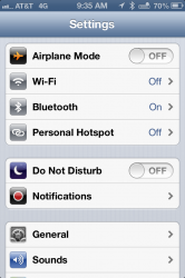
Urgh. They are destroying the clean consistent refreshing look that was one of the good points about iOS 7. What's with the random coloured background for the icons - why is cellular green, wifi and bluetooth blue, Airplane mode orange, Do Not Disturb purple?
Stop spitting this bolshevism crap. Majorities do not matter. Only the truth, right and wrong.
Good design and bad design. Im talking about user interface usability science.
Truth is singular. Its versions are mistruths.
Why should I ever care about what a majority of people thinks about anything?
I've always only been interested in undeniable facts of life, not stupid democracy.
The OS has to get the **** out of my way and not IN my way! And THAT is a job that ANY other operating system on the planet does better than iOS!
I don't want to be locked into Apple's services like iCloud or iTunes to get basic stuff done - like copying files FROM or TO the stupid device. I don't want "deep social network integration" unless I install applications for that purpose; and trust me, I won't ever install Facebook or Linked-In or Twitter stuff on any of my devices because I don't need or want that crap in my life. But Apple thinks otherwise - and the thing is, I don't need or want Apple to think on my behalf.
And hell, YES, should I desire to "CHANGE EVERYTHING", then I want to be able to do exactly that.
Linux and Android NEVER get in way; they let me have my cake and eat it, too. Even Windows 8, which thus far is the most restrictive platform that Microsoft has ever released, gets less in my way and is more open than any Apple product ever was and ever will be.
If you enjoy being told what you can and cannot do with device you paid a lot of money for, be my guest. Apple loves customers like you! I, on the other side, want to actually OWN the product that I've bought and not be restricted in its use in any way.
I think the new color coded Settings panel is a bad idea. All you have to do is put the same panels from b4 and b5 side by side with each other. It should be immediately obvious that the b4 blue on white icons are infinitely more readable than the b5 icons with color background. I also have a hard time figuring out what the colors mean. In this specific area, it's step backward for the UI team.
they haven't flip flopped -- it hasn't even been released yet. it's a beta and things often change during betas.
remind yourself. often.
the future is not limited to the past.
apple has the best selling and mot profitable handset in the world. I don't think they're going to sweat your lack of confidence...seems like they have things figured out pretty well on their own, don't you think?
Apple largely ignores what the customer wants. That's the reason people spin it by repeating the line about how brilliant Steve was by creating what people wanted before they knew they needed it.

Anyone else's battery life getting absolutely slaughtered running beta 5?
I noticed an uptick in polish and stability in betas 4 and 5 but a huge hit to battery life. My phone was fully charged at 3AM. Upon waking at 9AM I had 55% charge remaining. Bummer.
opposite for me -- my mind immediately identifies, say, airplane mode, due to its orange color, which is linked to it in my mind. just like colored VCR style buttons, etc...
Anyone else's battery life getting absolutely slaughtered running beta 5?
I noticed an uptick in polish and stability in betas 4 and 5 but a huge hit to battery life. My phone was fully charged at 3AM. Upon waking at 9AM I had 55% charge remaining. Bummer.
I can only talk about the betas because that's all they've released so far. The betas, to date have flip-flopped in terms of the UI design.
I also agree the calendar app isn't quite as useful as it should be.
It looks super pretty, but not much practical.
Only being able to see dots in the month view really bother's me. I constantly have to go in and out to see what's coming up. Plus, even if you tap on a date with a dot indicating an existing event, if the event is pass 4pm, you still have to scroll down to the appropriate time to see actual event. The same goes for the calendar day view in the notification center. Why can't Apple just truncate empty space that has no events?
There's just too many steps to get to information that should be readily visible.
And the list of events being under the search isn't really user friendly. It took me a while to realize apple hasn't removed that view option. Again, the list may look pretty but I just don't think it clearly conveys the events and its corresponding date and time in a visually effective manner.