RightI'm installing the beta and noticed the progress screen is now white (I have a white iphone). I think it used to be white over black in earlier versions right?
Got a tip for us?
Let us know
Become a MacRumors Supporter for $50/year with no ads, ability to filter front page stories, and private forums.
iOS 7 Beta 5 Tidbits: Icon Settings Redesign, New Control Center Options
- Thread starter MacRumors
- Start date
- Sort by reaction score
You are using an out of date browser. It may not display this or other websites correctly.
You should upgrade or use an alternative browser.
You should upgrade or use an alternative browser.
Rogifan
macrumors Penryn
This is the most UI changes I've seen across beta. Usually its just fixing bugs.
I wonder if Apple is doing this to stir up rumors and go back to its original plan?
I would guess more like the first few betas were really alpha and probably wouldn't have been released to the public had Apple had more time to finalize.
I think the appropriate Steve Jobs quote here is that "people don't know what they want until you show it to them".
This has turned out to be one of the most misunderstood, most often misused quote of all time.
Jobs spoke of this in terms of entirely new product categories, something that people really hadn't seen before. He didn't intend for it to mean "ignore people that have been using similar products and act like you are smarter than them."
I'm growing very tired of hearing software engineers using that phrase as justification for being self-centered, egotistical asshats.
Avenged110
macrumors 6502a
Glad they're finally starting to add some color back, there's *way* too much white. And bringing some buttons back is a nice touch as well. I still hate iOS 7 and the pastel homescreen is irritating but beta 5 is a step in the right direction, I guess.
Rogifan
macrumors Penryn
What a mess of colors and icons. Not a minimal harmony.
What you want black and white? When you have an OS that is primarily white, color is necessary IMO. Otherwise the OS becomes incredibly boring.
ncaissie
macrumors 6502a
You don't speak for everyone. I like spotlight being able to be accessed anywhere. I don't have to scroll through 5 pages to go all the way to the left to access spotlight.
What are you talking about? Hit the home button and slide right and your there. Why would you scroll 5 pages? 😕
Fingerprint sensor reference
The fingerpint sensor reference previously discovered has now disappeared in beta 5.
The fingerpint sensor reference previously discovered has now disappeared in beta 5.
daijholt
macrumors 65816
I've encountered something of a dilemma with Siri, she now keeps telling me "it doesnt look like you have an app named....." when asking to open a particular app. It works fine for the built in apps like Safari and passbook, but apparently, I dont have an app named twitter, even though its sitting on my homescreen staring me in the face. 🙁
Edit: Scratch that a restart has solved it.
Edit: Scratch that a restart has solved it.
Last edited:
What, are you saying Apple isn't respecting your designs!? 😱 😉
I'm saying that Apple isn't respecting clean minimalism. 😉
aismaiil
macrumors member
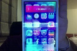
My phone gets stuck on boot up. It takes literally minutes to get to the lock screen. Same thing happens with a hard reset. 🙁
Other than that, I noticed the power off screen looks different now with round rectangle buttons. It won't let me take a screenshot of it.
Here you go 🙂
Attachments
And still no changes to the Settings icon itself?! 😡 C'mon, Apple, I submitted this a while ago:
Image
And this is really serious right? 😀
This has turned out to be one of the most misunderstood, most often misused quote of all time.
Jobs spoke of this in terms of entirely new product categories, something that people really hadn't seen before. He didn't intend for it to mean "ignore people that have been using similar products and act like you are smarter than them."
I'm growing very tired of hearing software engineers using that phrase as justification for being self-centered, egotistical asshats.
People knew what a mobile phone was and everyone was used to their phones but Apple told them "this is way better". It wasn't a new product, just a different take on an existing product category. I think the same principle is at work everywhere at Apple. Even for their own products, sometimes they say "this is better so we changed it". Like FCPX. Whether they get it right every time is up to discussion but it's certainly not about pre-existing products vs new products.
thisisdallas
macrumors regular
I agree 100%. I thought I disliked all the silly skeumorphicism, but a phone without it is just so unfriendly and less functional.
You can go overboard with skeumorphicism, like Game Center ugly, and perhaps the calendar and contacts in OSX, but I'll take those over the hospital clean look of ios7. New features are welcome. I see no reason to overhaul the interface. Buttons are better than text links. Apps that look different are less confusing than ones that all look the same. The new iOS is kinda android like. Looks sleek and cool until you actually use it and discover how unfriendly and less functional it is.
I strongly disagree. Sure, iOS 7 is much sleeker and has a completely different feel to it, but it's definitely not "hospital like" or "unfriendly". The bright, vibrant colors and smooth animations and transparencies really give it a great, cheerful feel.
For example, compare the new keyboard to the old keyboard.
One is grey and lifeless, whereas the other is really bright, colorful, and full of life.
Apple did a great thing by letting the UI take a backseat to the content. Going from iOS 6 to 7, the screen feels like it gets bigger and the phone feels like it travels out of the stone age and breathes fresh life into it.
What are you talking about? Hit the home button and slide right and your there. Why would you scroll 5 pages? 😕
That's still one more unnecessary action.
I personally think this is a step backwards. The original flat was cleaner. Possible someone at apple feels the pressure to adjust to the mainstream?
The original flat was cleaner and looked great. but looking at what they have done is more logical with a little colour coming back. Otherwise usability would be minimal with detriment to speed recognition.
I'm happy they are not stripping it back 'just' for minimalism sake
lordofthereef
macrumors G5
I think it looks fantastic. The minor pop of color actually makes a difference. At a glance, it was a bit jarring on the eyes to mess with settings with everything black/white/blue. Not so much anymore.
I see a lot of similarities with Windows Phone, I really do. No so much in execution as in looks, colors, etc. Makes sense, since both proudly claim minimalist designs. Curious to see if more people start checking out Windows Phone as a result.
I see a lot of similarities with Windows Phone, I really do. No so much in execution as in looks, colors, etc. Makes sense, since both proudly claim minimalist designs. Curious to see if more people start checking out Windows Phone as a result.
Avenged110
macrumors 6502a
Except Steve is one of the biggest lovers of skeumorphicism there was. It's what the original Macintosh was all about. That's why it's called a desktop, and folders instead of a filesystem and directories. It's why you drag and drop instead of typing in commands. It's what modern is is based on. Using different colors and themes gives instant recognition and feedback. Making email, notes, safari, settings, iTunes, etc. all look exactly the same is pointless. Buttons that are text make you feel you have to click right on the text. Buttons that are surrounded in skeumorphic buttons and use icons and colors are quicker to ascertain meaning without being read and without feeling like you have to click directly on the word.
Ugh. Not a ios7 fan.
So true. Something iOS 6 was definitely better at; your eyes were drawn to where they needed to go and you felt like you knew what to do. iOS 7 makes it so you have that momentary hesitation to see what you're doing.
It almost looks decent now.
Not really, still looks hollow and spiritless.
ghostface147
macrumors 601
What are you talking about? Hit the home button and slide right and your there. Why would you scroll 5 pages? 😕
I never said I do that, it was just an example for those who don't know how to use it very well. There are many of those. Even then, anything to eliminate additional steps is welcome. Just swipe down.