I'm guessing Apple saw that this is what people are buying so they didn't want to become outdated. I'm holding off judgement till the event because all of this is just speculation but if this is what it looks like I'll probably hold off. I'm just not feeling it.Yea it’s a Gimmick to me. It’s an ugly black void that will constantly stand out every time the screen is slightly bright.
The notch design being smaller makes 100% more sense. But that pill hole is just…. No im
Not buying the iPhone 12 Pro Max S,S.
Got a tip for us?
Let us know
Become a MacRumors Supporter for $50/year with no ads, ability to filter front page stories, and private forums.
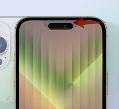
iPhone 14 Pro's Large Pill-Shaped Cutout Will Display Camera and Microphone Privacy Indicators
- Thread starter MacRumors
- Start date
- Sort by reaction score
You are using an out of date browser. It may not display this or other websites correctly.
You should upgrade or use an alternative browser.
You should upgrade or use an alternative browser.

I liked the look of the i too. It was funny and quirky. But I’m really happy about the functionality built into the space and it doesn’t look bad to me this way. I just found the other look kind of amusing.Why do I seem like I’m the only person who actually really liked the look of the hole + pill shaped cutout? I think one long pill-shaped cutout looks terrible, at least the other design looked somewhat unique compared to most of the other Android camera cutout designs. They might as well keep the notch if they’re gonna go this route, it’s not like it’s much different anyway.
I hope there’s a way to turn off the black space in between the Face ID sensors and the camera so we can actually see the screen in between them.
I’m sorry but I prefer this to the notch.
What's the point of adding a huge notch to laptops if you're not going to follow through on that design language with other products?
I wonder how long the pill will last. Is this the next iPhone for a few years or just one more step in the transition to putting everything behind the screen?
We got battery percentage back regardless (yay!) so it’s all cosmetic at this point.
We got battery percentage back regardless (yay!) so it’s all cosmetic at this point.
" data-source="post: 31382204"
class="bbCodeBlock bbCodeBlock--expandable bbCodeBlock--quote js-expandWatch">
You’re right about that! I’m ready to order right now!
 said:
said:
Nothing is going to stop us from upgrading from our iPhone Pro Max. 
Let’s get it!!!

Let’s get it!!!

You’re right about that! I’m ready to order right now!
Apple’s Ess Natch.Good grief. By launch date, it'll be like this, and we’ll call it Apple’s Natch:
View attachment 2049443
Come. See it next Tuesday…
Exactly, just make as small of a notch as possible. No one is going to miss those wasted pixels and Apple maintains a unique design trademark that makes their phones immediately distinguishable instead of looking like all the others.This is one of the problems I have with hole punch cameras. Everything above the hole is useless because it's just too thin to display anything. If the bottom of the hole is lower than the current notch it's effectively a bigger notch.
-
View attachment 2049469
if these renders are any close to the real product then yeah, cutout is way lower than the current notch designExactly, just make as small of a notch as possible. No one is going to miss those wasted pixels and Apple maintains a unique design trademark that makes their phones immediately distinguishable instead of looking like all the others.
Attachments
It looks new and fresh. Frankly, bored of the notch. This have do till under display tech.If anything and the bottom of this hole is about the same as the current notch then it's the same from a usability standpoint. Then it becomes a matter of what looks better and that's just how someone feels.
This is what I call a lemons to lemonade approach by Apple, finding a clever way to make use of “dead space” in the display. Well done.
Why do I seem like I’m the only person who actually really liked the look of the hole + pill shaped cutout? I think one long pill-shaped cutout looks terrible, at least the other design looked somewhat unique compared to most of the other Android camera cutout designs. They might as well keep the notch if they’re gonna go this route, it’s not like it’s much different anyway.
I hope there’s a way to turn off the black space in between the Face ID sensors and the camera so we can actually see the screen in between them.
There's a realistic reason for the pill shape vs. the notch. It naturally has a boundary, giving the space some utility when the indicator "lights" appear. Transitioning from the sideways "i" shape to a solid pill, plus the indicator lights, makes it painfully obvious that the camera or microphone are in use. That's superior user feedback!
I understand you don’t like the pill shape design, but I think you are missing the point as to why Apple went in this direction… it’s more so a bridge towards the end goal of having an a no camera (visible) front display.I'm guessing Apple saw that this is what people are buying so they didn't want to become outdated. I'm holding off judgement till the event because all of this is just speculation but if this is what it looks like I'll probably hold off. I'm just not feeling it.
Take for instance the UDC technology, granted… it’s still in its infancy. But Android OEMs had to get to the pill shape design then later it became a single hole punch which in turn brought UDC technology. I take Apple approach as a step toward evolution. Obviously they can keep the notch until UDC technology is fully ready… but that could take years.
So, in this approach it gives user a fresh new look while in an effort to build for the future.
Agree.I hope they don't move essential camera controls to the top of the screen! Apple seems to finally be understanding that the top is harder to reach than the bottom (Safari in iOS 15, Notifications in iOS 16, etc)
Also, there will be a lot more smudges on the lens when trying to press those buttons.
Sorry, but no. I don’t mind them filling in the dead space with black pixels, but why would I want microphone and camera indicators off centered in the middle of the screen compared to where they currently are, in a discrete non-intrusive location. This is way more distracting.
Register on MacRumors! This sidebar will go away, and you'll see fewer ads.