This! I was going to say this, too.This is one of the problems I have with hole punch cameras. Everything above the hole is useless because it's just too thin to display anything. If the bottom of the hole is lower than the current notch it's effectively a bigger notch.
-
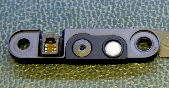
View attachment 2049469
Got a tip for us?
Let us know
Become a MacRumors Supporter for $50/year with no ads, ability to filter front page stories, and private forums.
iPhone 14 Pro's Large Pill-Shaped Cutout Will Display Camera and Microphone Privacy Indicators
- Thread starter MacRumors
- Start date
- Sort by reaction score
You are using an out of date browser. It may not display this or other websites correctly.
You should upgrade or use an alternative browser.
You should upgrade or use an alternative browser.

What do you mean. The notch, on either the iPhone or the MacBooks, is not just a graphic styling. It is a functional change to expand the content area of the screen. We’ve always expected Apple to eventually shrink those notches, which they did last year on the iPhone and now even more on this year’s phone. The expectation is as soon as Apple can shrink the components enough, they will get rid of the notches. In the meantime, the notches are minor annoyances with functional benefits.What's the point of adding a huge notch to laptops if you're not going to follow through on that design language with other products?
This is not a tiny pill, this is looking more like the size of a horse tranquilizer.
That doesn't explain why they made the notch so prominent on the laptops. There is a ton of unused space in those notches, which sure makes it seem like a design choice rather than functional.What do you mean. The notch, on either the iPhone or the MacBooks, is not just a graphic styling. It is a functional change to expand the content area of the screen. We’ve always expected Apple to eventually shrink those notches, which they did last year on the iPhone and now even more on this year’s phone. The expectation is as soon as Apple can shrink the components enough, they will get rid of the notches. In the meantime, the notches are minor annoyances with functional benefits.
The pill shape is such a dumb design. What use is that narrow strip of screen above it?
So still a notch, however lower down, more visible and in your face ugly. No thanks.
This is better because those indicators are more front and center and harder to miss. This is the kind if indicator that you want to be visible, not hidden away.Sorry, but no. I don’t mind them filling in the dead space with black pixels, but why would I want microphone and camera indicators off centered in the middle of the screen compared to where they currently are, in a discrete non-intrusive location. This is way more distracting.
The notch on the laptops contains several components that take up space. It’s not just a small camera. that is why that notch is the size that it is, not the design choice that you claim.That doesn't explain why they made the notch so prominent on the laptops. There is a ton of unused space in those notches, which sure makes it seem like a design choice rather than functional.

Apple MacBook Pro's notch houses more than just a 1080p camera
Apple's decision to include a notch in the new MacBook Pros has created divided opinion, but the notch area houses more than just a 1080p camera. It is not clear whether Apple could've managed the same apparatus within the bezel itself similar to Windows laptops, but the larger camera sensor may...
Attachments
I’m in the same boat. This is gonna be an expensive year if a certain virtual reality tech comes to fruition too… 😬Getting more and more excited for this release. Originally I thought no way am I going for this. But lately, I think I’ll pre order day one. My 11 Pro Max is starting to show its age in terms of design and other hardware feature (5g, MagSafe).
Bring back notifications lights!
Perfect spot here for that.
Loved back in the day on Blackberry and Android when could set colors for types of notifications.
Different email accounts, missed calls, and texts notifications all had different colors, so a glance at the phone without opening it could tell me what I missed.
Perfect spot here for that.
Loved back in the day on Blackberry and Android when could set colors for types of notifications.
Different email accounts, missed calls, and texts notifications all had different colors, so a glance at the phone without opening it could tell me what I missed.
Every new photo of the "pill," it keeps getting larger. The old movie 2010 Space Odyssey where Jupiter is sucked up by a hole comes to mind for some reason. 🤷🏻♂️🤔Good grief. By launch date, it'll be like this, and we’ll call it Apple’s Natch:
View attachment 2049443
Let’s wait and see what it really looks like and what Apple is putting into the top area of the screen.The pill shape is such a dumb design. What use is that narrow strip of screen above it?
if these renders are any close to the real product then yeah, cutout is way lower than the current notch design
I remember this being my concern too when the first mockups and schematics leaked. Just because the 'notch area' is now technically smaller doesn't mean you're gaining usable real estate because all you've really done is move the boundary of the top status bar area down (i.e a reduction in usable area)
I think for zooming in on images or full screen apps like Camera the cutout will make the content seem more immersive but for most popular apps like Mail, social media stuff, and whatever you're actually getting an arguably worse experience.
With the larger space on the left and right of the notch, I hope they allow separate the battery indicator and the battery %. I would like them side by side. Currently, activating the percentage means the indicator looks as though it is on full bar all the time 🔋
This makes so much sense. putting the indicators on an area that has a black background all the time will make them easier to notice due to increased contrast as well. Plus a singular bar that can be used as an "i" cutout would look cleaner, yet not require extra hardware to have led indicators there.
Will be a really great use of the space between the pill and the hole.
Register on MacRumors! This sidebar will go away, and you'll see fewer ads.