Become a MacRumors Supporter for $50/year with no ads, ability to filter front page stories, and private forums.
This is the best example of GUI inconsistency yet. Following the new logic, the B, I and U are all selected/pressed. You have to watch closely to realize that's not true, because B, I and U are buttons instead of a slider. But at first glance this is not apparent. Bad move, Apple.

You realize UI consistency went out the window long ago, right?
 
I'm not to impressed yet.

I feel like most the interface changes are just for the sake of change. I looks nice, but thats really all. It doesn't feel or start any faster for me. I actually get random lags, not any pinwheel but just bits where it seems the OS is having a brief hang then catches back up. Maybe its just the animations.

I also have my nvidia card always on. I only have Adium and one Safari window with no flash and no tabs. Why is my dedicated GPU on?

On the dock there is no way to tell if I already have an App running or if its just an icon, there is nothing to tell me if that app is loaded or not.

While typing this post I keep getting blue lines under my words as if I am spelling them wrong but I'm not, and when I click on them it just gives me the normal menu which doesn't tell me why they are underlined with blue.

Also I miss the button to hide the menu bar.
 
Last edited:
Not sure if anyone else has seen this yet, but System Profiler is now "System Information" and has some cool new views (but also allows you to bring up the old view)

i see on yours and mine and the other guy's that the apps section all show 0kb used. maybe that part isnt implemented yet?

On the dock there is no way to tell if I already have an App running or if its just an I can, there is nothing to tell me if that app is loaded or not.

there's an option to turn indicator lights back on
 
the sliding view buttons are a horrible idea.

hopefully by the time this comes out in july/august somebody in charge of the gui will have come to their senses.

i wonder if ilife 11 or iwork 09 work on this build. lets find out shall we....
 
hrrrgh. First off its not a colour its a shade. Yes SHADOWS do affect perception to the human eye - last I checked this is a USER Interface so yet switching the shadows that represent a depressed/selected button DO make it easier if done right. ALL windowing computer systems & now mobile systems do this.

So back up your boggle again?

look to be honest i don't care, but since i use the graphite theme/look i like because it grays it out like the rest of the operating system is when its on that setting.
 
My favorite part of this "update" is the hidden scroll bars.
Not only does it fly in the face of Apple's UI standards, but IT HAS AN OPTION TO TURN IT ON/ OFF.
So, when we were fairly evenly divided on the Transparent Menus in Leopard they just TOOK THEM AWAY, no option! But now that they totally disregard their own standards they include an option. Pretty lame Apple. I'm totally sure my Mom would be able to figure that out... :rolleyes:

Secondly, they didn't just ignore their own UI design, but the entire concept of UI design, by making the "view mode" into a slider that is exactly backward of everything logical. That's not just lame, it's stupid. My god, this crap extends all the way into the system prefs between "desktop/ screen saver" and "exposé/ spaces" and all the other title bars!!!!! I notice that the "buttons" works correctly for views in Font Book... nice consistency...

This idiocy started in Safari when they moved "stop/ refresh" to be in the address bar, not only reducing the size of the active area, but ruining the the way the loading bar indicated what was happening. That loading bar was a fantastic UI discovery. Then Apple destroyed it for NO REASON. The new way doesn't do anything better than the original way. It doesn't solve even ONE customer complaint, but it created some. Oh, but it "matches" the iOS... how retarded.

You know what would actually be helpful and slick? If Spotlight did the "spotlight" effect (like system prefs) when you are in icon mode searching a folder.

Now there's "Launch Pad." Wat? What is this, I don't even...?
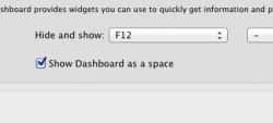
New dashboard? That was a dumb move. Dashboard actually helped me do certain little things. But only because I was able to still see what was on the screen underneath...

The only nice things I have to say are about the redone Quicklook. Though I still can't find QL plugins for file types that would be helpful, like Adobe Illustrator and VOB builds. And what happened there too? VOB used to work in the preview column in column view, but then they took that "feature" away in Leopard. I used that constantly. Having to open my VOBs in VLC has been pretty annoying for the last few years.

The "new" Finder is slow. Yay. That's what I needed. Finder worked a little too quickly compared to Safari 5 and iTunes 10...

All in all, Apple's made some pretty bonehead moves over the last few years that have left me flaming pissed. Lion is no exception to this trend unfortunately... :mad:
 
+1,000,000 !! Lack of folder merge is one of the most major peeves I have with Finder. In fact, I have to use VMWare Fusion running Windows sometimes just so I can get it done. Apple has FileMerge in with its Developer Tools, but it's one of the most horrible, confusing piece of software they've ever written.

Lack of folder merging caught me out a few times, and each time I seriously considered changing OS's.

Like a bashed puppy I now have paranoid habits of folder dragging, that I honestly shouldnt have. Its the biggest set back as an OSX user for me.
 
the sliding view buttons are a horrible idea.

hopefully by the time this comes out in july/august somebody in charge of the gui will have come to their senses.

i wonder if ilife 11 or iwork 09 work on this build. lets find out shall we....

they do i have installed both but iphoto needs an update before it works
 
Dashboard actually helped me do certain little things. But only because I was able to still see what was on the screen underneath...

theres in option in the expose menu to change it back to the old view
edit: didn't read your full post before but lion is actually faster on an external hard drive than slow leopard is on my internal harddrive atleast for me
 

Attachments

  • Screen Shot 2011-02-26 at 6.10.07 PM.png
    Screen Shot 2011-02-26 at 6.10.07 PM.png
    12.5 KB · Views: 75
theres in option in the expose menu to change it back to the old view
edit: didn't read your full post before but lion is actually faster on an external hard drive than slow leopard is on my internal harddrive atleast for me

My god man, is everything going to be an OPTION box that I have to seek out?????
thx
 
There best be a choice to restore colour to the finder GUI, I disliked the UI of iTunes 10 so much that I've kept 9.

You don't need to keep 9.. Google "itunes109" and you'll find a fix to get the colour back in the new version... i hate no colour and this saved me

i pray there will be one for the god awful finder soon...
 
does Flash work on it or do i have to boot into windows? my wife is bugging me for a MBP and running Flash is a requirement
 
Been playing with it for a few minutes now. the reverse scrolling would take some getting used to but i can see it working great on the trackpad.

One issue i have noticed so far with the scrollbars is that they do not appear on mouse over when using a wacom tablet. As someone who uses a magic mouse+tablet combo with most input being done on the tablet this has been quite frustrating.

Also, i have yet to find a way of deleting items from launchpad.

Fullscreen apps look good and the new quick look seems interesting. Gonna have to test to see if all my old quick look plugins still work though.
 
uhhhhh, how does grey icons make navigation difficult? The icons are still there. You can still click them. Its not like the color makes it easier to use.

Are you joking? it takes longer to mentally ID each one because colour is the first thing your brain ID's... you now have to read them to ID them rather than glance almost instantly at the colours. Think about it and you'll see. Think of an Album cover, lay your 15 favourite CD's out on the floor and be asked for a certain one. You'll find it instantly. Change all those lovely Album covers to identical black writing on a white background and you'll spend time reading through each one to find the one you want. It's not much time, but it's enough to make an annoying difference when you spend a lot of time in finder.
 
What a pointless rant. U comment on any corner resize as being copied from windows! Is that all u can come up with?! How is the quick look function in windoze? Oh yes, there isn't one. How about cover flow, expose, spotlight, built in cloud computing, easy networking, app store, FaceTime, time machine, not having to deal with constant pop ups from the os, the bundled iLife suite, the complete lack of viruses ( shall I go on? )

Manipulative? How about having to buy and subscribe to services just to be able to protect the os from viruses, or an operating system that costs five times more to upgrade?

I don't know about the "quick look", but I know alt tab sucks in Mac OS compared to Windows. I would rather alt tab cycle every window vs every application.
 
Register on MacRumors! This sidebar will go away, and you'll see fewer ads.