Become a MacRumors Supporter for $50/year with no ads, ability to filter front page stories, and private forums.
No it's not a deflection. Classless or not, words don't bother me, and I don't want the marketplace of ideas to be diminished to conform to the delicate sensibilities of some yokel who gets the vapors if they happen to run across a "bad word" or two.

It's a sliding scale, no? I live on a farm and after my other job I actually use the words in question (and more) with practiced and applied familiarity that far exceeds the capabilities of mere mortals such as some posting here. They are swear words and have a place; I'm not offended. But I wouldn't call the two most commonly used words essential to a marketplace of ideas, and I don't think we should reduce every single descriptive in our communication to the same pointless words.
 
All the icons being grey is ridiculous. What is the concept behind that? All it does is make navigation immensely more difficult.

uhhhhh, how does grey icons make navigation difficult? The icons are still there. You can still click them. Its not like the color makes it easier to use.
 
uhhhhh, how does grey icons make navigation difficult? The icons are still there. You can still click them. Its not like the color makes it easier to use.

Actually, the color DOES make it easier to use. It makes it easier to find what you're looking for (once you subconsciously learn the colors) so you spend a little less time each time you need to click on something.

It's the same reason a color map is easier to read than a black and white map.
 
You bet they are! It was pulled because Lion is copyrighted by Apple and images of it aren't supposed to be made public until it's released. :apple:

Which is fair enough cause the OS is barely in Alpha1 stage. By the time it's released it will probably look completely different. They don't want people to see something that isn't anywhere near the finished product.
 
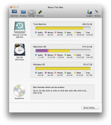
Not sure if anyone else has seen this yet, but System Profiler is now "System Information" and has some cool new views (but also allows you to bring up the old view)
 

Attachments

  • Screen Shot 2011-02-26 at 4.04.24 PM.png
    Screen Shot 2011-02-26 at 4.04.24 PM.png
    151.1 KB · Views: 308
With all this talk about window resizing I have not seen any mention of what seems obvious: Apple brought in the new resizing method because without permanent scrollbars there is no natural place to have the resizing glyph. I guess it could work on mouseover, but this would potentially confuse people. It is far easier to just make the entire frame a resize point so people don't need to look for it.
 
this is a wonderful example of how extremely manipulative apple is. notice that on windows it has always been possible to resize windows on every corner? an notice, that most windows on windows can be fullsize?

well, i still remember very clearly how bad this is, it confuses the user... no one needs fullscreen... windows is bad, because the apple concept of only resizing on the bottom right corner is more logical bla bla bla.

and what is the new INNOVATION now???

Lol so true, these are really just minor ui tweaks to [imo] a damn near perfect desktop experience. There's no real innovation here, but to their defense the ui doesn't need a dose of innovation. I'm glad they are just doing minor things and not fixing what clearly isn't broken.
 
I just noticed that Airport is now know as Wi-Fi.......

Also, my Mail seems to have a grey box on nearly all of my emails in the Inbox with the word "To" on it...but I don't know why?
 

Attachments

  • Screen Shot 2011-02-26 at 21.21.24.png
    Screen Shot 2011-02-26 at 21.21.24.png
    19.7 KB · Views: 1,398
  • Screen Shot 2011-02-26 at 21.21.46.png
    Screen Shot 2011-02-26 at 21.21.46.png
    19.3 KB · Views: 1,393
Overlay scrollbars = really bad idea

Overlay scrollbars are flipping lame. Sometimes it's actually beneficial to have a visual clue that you can do something before you try to do it. Looking at the static shot of the embedded video in the first post, you would never think that the window could be scrolled. Only when you somehow divine through unspecified ESP powers that there might be something farther up or down the to be scrolled to and move your pointer there do you get the visual indicator that your intuition was correct. Very, very bad interface design.

I'm thinking of all the people in the world who don't even know that they can type a website address directly into the location bar of their web browser and thinking they aren't possibly going to grok this.
 
Or is it simply because most users don't care, and it's not some nefarious plot to deny you a tool that few people use. I've never had to use it, copy-paste works fine. But maybe I organize my files so I don't have to keep moving them.

Then why does it constantly come up? I mean with EVERY thread about UI. You can't use the "nobody wants it" argument forever, Cut-paste is one of the most asked-for features.
 
Also, my Mail seems to have a grey box on nearly all of my emails in the Inbox with the word "To" on it...but I don't know why?

To differentiate between items where you are in the "To" field or if you were copied.
 

Attachments

  • Screen Shot 2011-02-26 at 4.33.20 PM.png
    Screen Shot 2011-02-26 at 4.33.20 PM.png
    4.5 KB · Views: 1,308
Wow take a pill dude. There will probably be a Finder preference for color or b/w icons, as in the latest iTunes.

Where is the preference for colour icons in iTunes?

EDIT: Drat, got my hopes up…
 
uhhhhh, how does grey icons make navigation difficult? The icons are still there. You can still click them. Its not like the color makes it easier to use.

hrrrgh. First off its not a colour its a shade. Yes SHADOWS do affect perception to the human eye - last I checked this is a USER Interface so yet switching the shadows that represent a depressed/selected button DO make it easier if done right. ALL windowing computer systems & now mobile systems do this.

So back up your boggle again?

I'm guessing some arguments are getting mixed up with each other… :D Come to think of it, I might have gotten mixed up myself a couple of posts ago.
 
I'm really excited about all the add on's.

The new mail looks good, however I might keep it the classic view.

It would be great if they improved iChat to incorporate more of an Adium customization. iTunes and iMovie really need a 64bit version as well.

Can't wait for it's release :D

One thing I gotta give Apple props for is their ability to make everything consistent. I'm glad they're bridging the iOS with OSX. Consistency is not something you normally see in OS's (Linux brands, Windows). However Apple is trying to make it all similar, I really dig it
 
The new scrollbars seem to inhibit usability if you use a conventional mouse, but there an option to restore the Aqua bars somewhere in the documentation, its just not implemented in the first developer beta.
 
The new scrollbars seem to inhibit usability if you use a conventional mouse, but there an option to restore the Aqua bars somewhere in the documentation, its just not implemented in the first developer beta.

Appearance->show scrollbars always.
 
Register on MacRumors! This sidebar will go away, and you'll see fewer ads.