Become a MacRumors Supporter for $50/year with no ads, ability to filter front page stories, and private forums.
There's a plugin that allows that. I'm just being cautious about adding too many third party plugins to start since we have other things that need to be fixed, I don't want to introduce too many other issues.

arn

Personally, I'd prefer to NOT have that plugin/function. There have been times that it confuses the thread. Just my unsolicited $0.02.
 
  • Like
Reactions: grahamperrin
I've noticed the new forums don't automatically add a quick second post to the previous post (creating a single post when one posts twice in quick succession where you are the next poster as if you were multi-quoting) like the old forums did.
That's one of the things I miss. Because now I end up either having one huge reply that I have to accurately navigate with a bunch of different posts quoted and makes sure I reply in the correct place to the correct one with no real separators, or a bunch of separate posts which almost makes it seem like I might be spamming a thread (if I'm catching up on a few hours of posts and replying to a number of different people).
 
I just want to say thanks Arn and everyone at Macrumors for doing a great job continuing to polish out the design and functional bugs here. It's really starting to come together nicely and make for a cohesive design.

Still hoping for a Spy that was as functional as the old one, a Forum splash page with recent content previews, and links that are made a little more obvious in a few places, but overall, awesome job! I'm sure this has been a busy week!
 
  • Like
Reactions: Reikochan
I just want to say thanks Arn and everyone at Macrumors for doing a great job continuing to polish out the design and functional bugs here. It's really starting to come together nicely and make for a cohesive design.

Still hoping for a Spy that was as functional as the old one, a Forum splash page with recent content previews, and links that are made a little more obvious in a few places, but overall, awesome job! I'm sure this has been a busy week!

Better spy will require some development but it's on our list of things.

I agree with a better forum splash. We maybe went too simple... I think discovery is a major issue with forums in general, and hope to have a more content-driven forum-front-page eventually.
 
I hesitated to comment on the redesign until now as I wanted to give it a few days so I could get used to it and give a proper unbiased opinion due to my fondness of the old theme.

And I really like it. I think the new forum software is excellent. A definite improvement. Makes the forums look much more modern and the functionality using more javascript for in place updates and notifications without page refreshes are all great additions.

Good job :)
 
Last edited:
I agree with a better forum splash. We maybe went too simple... I think discovery is a major issue with forums in general, and hope to have a more content-driven forum-front-page eventually.

The old splash page at least often enticed me to click on some things that I maybe wouldn't have otherwise, although it was definitely the New Posts view and the Spy that drove most of my browsing. The current splash page is just something that I skip over if I end up on the main page and have to click there first to get to the New Posts view. Perhaps it would be possible to build a view that is semi-tailored to the logged-in user, as per sites that make suggestions based on your previous history?
 
There are sometimes amber stars in what drops down beneath the red flag. I saw one a few minutes ago. Amber alerts maybe?


Something disappeared without explanation (no red flag, no amber star, no alert). https://macrumors.zendesk.com/hc/en-us/requests includes an open request about the disappearance.
Oh, those? I'm pretty sure they are there simply next to the new alerts when you have new alerts.
 
… next to the new alerts when you have new alerts.

I wondered the same thing, but the star does not disappear after the star is observed; does not disappear when I follow a link from within the starred item.

An amber star for an alert that is not new.

The first time I saw an amber star, it was during testing. An amber star alert from a moderator or staff, but neither word appeared so I assumed that amber indicated moderation, or a response to a report, or contact from a member of staff, or a warning.
It disappears shortly after that. Perhaps it's time dependent or something of that sort. But the main association appears to be with newer alerts.
 
I just noticed the stars. Guessing they show you which alerts are new because the flag badge disappears quickly
 
  • Like
Reactions: S.B.G
I just tried the "Watch Thread" feature, never used it before today. I'm really liking this feature, it sends you a notification upon new posts and places a binoculars icon in the New Posts list for the watched thread. A big thank you to staff for including this!
 
I just noticed the stars. Guessing they show you which alerts are new because the flag badge disappears quickly

If the amber stars are intended to indicate newness or relative newness: there's overkill and inconsistency. All three, in this order:
  1. red flag
  2. yellow highlighting, of all that's new, which fades,
  3. amber stars that may loiter for more than five hours (inconsistent with my perception of 'quick'):

2015-06-07 05-34-09 screenshot.png


Note: I'm almost certain that the yellow flash, which disappeared before I could take a screenshot, excluded the first (lowest) amber star.

Initial thoughts

Associate the colour red with highest importance, with seniority, with something that demands attention.

Associate the colour yellow with simple alerts.

If amber is to be used for anything, never use it ambiguously (the star shape already has at least one other meaning, unrelated to alerts, in the redesign).​

The future red alert should be reserved for use only when the reverse chronological list of alerts (not to be confused with the drop-down beneath the current red flag) includes an alert from a member of staff or moderator. Each such red alert should persist, not time out.

Probably noted during the open test phase, alerts from moderators and members of staff have a generic appearance (grey head and shoulders); these supposedly important alerts are less impressive than posts from normal members who have grey heads and grey shoulders. The opposite should be true!

Personally, I'd prefer to NOT have that plugin/function. There have been times that it confuses the thread. Just my unsolicited $0.02.

The feedback is solicited, you need not devalue it. Recall the opening post:

… general feedback …

May 31, 2015.

… separate posts which almost makes it seem like I might be spamming a thread …

The illusion of spam is not created by a succession of reasonably worded, focused posts.

A perception of spam – of wastes of space with things that are off-topic from the opening post – may be gained from non-focused, multi-subject posts with repetition.

Jun 8, 2007. Apr 9, 2001.

This post as an example

A member of staff might like this post because it questions, amongst other things, UI issues – primarily, possible inconsistencies between the application of yellow flashes and the persistence of amber stars.

The same person might dislike this post because it proceeds to discuss an entirely different subject, a different thread within the topic, that is contentious: styles of writing.

It's easier to like something that is concise and focused.​
 
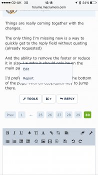
Things are really coming together with the changes.

The only thing I'm missing now is a way to quickly get to the reply field without quoting (already requested)

And the ability to remove the footer or reduce it in size. Perhaps it should only be on the main page and not thread pages? Especially in iPhone.

I'd prefer it if the reply field was at the bottom of the page. With an easy/quick way to jump there.
 
Last edited:
  • Like
Reactions: grahamperrin
Minor Bug

When you edit a post, you need to press Tools and then Edit.

However, after you confirm the edited post the Tools menu remains visible. Annoying.

PS: I'm on iPhone.

Workaround
Tap on the page (anywhere that isn't a link, button, text area or the menu) to hide the menu.
 

Attachments

  • image.jpg
    image.jpg
    136.8 KB · Views: 154
  • Like
Reactions: grahamperrin
Well, I just visited the forum again after receiving a reply email that was different, and to my surprise, everything has been migrated already. Also, quick question; why did you remove the post count under the join date of each user? It was there in the beta.
 
Well, I just visited the forum again after receiving a reply email that was different, and to my surprise, everything has been migrated already. Also, quick question; why did you remove the post count under the join date of each user? It was there in the beta.
Some people felt it made post box sizes too big with the extra line added under the avatar. The way it is now mimics the old forum style.

Plus, for those that filled out a location in their profile, if you click it, it takes you to that place in Google Maps.
 
Register on MacRumors! This sidebar will go away, and you'll see fewer ads.