Become a MacRumors Supporter for $50/year with no ads, ability to filter front page stories, and private forums.
the version posted here is a complete fake. there's absolutely no consistency between that and the design of EVERY OS X that has been released so far.

why would apple completely change the design from the one they've been using for a while now on their own website. here's the snow leopard page with the purple/black background:
http://www.apple.com/macosx/
there's a photo of the disc on this page as well

here's a photo of the retail snow leopard box design on apple's site:
http://www.apple.com/macosx/notify-me.html

here's the server page with the blue/black background:
http://www.apple.com/server/macosx/

here's a photo of the server retail box:
http://www.apple.com/server/macosx/notify-me.html

anyone who thinks these "leaked" photos are real are fools

tip: Look at the image files. (right click the image, chose view image and see the name. they all say leopard)
 
reminds me of windows 7. Windows 7 is vista done right.

and on the part about moving on, we all know if it doesn't these same people who are complaining now, will be complaining about not moving on....

Exactly. Even though I still think the interface for Windows 7 still isn't that great, it's a hell of a lot better than Vista. Basically a better Vista.

If you can't afford to upgrade, stop complaining, continue using your PPC machine, save up money, then upgrade. You'll be glad you did. Personally, I don't see how people can use a machine that's more than 3 years old. :rolleyes:

I still remember back when I got my Macbook back in 2006, when there wasn't many universal binaries at the time. I had a G5 workstation at work, and a Power Mac G4 and PowerBook G4 at home. When I got that Macbook, I could already TELL how much potential and how much snappier the machine was compared to G5. It was already world's faster than my Power Mac and PowerBook. It was like a portable G5, only a little faster. That's saying A LOT. And guess what? That was almost FOUR years ago. ;)
 
I must say I am always amazed at the attention Apple packaging gets on these forums...then the porn-like unpacking pics and videos...strange, but then, some people get off on stuffed animals, so to each his own. I must say, I am in the, "who cares about the packaging I care about the product" camp; but I would add that this packaging seems much more mature than the tacky space X packaging.


The space theme was due to the main new feature of Leopard which was "Time Machine" now that there is no new features on Snow Leopard it's normal that they adopt a different design ! personally I like it ! and the look in th eye of that snow leopard is a killer ! LOVE IT !!!
 
tip: Look at the image files. (right click the image, chose view image and see the name. they all say leopard)

I've said it several times and people here keep ignoring what I and many others have said - the photos on the website are only place holders. Many of us have pointed that Golden Master does not mean bug free - again, people ignore what people here have been saying.

Unfortunately you're wasting your time correcting people - in one ear and goes out the other for many people posting on this forum.
 
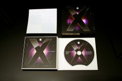
The text looks oddly aligned (vertically). Could be real, but would be a step backwards in package design IMO. Why would they add a plastic sleeve when they already changed to a more eco-friendly package in both Leopard (10.5) and iLife '09? Notice the way the disc is contained in the Leopard package vs. Snow Leopard.
 

Attachments

  • leopard.jpg
    leopard.jpg
    56.9 KB · Views: 210
The text looks oddly aligned (vertically). Could be real, but would be a step backwards in package design IMO.

I think it's 100% real, alignment issues can be negated by the fact that it's been taken with an iPhone camera - not the most "true" camera going around...
 
I've said it several times and people here keep ignoring what I and many others have said - the photos on the website are only place holders. Many of us have pointed that Golden Master does not mean bug free - again, people ignore what people here have been saying.

Unfortunately you're wasting your time correcting people - in one ear and goes out the other for many people posting on this forum.

No no, I agree with you. when I say look at the image files, it says "leopard" so of course its a placeholder.
 
I think it's 100% real, alignment issues can be negated by the fact that it's been taken with an iPhone camera - not the most "true" camera going around...

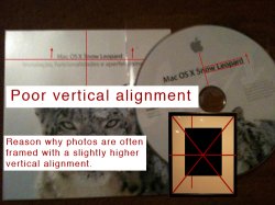
I am saying I think some kid made the box art and disc design using images off of Apple's website, printed them out on good quality paper and placed them over an old iLife or iWork box. The disc was either printed on with an inkjet directly or he used a well applied adhesive label. That's my theory at least. It could turn out to be real and just have some non-standard layout. The text is dead center and not offset at all. Titles are generally aligned using the rule of "thirds". Instead of being aligned at 1/2 (50%), align at 2/3 (66.67%).

The baseline of "Mac OS X Snow Leopard" on the disc isn't even centered, it's actually too low. That's if they are using the center hole as the alignment base.

So the packaging change (plastic sleeve instead of current built in eco-friendly pocket) is my main argument, but the graphic design could just be a little abnormal in terms of alignment. Then again, who would go through this much trouble for a software package mock-up and not a more fun product like an iPod Touch? Probably real... but if this is a fake, I give the artist lots of credit for believability.
 

Attachments

  • faked.jpg
    faked.jpg
    101.6 KB · Views: 127
I am saying I think some kid made the box art and disc design using images off of Apple's website, printed them out and placed them over an old iLife or iWork box. The disc was either printed on with an inkjet directly or he used a well applied adhesive label. That's my theory at least. It could turn out to be real and just have some non-standard layout. The text is dead center and not offset at all. Titles are generally aligned using the rule of "thirds". Instead of being aligned at 1/2 (50%), align at 2/3 (66.67%).

The baseline of "Mac OS X Snow Leopard" on the disc isn't even centered, it's actually too low. That's if they are using the center hole as the alignment base.

Sorry, but you need to get out more.

Does it matter what the box looks like? As long as the software works!
 
You know what would make this better? If there were three snow leopards. And a moon. And if it was airbrushed instead of a photo.

Will all apple staff be wearing mullet wigs for the release week too?
 
Not a brazilian box at all!

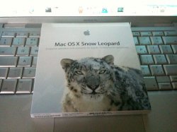
Actually, it's Brazilian Portuguese. Here is a quick and dirty translation of the back of the box:

Wrong! It is just Portuguese! :cool:
If you pay some attention to the box picture, you can clearly read "...Grand Central Dispatch optimiza o desempenho...". The mute P in "optimiza" is used in Portugal and not in brazil, therefore you are plain wrong. Another example is the use of the word "aplicações", which in brazil would be "aplicativos".

Assuming that the pics are not fake, they're of the box for the Portuguese market.
 
The world's most advanced operating system. Perfectly optimized.

I question if it will say:

"The world's most advanced operating system. Perfectly optimized."

If you look on Apple's website:

overview_hero20090608.jpg


It says "Finely tuned". Why it says "Perfectly optimized" in Portuguese is most likely a translation thing, maybe because saying "Finely tuned" wouldn't mean the same thing, so "Perfectly optimized" works better.

Plus, if they say "Perfectly optimized", in the USA, you know somebody would sue them at the first sign of something not being "Perfect".

The Stig
 
Keep in mind that Universal doesn't just mean PPC/Intel. Universal just means it contains executables for multiple architectures. This includes intel 32bit and intel 64bit - they are different architectures thus to support both means apps must be universal.

I know. try lipo i.e. on the kernel and see...

About the box: Never cared but if I think about it, I never liked that purple starfield...
 
The packaging IF real is nice and simple but not my primary concern.

It better be smoking FAST cuzz it would be about the only thing that would not get lost in the middle of Windows 7 buzz. Windows 7 may be fine tuned but surely won't match an optimized performance of Snow Leopard and that's where the focus should lie.
 
I am saying I think some kid made the box art and disc design using images off of Apple's website, printed them out on good quality paper and placed them over an old iLife or iWork box. The disc was either printed on with an inkjet directly or he used a well applied adhesive label. That's my theory at least. It could turn out to be real and just have some non-standard layout. The text is dead center and not offset at all. Titles are generally aligned using the rule of "thirds". Instead of being aligned at 1/2 (50%), align at 2/3 (66.67%).

The baseline of "Mac OS X Snow Leopard" on the disc isn't even centered, it's actually too low. That's if they are using the center hole as the alignment base.

So the packaging change (plastic sleeve instead of current built in eco-friendly pocket) is my main argument, but the graphic design could just be a little abnormal in terms of alignment. Then again, who would go through this much trouble for a software package mock-up and not a more fun product like an iPod Touch? Probably real... but if this is a fake, I give the artist lots of credit for believability.

You are going to look so stupid in a couple of weeks time...

:D
 
Fake!

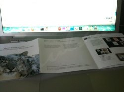
I'm not sure if this has already been mentioned (I'm not going to read all 30 pages of comments) but I'm sure this is a fake. Apple take pride in their packaging.
  1. You cannot see the thickness or the sides of the box
  2. The DVD is in a plastic sleeve (Apple usually use eco friendly recycled paper or none at all as the disc will fit into a recess)
  3. if the box has been opened to show the DVD, where's all the other printed matter??

Sorry, not convinced!
 
I'm not sure if this has already been mentioned (I'm not going to read all 30 pages of comments) but I'm sure this is a fake. Apple take pride in their packaging.
  1. You cannot see the thickness or the sides of the box
  2. if the box has been opened to show the DVD, where's all the other printed matter??

Sorry, not convinced!


Looky
 

Attachments

  • 6a00d83451c7b569e20120a55256e0970c.jpg
    6a00d83451c7b569e20120a55256e0970c.jpg
    46.7 KB · Views: 994
  • img0020dtl.jpg
    img0020dtl.jpg
    46.3 KB · Views: 191
  • img0023xfi.jpg
    img0023xfi.jpg
    41.4 KB · Views: 165
I'm not sure if this has already been mentioned (I'm not going to read all 30 pages of comments) but I'm sure this is a fake. Apple take pride in their packaging.
  1. You cannot see the thickness or the sides of the box
  2. The DVD is in a plastic sleeve (Apple usually use eco friendly recycled paper or none at all as the disc will fit into a recess)
  3. if the box has been opened to show the DVD, where's all the other printed matter??

Sorry, not convinced!

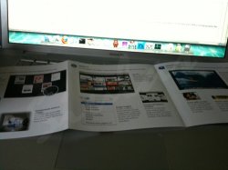
If you HAD read through this thread you would have seen the additionally supplied pics which not only shows a printed flip-out insert, but also a pic that reveals the bottom of the box.

I suggest you actually take the time to look for them. They aren't hard to find in this thread.

EDIT: I see Dragonforce was kind enough to find the pics for you

I stand corrected! I just don't get the time to read through all the threads when I'm supposed to be working!

Thanks Dragonforce for the images. (Dragonforce... now they ROCK!)

Still looks like poor quality packaging for an Apple OS when compared to Leopard! Still not 100% convinced, but will give it the benefit of the doubt.
 
I question if it will say:

"The world's most advanced operating system. Perfectly optimized."

If you look on Apple's website:

http://images.apple.com/macosx/images/overview_hero20090608.jpg

It says "Finely tuned". Why it says "Perfectly optimized" in Portuguese is most likely a translation thing, maybe because saying "Finely tuned" wouldn't mean the same thing, so "Perfectly optimized" works better.

Plus, if they say "Perfectly optimized", in the USA, you know somebody would sue them at the first sign of something not being "Perfect".

The Stig

now that you mentioned it, Apple Portugal site says something different as well

overview_hero20090608.jpg


then again, the packaging is completely different, so it could be one of those things Apple tweaked for the final release
 
Register on MacRumors! This sidebar will go away, and you'll see fewer ads.