You may have missed this post in response to your earlier assertion of this point, so I'll just report it here:
#310
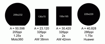
You have to compare Apples to Apples. You're showing Android's square screen to Android's round screen, specifically the Moto 360 with the flat tire, instead of the Huawei that has an edge to edge screen. But here's a direct comparison to the Moto with text:
Note all the unused space when the Watch display is superimposed on the Moto, even with the flat tire. Now here's the same exact text display optimized for the Moto, flat tire and all:
You see that so much more text can be included in the round display than with the Watch square display. Now imagine if this were a Huawei, and not the moto with the flat tire -- there's a lot more additional space to optimize per task.
So no matter how you slice it, a similarly sized round watch even displays text better than the Watch for applications that require that. Of course the Watch gains the lead again when they get rid of those bezels, but for the last 2 years, round watches technically have had the advantage, whether they utilized it effectively or not. If Apple keeps the exact same display and bezels, then that advantage continues on for other manufactures to capitalize on it.
Here's another way optimizing the same display on the Watch is improved on a round watch:
Notice how the Watch does not give the full display of what the iPhone sees, but the round watch of the same dimensions is able to give the full landscape display of the full image taken by the iPhone.