Happy I got myself a SE in classic silver a couple of weeks back.
Got a tip for us?
Let us know
Become a MacRumors Supporter for $50/year with no ads, ability to filter front page stories, and private forums.
Some Customers Unhappy With Apple Watch Series 7 Color Options
- Thread starter MacRumors
- Start date
- Sort by reaction score
You are using an out of date browser. It may not display this or other websites correctly.
You should upgrade or use an alternative browser.
You should upgrade or use an alternative browser.
I got one AW7 in starlight and one AW7 in midnight. I think that our backlit LCDs screens are probably not giving us a good feel for what the watches will actually look like in person. I suspect that it's akin to car body colors. It's one thing to pick a color on the dearlship's website, it's another to see the car in the real world.
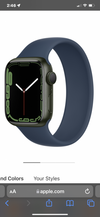
I think that we will be pleasantly surprised with the colors this year. I for one welcome the change from charcoal/silver. Most of my bands have a color to them, and I suspect will nicely pair with midnight blue. I actually think midnight blue is probably the most versatile color, and is likely darker that charcoal. Generally I suspect that anyone who likes a combination of the colors blue and red will like midnight blue. For instance, if you like the red circle on the dial of the cellular midnight blue AW7, you will likely find that midnight color pleasant.

However, if I pick up my AW's next week and find them horrendous, I'll just return them") I doubt that'll happen though.
I doubt that'll happen though.
I think that we will be pleasantly surprised with the colors this year. I for one welcome the change from charcoal/silver. Most of my bands have a color to them, and I suspect will nicely pair with midnight blue. I actually think midnight blue is probably the most versatile color, and is likely darker that charcoal. Generally I suspect that anyone who likes a combination of the colors blue and red will like midnight blue. For instance, if you like the red circle on the dial of the cellular midnight blue AW7, you will likely find that midnight color pleasant.
However, if I pick up my AW's next week and find them horrendous, I'll just return them
I doubt that'll happen though.This year was a weak year for all of Apple's colors. The only new color I really like is the purple for the iPad Mini.
The orange iMac 24” is pretty sweet. In fact, all the iMac 24 colors are nice.
But I agree with you about the rest.
The bracelet bands were always a mismatch with the aluminum because the materials are different.there is clearly mismatch with bracelet bands..and they don't look good.
something is wrong in Apple's design team recently..first those unbelievably ugly new iMacs and now mismatch bracelet bands with watches..it's very concerning.
Anyone order the stainless, graphite series 7 watch? I did. I am now wondering if there are going to be many watch band makers offering graphite color mounting hardware?
I think I may have made a mistake on this. The watch does come with a Milanese mesh band in the matching color. But I don't often wear that style. Pretty much in jeans and shorts these days.
Most of my current watch bands have black hardware, and I'm hoping they look alright with graphite.
I think I may have made a mistake on this. The watch does come with a Milanese mesh band in the matching color. But I don't often wear that style. Pretty much in jeans and shorts these days.
Most of my current watch bands have black hardware, and I'm hoping they look alright with graphite.
I for like the black/charcoal watches+band in the SE or 6, but I really don't like this combo in the midnight watch plus midnight sport band. The band obviously has less blue to it than the watch, to my eye it has almost zero blue even and the same band matches much better on the SE black or stainless steel black.I got one AW7 in starlight and one AW7 in midnight. I think that our backlit LCDs screens are probably not giving us a good feel for what the watches will actually look like in person. I suspect that it's akin to car body colors. It's one thing to pick a color on the dearlship's website, it's another to see the car in the real world.
I think that we will be pleasantly surprised with the colors this year. I for one welcome the change from charcoal/silver. Most of my bands have a color to them, and I suspect will nicely pair with midnight blue. I actually think midnight blue is probably the most versatile color, and is likely darker that charcoal. Generally I suspect that anyone who likes a combination of the colors blue and red will like midnight blue. For instance, if you like the red circle on the dial of the cellular midnight blue AW7, you will likely find that midnight color pleasant.
However, if I pick up my AW's next week and find them horrendous, I'll just return them
Oh nooo, 5 random twitter users are unhappy with a new product!
wouldve liked to see pink tbh but even the "pink" on this years offerings (especially the ipad mini) is very very muted
I would have gotten a series 7 in last year’s blue in a heartbeat to match my blue iPhone 12, but this year it looks like they swapped the too light red for a too light blue that doesn’t even match the lighter blue iPhone this year. I went with midnight since it seemed the safest option.
Last year’s colors were some of the best, but this year’s feels like a step backward.
Last year’s colors were some of the best, but this year’s feels like a step backward.
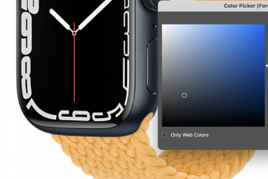
In chatting online with an Apple sales rep, she claimed that the Midnight option for Aluminum is not any more blue than Space Gray, but also darker. If it's as neutral as she claims, I won't have an issue. But if it's indeed more blue, yuck.
If anyone has a photo with a Space Gray (series 6, 5, or older) next to this new Midnight model, that'd be great.
If anyone has a photo with a Space Gray (series 6, 5, or older) next to this new Midnight model, that'd be great.
Last edited:
Yeah too many people are under the false assumption that people who WFH just slack off watching TV all day. They don't realize how it actually works and how you'd be fired quick if you slacked off.I was wondering how long until somebody went there
No Space Gray this year? What the heck? lol, well no thank you!
Closest is Midnight.
I’m disappointed there’s no space grey or some sort of actual black. What are they thinking?
I would’ve bought one if space grey was an option. But midnight is dark navy as proven by the iPhone 13 I had. So many of my watch straps don’t go with navy. I tried them in the studio and they look awful with it.
What a mess of a year for the watch.
What a mess of a year for the watch.
I like the green option and I got it with the Abyss blue. I think it’s a nice earthy combo which I like. Would have probably waited until next year but my series 6 broke.
Also, my series 6 was the blue option and unless it was under direct light, it looked black. I imagine the midnight option in the AW7 is the same, but much “blacker” even in direct light. Very subtle blue….
Also, my series 6 was the blue option and unless it was under direct light, it looked black. I imagine the midnight option in the AW7 is the same, but much “blacker” even in direct light. Very subtle blue….
Attachments
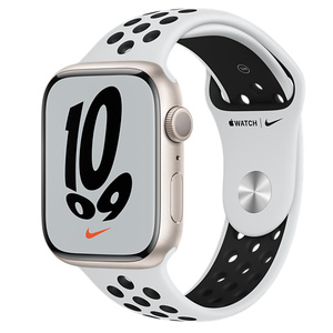
The Nike band with Starlight might be the worst.
My iPhone 13 mini is Midnight and it is BLACK, like deep black. I like it. Starlight on the iPhone 13 is more of a white than silver. So looks like we are getting more of a black or white option instead of grey and silver.Not sure how midnight can be described as navy blue. Looks the same as space gray to me.
Exactly why I didn't upgrade. I'm coming from a 5, but the larger face and Verizon credit they're offering on cellular models would have made it worth it to me after trade-in or resale. None of the aluminum colors do it for me (which partially pushed me to a 13 Pro as well; touché, Apple) and I have no interest in anything "higher end."
Hopefully they'll at least bring silver back for the 8, it's the perfect neutral color for a watch IMO. I'm also glad I grabbed a few official bands in black and white over the years...
Hopefully they'll at least bring silver back for the 8, it's the perfect neutral color for a watch IMO. I'm also glad I grabbed a few official bands in black and white over the years...
Since yesterday Macrumors has been trashing the Apple watch 7! I'm sure we could easily write and article about how happy are customers with the new colors and styles of the new Apple Watch. Beauty is on the eye of the beholder.
Thanks for this; I believe that Apple's web site is just not depicting Midnight correctly.My iPhone 13 mini is Midnight and it is BLACK, like deep black. I like it. Starlight on the iPhone 13 is more of a white than silver. So looks like we are getting more of a black or white option instead of grey and silver.
I have Starlight on my iPad mini (6th gen) and really like it. It's a cross between silver and gold. Reminds me of photography "sunlight" reflectors which are a mix of silver and gold.
And sometimes they're not being unreasonable.Some people are always unhappy.
I'm not sure anyone disputes that many customers might be perfectly happy with particular colors in the new lineup. That isn't really the point. I think what many people here and elsewhere are concerned about is that Apple has given us a non-cohesive color lineup with band options that do not coordinate well with several of the options. This is an outright mistake from a fashion perspective, and it's one that cuts against what traditionally has been one of Apple's great strengths.Since yesterday Macrumors has been trashing the Apple watch 7! I'm sure we could easily write and article about how happy are customers with the new colors and styles of the new Apple Watch. Beauty is on the eye of the beholder.
I'm not suggesting this is the end of the world by any means, but there are some huge red flags that Apple has lost something important.
Apply trying their hardest to mimic the 2014 Toyota Corolla color catalogue.
It's definitely a blue-ish gray from the color palette. Subdued a lot, I give you that.
Attachments
When people unbox their midnight watch, they are going to take a magnifying glass to it and shine it under operating room lights to see if they can see a speck of blue and report back here.
If it isn't immediately noticeable that it is a blue tint, who gives a crap?
If it isn't immediately noticeable that it is a blue tint, who gives a crap?
Register on MacRumors! This sidebar will go away, and you'll see fewer ads.