Got a tip for us?
Let us know
Become a MacRumors Supporter for $50/year with no ads, ability to filter front page stories, and private forums.
Some Customers Unhappy With Apple Watch Series 7 Color Options
- Thread starter MacRumors
- Start date
- Sort by reaction score
You are using an out of date browser. It may not display this or other websites correctly.
You should upgrade or use an alternative browser.
You should upgrade or use an alternative browser.
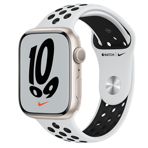
The Nike band with Starlight might be the worst.
yep - That is totally a 🤢🤮 combo

That does not look good but then again I hate that band with every watch.The Nike band with Starlight might be the worst.
The colours are different. Midnight is dark blue and starlight has gold tint to it. They are not space grey and silver.They still are, but now they call them midnight and starlight. It's the same marketing team that names iMacs.
Midnight and starlight are very clearly different colours. If you can’t tell by looking, take an eye dropper tool to the images of them and the silver and SG SE and compare. It’s a very obvious difference if you’re not willfully trying to ignore it.They still are, but now they call them midnight and starlight. It's the same marketing team that names iMacs.
I ordered my midnight this morning right when the store opened up. I'll admit that I was trying to hurry assuming that stock would run out for the first wave of deliveries, and I honestly didn't realize it was as blue as I now see that it is. At the time, I just assumed it must but the "black" option because Apple always names their black option something clever, and it was clearly the darkest color option.
I'm a little disappointed now. It's a nice-looking dark blue, and still my top choice of the aluminum options this year, but many of my existing bands are not a good match for it. Had I realized it wasn't actually black (or dark gray) ahead of time, I think I would have held off to see what happens next year. I'm replacing a Series 2 so tech wise, I was totally ready. Not on the fence like last year (the bigger screen and fast charging, for me, made the difference versus the 6).
I'm a little disappointed now. It's a nice-looking dark blue, and still my top choice of the aluminum options this year, but many of my existing bands are not a good match for it. Had I realized it wasn't actually black (or dark gray) ahead of time, I think I would have held off to see what happens next year. I'm replacing a Series 2 so tech wise, I was totally ready. Not on the fence like last year (the bigger screen and fast charging, for me, made the difference versus the 6).
For people wanting a silver Apple Watch, just go for the higher end models..I understand that it's not perfect and costs extra money, but this is how it is this year. Apple should just drop starlight and offer a classic silver in all of its products.
So it’s dark blue.Yes, it's a very dark navy blue color. I got a Midnight Apple leather MagSafe case for my 13 Pro Max, and it looks just like black to me except under direct, bright light.
We aren’t talking about cars. Talking about a $400 watch. Huge difference.These other people are going to hate buying a new car. Wait until they see that if they don't charge you more for the paint they require an upgrade package to change the color.
View attachment 1860189
It's not just the extra $300. Which is a lot for a color premium. It's also heavier. And tends to scratch more (the metal). Honestly even if the Aluminum and Steel cost the same, I'd prefer the aluminum model (and assuming color didn't force me one way or the other). I also use the smaller model, again, because I don't want my watch to be heavy.For people wanting a silver Apple Watch, just go for the higher end models..I understand that it's not perfect and costs extra money, but this is how it is this year. Apple should just drop starlight and offer a classic silver in all of its products.
1st statement is true but overstated. 2nd statement is wrong. Not that Apple of the last 20 years had a lot of colors, especially not the last 10 years under Jony Ive and no Steve Jobs. But the space gray wasn't always exactly the same between the iPads and the iPhones and the MBPs.The fact that colors and hues are different across products lines is an embarrassment.
This is not what the Apple of the past 20 years was about. I feel like we’ve gotten closer and closer to the sloppy Apple from the 90s.
Love my SE. Don’t use the health crap. Want notifications on my wrist for work.sure this is first world problems, but the reality is that I'm in market for this watch, but the color options are giving me pause. I just want a basic neutral color that can look business-y or sporty, and I don't want to spent $800 on it. Honestly, I'm now thinking just an SE is the way to go for the next 1-2 years.
Where is the black/dark gray watch? Midnight is blue and I don’t like it.
Midnight looks too close to blue than space grey so I want with graphite. Although the midnight case does seem more like black
I have a Midnight iPhone 13 mini. Under most light, it’s essentially black. Under bright direct light, one can see there’s a very slight blue tint to it.
Think of it as blue-black, like Superman’s hair (comic book fans will know what I mean by that).
No idea, however, if the Midnight watch is the same hue. I’m presuming so, but I’ve not yet seen one in person.
Think of it as blue-black, like Superman’s hair (comic book fans will know what I mean by that).
No idea, however, if the Midnight watch is the same hue. I’m presuming so, but I’ve not yet seen one in person.
It will be like blooming all over again. People are going to intentionally try and find the conditions to show that it is the most blue and then post about it here. Instead of just enjoying their product and realizing it isn't very blue under regular conditions.I have a Midnight iPhone 13 mini. Under most light, it’s essentially black. Under bright direct light, one can see there’s a very slight blue tint to it.
Think of it as blue-black, like Superman’s hair (comic book fans will know what I mean by that).
I personally love the color. Couldn’t decide between the regular blue and what I thought was basically black until I saw it in person. It’s a hard color to accurate depict on a website rendering.It will be like blooming all over again. People are going to intentionally try and find the conditions to show that it is the most blue and then post about it here. Instead of just enjoying their product and realizing it isn't very blue under regular conditions.
Essentially black for what it’s worth but with a drop of Navy in it.
I certainly don't care about the Blood O2 or EKG stuff. Heart rate is good for working out. But I agree, spec differences between SE and 7 seem pointless. I'm just gonna save myself a couple hundred bucks and be done with this.Love my SE. Don’t use the health crap. Want notifications on my wrist for work.
Also hated the Sport Loop band. There is no plain black anymore and the Nike version has Nike written all over the band.
I am shocked I tell you; shocked that some people on social media who have known about the colors are complaining on order day about said colors.
wow so midnight isn't even black? I've lost all interest in upgrading this year now. How can they not sell neutral colors on something like this. and I'mm sorry but stainless steel is not a premium metal worth hundreds of dollars more... not that they even have black in that anymore🤦♂️
Register on MacRumors! This sidebar will go away, and you'll see fewer ads.