So trueApple’s color options across all products is a mess
Got a tip for us?
Let us know
Become a MacRumors Supporter for $50/year with no ads, ability to filter front page stories, and private forums.
Some Customers Unhappy With Apple Watch Series 7 Color Options
- Thread starter MacRumors
- Start date
- Sort by reaction score
You are using an out of date browser. It may not display this or other websites correctly.
You should upgrade or use an alternative browser.
You should upgrade or use an alternative browser.

Don’t see the surprise here. There hasn’t been a “Space Black” stainless steel option since the Series 5 — last year’s Series 6 already adopted the lighter “Graphite” colour. 🤷♂️[…]While there are still Silver and Gold stainless steel Apple Watch options this year, Space Black has been replaced by Graphite, except on the Hermés models.
Stainless steel Link Bracelet users have also noted incongruity with some Series 7 models. This is particularly evident with the Graphite Stainless Steel Apple Watch, which no longer matches its accompanying Link Bracelet.
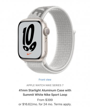
Can I mention here that the Nike edition watch bad with the Nike bands? Look at these two basic options for black and white band. Blech. I’m glad I got series 6 last year.
That white band and champagne colored case is a hideous combo
What the heck happened to Apple
I chose 45mm Graphite SS with the Clover sport band. It was very difficult having to rely on a couple of Youtube videos and at the mercy of the lighting conditions within them. Who knows if it will be a look my eyes will actually like? Ordered at 14 minutes past the opening hour and got a delivery of Nov 2-9. The site was slow and I ready knew what I wanted going in. I'm a little disappointed. Yes, first world problem.....and my employer is paying for most of the cost. Apple has brainwashed me. I'm sick and it's incurable.The thing is, even the titanium and stainless models don't have exactly matching bands
Would be better without the Nike brandingThis one is alright too…
I agree, but what's strange to me is how suddenly this occurred. Say what you will about Apple over the last 5-10 years, but its color palettes are always spot on. You could practically look to a new Apple watch band lineup to know what colors were going to be in vogue that year. Also, it was a pretty common thing for people to post pics of all their new matching Apple gear, which isn't even possible this time around. What happened?!The fact that colors and hues are different across products lines is an embarrassment.
This is not what the Apple of the past 20 years was about. I feel like we’ve gotten closer and closer to the sloppy Apple from the 90s.
I guess this is what happens if too many people work from home.The default color combos are horrible. It's like they said, how can we make the Apple Watch as ugly as possible. They make no sense. They actually sell a watch, with a stainless steel case, and black leather strap, with space black accents as a combo, from the factory. WTAF.
https://store.storeimages.cdn-apple...t=p-jpg&qlt=95&.v=1566450042993,1631662309000
I think that's right. They are happy to make a $400-$500 teen version of the watch and a $700-800 adult version. If you're on a budget, unfortunately you fall into the teen version. And to be honest it's half working on me here, I had a budget in mind, but a few hundred bucks to not walk around with a colored watch for a few years is probably well worth it. That or I just don't get one.I mean, Apple is this great marketing genius, right? It’s hard to imagine that the removal of the black and white from the cheapest options was anything but a calculated move to separate the plebes from the biggest spenders (comparing Apple buyers, of course…), and inspire people to spend more money on the popular color options.
Another thing that sucks with this is I really don't care about paying for a cellular watch... but that's also a forced upgrade with the steel option. So then that brings me back to just getting the SE....older tech, but good enough I suppose since I would be a new Apple Watch user.
Jony Ive and Angela Ahrendts aren’t there anymore.I agree, but what's strange to me is how suddenly this occurred. Say what you will about Apple over the last 5-10 years, but its color palettes are always spot on. You could practically look to a new Apple watch band lineup to know what colors were going to be in vogue that year. Also, it was a pretty common thing for people to post pics of all their new matching Apple gear, which isn't even possible this time around. What happened?!
I guess this is what happens if too many people work from home.
I was wondering how long until somebody went there

there is clearly mismatch with bracelet bands..and they don't look good.
something is wrong in Apple's design team recently..first those unbelievably ugly new iMacs and now mismatch bracelet bands with watches..it's very concerning.
something is wrong in Apple's design team recently..first those unbelievably ugly new iMacs and now mismatch bracelet bands with watches..it's very concerning.
Yeah I hate starlight. I feel like Apple is pushing people who want to use certain bands to higher priced models by making the colors clash.
Wow, you're not joking. I wouldn't even describe that pairing as minimally competent.The default color combos are horrible. It's like they said to themselves, how can we make the Apple Watch as ugly as possible? They make no sense. They actually sell a watch, with a stainless steel case, and black leather strap, with space black accents as a combo, from the factory. For $1200. WTAF.
https://store.storeimages.cdn-apple...t=p-jpg&qlt=95&.v=1566450042993,1631662309000
Lol I think I’m the only one who was happy about the new starlight color. I wasn’t going to upgrade my 6 even with the battery life falling off a bit. I tend to run my watches as long as I can. I still use a series 2 sometimes. My series 6 is black aluminum. As is my series 2. I never liked silver aluminum, no offense to those who do. I just thought it looked cold and often white rather than silver. I like the warmer silver tone of the starlight and think it will look better with my white gold jewelry. And even my gold and silver jewelry. It looks very neutral to me and unassuming. I flat out can’t afford to splurge on the very dressy stainless models. So this is a decent compromise. I’ve loved my black aluminum watches but they’re very sporty.
I ordered very late in the day yet still can get it in early November. Seeing the hate for it, I now understand why! 🤣
I ordered very late in the day yet still can get it in early November. Seeing the hate for it, I now understand why! 🤣
None of the blue bands really match the blue Apple Watch. I wish they had a deep navy case.
I ordered the Blue AW7 with the "Abyss Blue" Sports Band. It definitely matches:
If you mean you want the band to literally be IDENTICAL in color, then no, but it's definitely a pleasant match/contrast IMO. And even if it were the identical color, the sheen will be different due to the differing materials.
I'd consider the "Midnight" color to be deep navy.
My biggest concern is that the midnight 7 is going to be very similar to the blue 6
if that’s the case, I may try green for a fresh look
if that’s the case, I may try green for a fresh look
I ordered very late in the day yet still can get it in early November. Seeing the hate for it, I now understand why! 🤣
at least this is good news for somebody!
I always thought of Ahrendts as more of a store operations exec than a designer/stylist, but I agree on Jony and also agree more generally that no one is running the ship from a style perspective. Apple still has some great designs and great designers, but it seems that there is no one leader curating/editing what comes out.Jony Ive and Angela Ahrendts aren’t there anymore.
I guess my main issue isn't the bands, but the case itself. I wish it was a little darker. But when it came to the series 6 at least, it seemed a little darker in person compared to the pictures. I hope that's the case with series 7.I ordered the Blue AW7 with the "Abyss Blue" Sports Band. It definitely matches:
View attachment 1860264
If you mean you want the band to literally be IDENTICAL in color, then no, but it's definitely a pleasant match/contrast IMO. And even if it were the identical color, the sheen will be different due to the differing materials.
I'd consider the "Midnight" color to be deep navy.
Register on MacRumors! This sidebar will go away, and you'll see fewer ads.