Become a MacRumors Supporter for $50/year with no ads, ability to filter front page stories, and private forums.
When I first saw it I thought of those SweetTart candies I ate as a kid back in the 70's.

It said "Looney Tunes" to me. Dunno why :)

I'm half expecting the little note to do a dance, run off into a dot at the horizon, or have an "Acme" brand piano dropped on it.
 

Attachments

  • looney_tunes_logo_001.jpg
    looney_tunes_logo_001.jpg
    315.9 KB · Views: 114
I for one bawled my eyes out for two days after seeing the new icon. I still can think of little else.
 
WTF? It's just a one liner email, and we have a full article about how Jobs "defends" the new icon? :rolleyes: What happens if Jobs wrote one paragraph email? Are we going to see a 1-hour sermon based on it?
 
As some people have said, I think the problem is that the new icon just doesn't fit in well with the other OS icons. Apple almost always, even with its random apps in Utilities, makes icons 3D and resemble some sort of real object.

The only real object the new one seems to represent is a badge you could pin to your shirt or something. I'm not sure what object they could have picked instead, whether it be headphones, a speaker, a stereo- it might be tough to work with any of those common music symbols- but I am still not a fan of the new icon, and even though I can change it, it kind of just lessons my image of the app a little.
 
Who cares?
It's just an icon FFS !

Why would anyone even give it a second thought...unless they were some single desperate saddo !!
 
I like your icon I would pay for it if there was an app that would change the icon from apples crap. Apple has missed the mark again. It seems to me that over the last few years apple has been putting out crap.
No need for an app. Select iTunes, right click and select Show Package Contents, then open Contents and then Resources. Find iTunes.icns and replace it with whatever icon you want, making sure to rename it iTunes.icns. This entire thread is pointless.
 
This is an issue? I like the new logo, the old one was fine too. Can't believe it's an issue. Must be a slow news day.

It's not an issue. Apple is very focused on design. So when they change something radically as they have here, it is discussed. It sparks debate.

Do not have a Pinzgau.

I think the icon is ****.
 
Well the data supports Steve's claim of "iTunes likely to surpass physical CD sales sometime next year" ... I think the icon change was Apple's subtle way to help iTunes users to "forget the CD"... also a way to focus the icon just on the music note and not on two items as the old ones always have.

Granted, I don't like the colors. Apple only went HALF WAY with unifying the icon on the phone with the basic Music Note within a Circle. I would've gone purple with it, too. The APP STORE logo is blue so this would be a better color choice.

While we're on the subject, I've always hated the MUSIC icon on the iPod Touch, The Burnt Orange on the light orange doesn't work near as well as the White on Orange of the iPOD icon on the iPhone. Also, never cared for having the VIDEO app within the iPod App of the iPhone and feel it would be better separated out into two apps like it is on the iPod Touch.
 
I like your icon I would pay for it if there was an app that would change the icon from apples crap. Apple has missed the mark again. It seems to me that over the last few years apple has been putting out crap.

1) Command+I on iTunes
2) Command+I on your icon/graphic
3) on the info window of the icon you want click on the little preview icon (upper left) then press Command+C
4) on the iTunes info window click on the preview icon and press Command+V

I think this should change the icon for you unless iTunes forces its original icon back somehow.
 
I like the new icon better than the old one, however, I'm sure they could have made it even better. We're Apple people, so it's totally okay for us to talk about something like an icon. We admit that it's ridiculous and we're fine with it.

I think the shade of blue they used doesn't go well with the Finder, Mail, and Safari icons. It's a deeper blue, closer to the Photoshop blue rather than the Skype blue, if you get my point.

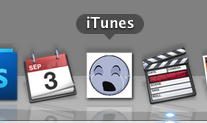
The rounded, glass icon is very classical Mac-like, there is nothing new about it. It's very simple, and I think it doesn't really represent iTunes much. It could be any random music button on any website. However, I still like it more than the badly-balanced CD icon.

Have a look at the orange music note icon on the iPod Touch. It's pretty plain and boring too, but it's really simple and that's the only point. It's a music note, it's round, it's shiny and blue. It can't get more Apple than this.

Now the thing is that Apple usually likes to have a retro-styled object represent the application:

Stamp for Mail
Compass for Safari
Clapper for Final Cut Pro
Ink bottle for Pages
Etc...

So maybe a Vinyl icon for iTunes would have been better. The CD isn't retro enough, but maybe a gramophone or a black Vinyl disk would be cool.

I like the new gray iTunes UI though, the only strange thing in my opinion is the volume slider's button: it wants to look like the iPod Shuffle's brushed metal buttons, but it instead looks weird, since it doesn't look shiny. maybe a more classical grey rounded aluminum button would be fine here.

But seriously, only Mac users talk about stuff like this: on Windows, you would have an endless list of ugly UI and icon choices, so it's not even worth starting.
 
As a graphic designer for over 20 years. I concur: that new logo sucks! It looks like someone created that in about 2 minutes. Let see, "Take generic 2 tone aqua color circle, add musical note . . . . and . . . . there you go! Instant logo. Can I interest you in 20 animated gifs for your web site now?"

I much rather prefer something like this:

http://dribbble.com/system/users/1474/screenshots/51530/shot_1283440682.png?1283440682

P.S. This icon was designed by Chris Carlozzi. He is a link to it.

+1, being a designer myself, I feel the same, the new itunes 10 logo is something that can be made in minutes.. And it doesn't really go well with the rest of the icons in the dock..
 
The voiceover icon maybe a little modified would look better i think.
 

Attachments

  • Screen shot 2010-09-03 at 9.48.25 PM.png
    Screen shot 2010-09-03 at 9.48.25 PM.png
    9.5 KB · Views: 473
My best friend was telling me how great life was going but then she accidentally glanced at the new iTunes icon.

Next thing I knew she was throwing dogs into a river.

Steve Jobs' hands are red with puppy blood.
 
They could keep the iTunes Music Store, but use iMedia for the app itself.

iMedia:
iTunes Music Store
iMovies Movie Store
iBooks Book Store
App Store

;)

Yeah, this has been bugging me ever since the iPod Photo, which was the first time they needed to find a way to shoehorn an interface into the music app to manage photos.

Then when the iPhone came into the picture, suddenly iTunes was handling more than just music and videos, also now your photos, your contacts, your calendars, and an App store too.

Now there's all the media, all that other stuff, and a book store.

Pretty soon they'll just merge iTunes with the Finder and you'll just run your entire computer from it.
 
Wonder if they will change it iOS? The current one looks the same just purple. I hope they stick with the purple on iOS because there are already to many blue apple icons
 
There BOTH taken from my dock. One at "rest" state and one is from the "magnification effect" when the mouse rolls over it. ... I know you want to make some valid point and are trying real hard to back it up, but sorry, you fail.

Thanks for the clarification. I don't use the magnification effect because I think it's campy and pointless. And I think the iTunes icon you use is too busy for its size.

That's just my opinion, but I love how I "fail" just because I disagree with you.

And just for fun, I made my own iTunes logo dedicated to this thread, you and everyone else who's crying about Apple's new iTunes logo.

Here it is. I hope you like it:
 

Attachments

  • iTunes.jpg
    iTunes.jpg
    35.8 KB · Views: 520
They should have rebranded it iMedia. iTunes is quite an inaccurate name nowadays.

No, because iTunes is the name everyone recognises. The same way as the iPhone isn't just a phone, and the iPod Touch isn't just an iPod at all. Apple is going towards less specific names, such as "Ping" and "iPad", and even "iPod" wasn't specific in the beginning. However, it's not a good idea to rename things that everyone got used to. Renaming Apple TV to iTV would have worked, since it's not such a big and famous product, and the name would have stayed almost the same (Apple = i). But otherwise, not really.
 
Register on MacRumors! This sidebar will go away, and you'll see fewer ads.