You don't? I see it right away in your screenshot.
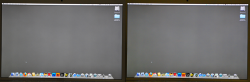
Surface blur + Saturation boost:
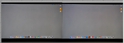
View attachment 209701
Original colors (no saturation boost):
31 by 31 pixel average in top left of the white area: #d0d2d6
31 by 31 pixel average in btm right of the white area: #c7c5c1
Picture:
View attachment 209702
Of course the closer the circle is to the bottom of those color graphs, the less it matters where the circle is from left to right, but you can clearly see the tendency toward BLUE for the top left, and YELLOW for the bottom right.
Just feel lucky yours is so desaturated. I believe mine is about the same as yours, and my gradient is in the same orientation. You only have a max of 6 difference between R and B (C7 vs C1 and D0 vs D6), so it could be much worse.
I am sticking with mine as well. Have been doing some work on it and it really hasn't affected my ability to tell that something is grey. I have software that tells me that.
")
As for colors I'm aware the color temperature must affect them some, but I feel it's hardly noticeable to the eye. And I can always move a color swatch around the screen to see. It's just the greys and whites that are problematic for me... Notice it a bit too often in those situations.