sbailey4
macrumors 601
Does this beta fix the horrible battery life for the people who actually use their phone?
Yes battery life is awesome now. I been on standby for 2 days and 3 hrs use and still at 85% on a 4s. 😱
Does this beta fix the horrible battery life for the people who actually use their phone?
It's illegal to use your phone while driving.
Am I the only one that has always wanted a row, or optional row of numbers along the top of the keyboard?
The funny thing is, they made the iPhone longer, so they could of added in another numeric row on the taller screen for zero impact.
It's illegal to use your phone while driving.
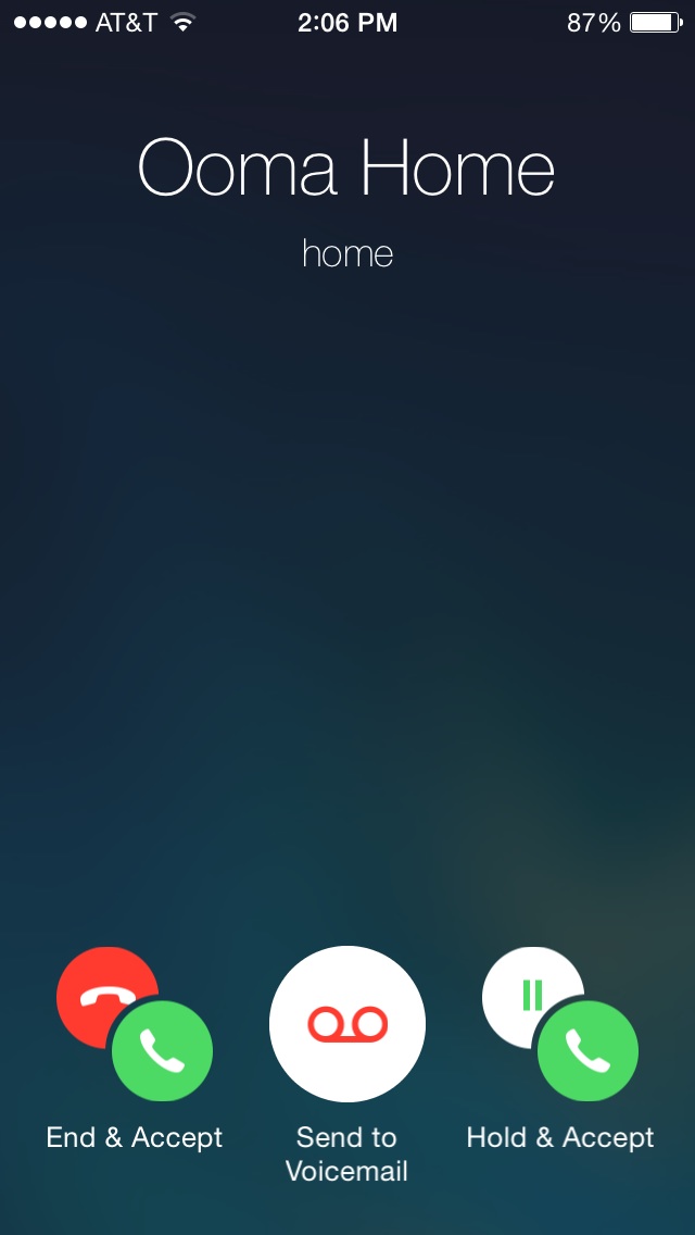
What does it look like when you are ON A CALL, and you get an incoming call? Does it still have all that text that you have to read or is there a new/better way of conveying the whole "end this call and answer new call/hold this call and answer new call/decline incoming call" jumble of text?
Would you rather them release 7.1 this month and add a ton MORE bugs to that "riddled mess"? Or would you rather them wait till march so they can squash almost all of the currently existing bugs?
... a graphic designer to see which design tell u more...
What does it look like when you are ON A CALL, and you get an incoming call? Does it still have all that text that you have to read or is there a new/better way of conveying the whole "end this call and answer new call/hold this call and answer new call/decline incoming call" jumble of text?
It's illegal to use your phone while driving.
Here's the new already-on-a-call-when-another-comes-in screen... Sorry about the size. On my phone right now. 😀
Image
Oops, got beat to it, here is incoming call 2. Why are their different versions? The pics don't convey the really clever animations.
This is so much better than before. I always second guess myself when I get a second call. Now it's crystal clear.
Can't say that I've noticed any really noticeable effect from unplugging soon after it gets to 100% to doing it an hour or more later.
I said it in the post. Battery detective. You have to be jailboken though.
Nice to know they are dicking around with design changes when iOS 7.0.4 sucks on our devices and we've spent months dealing with instability...
Does not work flawlessly. Three 5S' in the house. All have the same finger (for different people) programmed on their devices. Each finger takes up all 5 spots. Works 60% of the time. And 30% you have to scan twice.
Maybe use it as designed? One finger = one slot.
The system learns as you go so I understand why your setup wouldn't work.