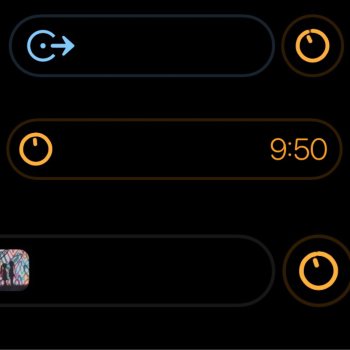
Not sure, doesn‘t look that much bolder on yoursBut what you’re missing is that it was so faint it was imperceptible most of the time, why do you think it got so much negative attention when beta 4 dropped last week? It was NOT like it is now where it’s this bright garish looking outline that’s there most of the time. And for some reason when you visit macrumors it goes away, maybe they did something to disable it since it’s so hideous? Try going to a site like 500px, and see how bad it is. It also changes color depending on what is using it so if the app icon is the same color as the area around the island you’re not going to notice it as much.
View attachment 2093030
Got a tip for us?
Let us know
Become a MacRumors Supporter for $50/year with no ads, ability to filter front page stories, and private forums.
iOS 16.1 Beta 5 ― Bug Fixes, Changes, and Improvements
- Thread starter Banglazed
- WikiPost WikiPost
- Start date
- Sort by reaction score
You are using an out of date browser. It may not display this or other websites correctly.
You should upgrade or use an alternative browser.
You should upgrade or use an alternative browser.
- Status
- The first post of this thread is a WikiPost and can be edited by anyone with the appropiate permissions. Your edits will be public.
Wrong, see blow.
Exactly the same here on 16.0.x, examples:
View attachment 2092999
View attachment 2093000
View attachment 2093001
I can go on and on with a plethora of different activities.
Also a very ugly and annoying green glow on the active call activity, always been like that.
Build for proof:
View attachment 2093002
Ive had black/dark wallpapers and never had a glow, this is the first its ever appeared on my iPhone.
Huge difference in my eyes between both your screensNot sure, doesn‘t look that much bolder on yours
View attachment 2093033
Wow. Lighten up people: it’s a tiny outline. It’s not like they put a giant blob in the middle of the screen. Surely there are things more important in this world than this to worry about: pandemics, famine, wars.
Wow. Lighten up people: it’s a tiny outline. It’s not like they put a giant blob in there middle of the screen. Surely there are things more important in this world than this to worry about: pandemics, famine, wars.
…… really stupid reply. It’s bothers people, no need to belittle or make it out to be stupid, just because you feel it is. It bothered people and people have a right to moan about it, if you don’t like that then go read some news articles on the war if that’s what’s important to you.
…… really stupid reply. It’s bothers people, no need to belittle or make it out to be stupid, just because you feel it is. It bothered people and people have a right to moan about it, if you don’t like that then go read some news articles on the war if that’s what’s important to you.
You are entitled to your opinion. I am entitled to mine. And yes: there are some things that it makes no sense to be upset about. This is one of them. And if it upsets you that much, then perhaps you need to rethink your priorities in life. It’s ok not to like it. It is quite another thing to act like it is the end of the world. It clearly is not.
Weird on mine it’s much more pronounced, you said you were on 16.03 right?Not sure, doesn‘t look that much bolder on yours
View attachment 2093033
Technically, they did and then outlined it 🤣Wow. Lighten up people: it’s a tiny outline. It’s not like they put a giant blob in the middle of the screen. Surely there are things more important in this world than this to worry about: pandemics, famine, wars.
Wow. Lighten up people: it’s a tiny outline. It’s not like they put a giant blob in the middle of the screen. Surely there are things more important in this world than this to worry about: pandemics, famine, wars.
Ok but I heard there was a scientist in Bratislava who had come up with a solution to all those ills and he had written his equation in his notes app. He’s a big time dev like me and installed the 16.1 dev beta 4 last week. When he went back to his notes the outline was so garish and unsightly that he dropped his phone into a sewer grate and never saw it again and he forgot the solution.
You are entitled to your opinion. I am entitled to mine. And yes: there are some things that it makes no sense to be upset about. This is one of them. And if it upsets you that much, then perhaps you need to rethink your priorities in life. It’s ok not to like it. It is quite another thing to act like it is the end of the world. It clearly is not.
Seems to bother you more *shrug*
So were these sun icons always sh*t brown and I am just now noticing it 🫣

Did anyone lose image transparency system-wide since beta 2 or 3?
All my PNGs, TIFFa have a white background now in the photos app and when used in other apps like IG/iMovie, the white BG stays when there should be nothing… I had a workaround in beta 4 with PSDs but even that’s not working now in beta 5
All my PNGs, TIFFa have a white background now in the photos app and when used in other apps like IG/iMovie, the white BG stays when there should be nothing… I had a workaround in beta 4 with PSDs but even that’s not working now in beta 5
Are the haptics still the same as the last beta? Weren’t they simmered down? Low heat? Defrost?
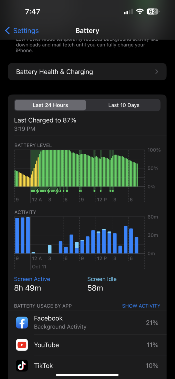
20% loss over 6.5 hours, some use but mostly standbyIs it just me or does battery seem much better? 14PM
5G performance seems to be much better than prior 16.1 betas when nothing would load. Stutter is back 1-2 times but much less prevalent than b4
A little bit stronger from my experience. (14 Pro)Are the haptics still the same as the last beta? Weren’t they simmered down? Low heat? Defrost?
Best battery life so far. I only dropped 25% in 4 hours.20% loss over 6.5 hours, some use but mostly standby
5G performance seems to be much better than prior 16.1 betas when nothing would load. Stutter is back 1-2 times but much less prevalent than b4
Attachments
DO YOU GUYS KNOW IF THEY FIXED THE
iOS 16 always asking for Apple ID password every restart BUG?
They're still the normal piss yellow for me.
Because the background isn't black, when it's DI on black background, there will be a light greyish border.
Once I figured out it didn’t work with Split View I turned it off. Doesn’t appear I’m missing anything.Personally, I think Federico and Steve Troughton-Smith are both being drama queens about this feature. Does it work perfectly for me on my 2018 IPP or my 2020 M1 Mac? No. Does it work well enough? Yes.
Praise baby Jesus. 🙏🏼The dynamic island outline is gone. Phew.
Register on MacRumors! This sidebar will go away, and you'll see fewer ads.


