Become a MacRumors Supporter for $50/year with no ads, ability to filter front page stories, and private forums.
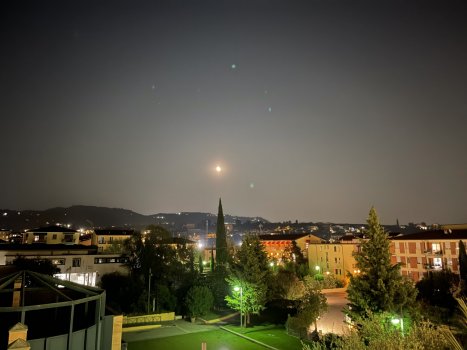
Yeah, looks like they managed to control the flares better.
Look at the picture I took yesterday evening. It’s unusable because of all the dots….
12 Pro Max ( standard wide Lens )

Edit: which lens was used to take the pictures above? standard or ultra wide?
 

Attachments

  • 1E2D2B80-CCD3-4652-B4BB-BB9C1F96FA13.jpeg
    1E2D2B80-CCD3-4652-B4BB-BB9C1F96FA13.jpeg
    299.6 KB · Views: 249
The displays on max brightness are much darker than the 12 pro max also the notch is worse and taller it’s more noticeable now
 
  • Like
Reactions: Tpevans0105
Yeah, looks like they managed to control the flares better.
Look at the picture I took yesterday evening. It’s unusable because of all the dots….
12 Pro Max ( standard wide Lens )

Edit: which lens was used to take the pictures above? standard or ultra wide?
Standard.
 
Unfortunately I had to leave to work minutes after I got the quickest possible setup just to get it open so some of these quick impressions just might be wrong, I’ll update the post if that’s the case.

- Color is lighter in person than I expected but only saw it indoors on an overcast day around noon. Not disappointed with it and I do enjoy the change but as a fan of darker phones I think Pacific Blue is better. (Sierra is still vastly better than Graphite though)
- Weight difference is tiny, but still noticeable even when I expected it not to be, so I should be unbiased.
- Screen looks pink and warmer compared to my god awful green tinted panel on 12 Pro Max, need to compare it to old SE LCD screen and (what I perceive to be) perfect S6 Watch later.
- I wasn’t as amazed with 120hz as many of you seem to be, but the difference is still massive and very welcome.
 
Mine just arrived! Loving it! And the Sequoia case looks nice with the Sierra blue! Btw the SB color looks so much nicer in person, it’s not the silly baby blue people kept saying it was…it’s actually a nice metallic blue silver View attachment 1844211View attachment 1844225
Sequoia green is definitely a good match with the Sierra Blue! It was my first choice!
 
  • Like
Reactions: Legendts
That cherry case looks more purple than red in a lot of photos. How does it look to you in person?

Great photos, btw. Thanks so much for posting them here.
I got that case as my first choice but returned it and switched to sequoia..the cherry looks nice and elegant inside like a deep red / burgundy…but outside it looked like an ugly cheap purple
 
  • Like
Reactions: brgjoe
Does anyone else thing the notch is a big downgrade they claim it’s smaller white it looks worse and is taller I would rather the old one this goes into the display a lot more
 
More comparison pics of 13 PM vs 12 PM

Pacific blue (left) vs Sierra blue (right)
View attachment 1842919View attachment 1842920

13 Pro Max Graphite (left) vs 12 Pro Max Graphite (right) - The 13PM graphite is slightly darker
View attachment 1842921View attachment 1842922
Lovely! I ordered the 13 Pro in Graphite and am happy to see and hear it is slightly darker than the Graphite on the 12 Pros. I really liked the darker Space Grey on my 11 Pro and really wish they would have done a matte black.
 
Lovely! I ordered the 13 Pro in Graphite and am happy to see and hear it is slightly darker than the Graphite on the 12 Pros. I really liked the darker Space Grey on my 11 Pro and really wish they would have done a matte black.
It’s not darker I have went to an Apple store and compared they are identical, the reason some photos look darker because on a slight angle it looks diffrent in pics, but I promise it’s the same colour no change at all
 
  • Like
Reactions: GuruZac
More comparison pics of 13 PM vs 12 PM

Pacific blue (left) vs Sierra blue (right)
View attachment 1842919View attachment 1842920

13 Pro Max Graphite (left) vs 12 Pro Max Graphite (right) - The 13PM graphite is slightly darker
View attachment 1842921View attachment 1842922
Your wrong don’t make people believe it’s darker they are exactly the same colour I compared them for ages in the apple store, the reason the photo looks darker is at an angle it goes darker that’s my you can’t see the apple logo but in person head on they are identical even apple said that, the new one is NOT darker it’s the exact same graphite
 
  • Like
Reactions: Ahmed7
Register on MacRumors! This sidebar will go away, and you'll see fewer ads.