Become a MacRumors Supporter for $50/year with no ads, ability to filter front page stories, and private forums.
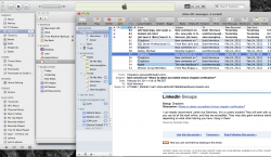
I was just complaining the other day how i would hate to have to use the new Mail app, because i simply hate threaded mails, Gmail style. I send and receive more than 50 very complex mails each day and i tell you, i cannot do with threaded emails. I need to have each mail in its separate thread.

So, i'm really thankful for the "Classic" option on Lion, i was even thinking about staying with SL just for Mail.

Otherwise, updates are nice, hoping for a slight redesign.

The threaded view isnt even enabled by default. You have to go to the view menu to enable it.
 
They're not targeting Lion at touch screen devices, they're targeting it at trackpads.

Trackpads are the sole input for MacBooks and MacBook Pros. For iMacs and Mac Pros, the mouse is currently used for 90% to 95% of input. But Apple has introduced the new Magic Trackpad, which essentially changes the desktop mice interface into a laptop-style trackpad interface (but for your desktop).

Apple sees a future where normal people use trackpads to interact with OS X, whether it's on a laptop or desktop. There will be a small group of professionals (probably including you) who need the precision of the mouse or can't make the transition to the trackpad.

That's not what I'm suggesting though. You don't need larger hit targets, giant button sliders, etc for trackpads. It's clear that many of these changes benefit or at least conform to the concept of touch.
 
It acts more like a scrollbar now rather than a pressed button. I think the video showed it sliding around.
It's a slider now. If you look at it without the mindset of how it was, it makes perfect sense.
 
They sure are going out of their way to make the entire interface touch-friendly, to the point where some of these things are harder to use with a mouse than they were before. Somewhere is Cupertino people are hammering away on touch-screen Macs, ergonomics be damned. I only wonder how long they'll be in development.

Giant slider for time machine preferences, slider instead of buttons for finder views, full-screen apps, iOS scroll bars (ie touch scrollbars), Larger interface elements in newer apps like iPhoto, scaling windows from all corners, touch-sized mail list in mail, Launchpad, etc.

It's clear they see touch in the Mac future, despite what they've said.
Please watch the Macbook Air advertisement. Apple has said that they have considered but determined that it's not good to incorporate a touch screen on a Mac due to ergonomics. So they will rely on trackpads for touch control.
 
Lion: the destroyer of worlds?

And ppc support, I mean really they had to drop it so fast? The last ppc Mac was sold in like 2006 right? So now we can't do anything with old macs anymore. Either way, there needs to be a reverse Rosetta.

Your old macs will still work after Lion comes out.
 
Marble

I can't help but feel like some of these UI elements don't fit together completely. Like the scroll bars, or the old dock style with the iOS style icon views above it (from other screen shots online), etc.

I feel like Apple is holding back on the UI. They will probably do something with that old style aluminum interface. Shouldn't we be seeing Marble now that it slipped from Snow Leopard? Or was that scrapped?

These quirks could easily feel integrated with a shift in the overall UI design. I also feel like there will be a UI change in iOS 5.0 that they will show next week. Certain things will remain the same, but the baby blues, etc will probably change. Something that really pops like crazy on the retina displays, and that perhaps could help unify the iPhone, iPad, and Mac just a little bit more. They won't be the same, but feel more cohesive.

Marble was the internal codename for Xcode 4.
 
It is annoying to have to select all of the photos you want to view in Preview. If you click on one to quick view, the program should allow you to scroll/swipe to the others in that folder.

CMD-A; ALT-Space -- how hard is that?

I do agree, however, that if you invoke Quicklook in non-fullscreen mode, then you can arrow down the files in list view, and the Quicklook preview changes accordingly -- it would be nice if that behaviour remained in fullscreen.

Cheers

Jim
 
It's a slider now. If you look at it without the mindset of how it was, it makes perfect sense.

That is not accurate. It's not the old mindset that makes it look odd and counterintuitive, it's not an attitude issue. It's a design issue. Because it's two conflicting frames of reference (a huge design error that I am sure won't be in the release of lion), one that shows buttons that are supposed to be pressed, and when they are they show this via gray shadows, and another where "pressed buttons" appear in the slider with a different rational. So essentially these two frames of reference are incongruent thus CAUSING the issue. If you use one convention to denote something you have to use it consistently within the safe frame of reference, end of story.
 
it is not exlained, so they doubleclick on files instead of pressing space etc.
I agree with this. I have a friend who just bought a Mac for the first time. He keeps alternating between double clicking on pictures to view them and pressing space. I keep telling him that all he needs to do is press space, but he keeps on mixing the two. He doesn't seem to realise that double clicking opens an app to view while space will simply show you the file contents.
 
One thing I hope they steal from Windows 7, is the dragging a window to the side of the screen, and it fills the entire half of the screen.
 
That is not accurate. It's not the old mindset that makes it look odd and counterintuitive, it's not an attitude issue. It's a design issue. Because it's two conflicting frames of reference (a huge design error that I am sure won't be in the release of lion), one that shows buttons that are supposed to be pressed, and when they are they show this via gray shadows, and another where "pressed buttons" appear in the slider with a different rational. So essentially these two frames of reference are incongruent thus CAUSING the issue. If you use one convention to denote something you have to use it consistently within the safe frame of reference, end of story.
Exactly. They're not buttons. They're sliders. So it's not that they're "pressed" as much as selected.
 
Liking most so far

I am really loving most of what I am seeing so far with Lion. Thanks for posting.

I will agree with most. I prefer the colors in the old finder, over the drab grey on grey like iTunes.

As for the new mail… On my iPad, I like that version and will probably love the new Lion version. But (and don't flog me for this), I do not use Entourage / Outlook anymore since they took away syncing with my iOS devices (and Entourage started creating 100's of duplicates and got way to slow). I really wish, since they are integrated anyway - that they would combine mail and iCal into one app on the mac. Notice my screen shot. Todo items / Reminders are added through iCal and show up in my mail; I can add them to my mail and they show in my iCal. Would be nice to just combine the ical/mail into one app with an icon to switch between the two?.
 

Attachments

  • Screen shot 2011-02-26 at 10.50.03 AM.png
    Screen shot 2011-02-26 at 10.50.03 AM.png
    390 KB · Views: 297
I wish the plus sign in the left top corner of windows was actually a maximize button like in windows, is there some rights/patent or something Microsoft owns to having a maximize button?
 
I'll probably get slammed for this but I was hoping for mail/cal/addy integration in some way. I may be a minority in this, but I think mail is such a weak link in OSX, and forces me to use outlook at the same time with work.

Mailhub is a great add on on SL and allows me to shoot a mail to a folder with a click. But seriously, this looks very similar to the same old mail with some different window variations.

Back to point, why don't they integrate them all in one? Mail cal and address that is?

I think that would be a great way for Apple to show Google how it's done. I always thought those three were too weak as stand-alone apps... so off my dock and in the folder they went only to be opened... well.. never, I guess.. haha

So +1 from me.
 
I kinda like the one corner resizing. It seems better and less easy to accidentally resize a window. Anyone with me on that one? Plus you don't get those ugly double arrowed cursors.

although, maybe it is just because I am used to it.:apple:
I'm with you; I prefer the lower-right corner resizing, and don't like the double-arrow cursors. Save those for windows.

Don't like hidden scroll bars. That's fine for an iPhone or iPad with limited real estate. On a Mac, Apple has always excelled at UI design by providing subtle cues without overwhelming with information. In this case, the presence of scroll bars told me there was more to see than what was shown in a window. With hidden scroll bars, I now need to deliberately check, which is not as elegant.
 
One thing I hope they steal from Windows 7, is the dragging a window to the side of the screen, and it fills the entire half of the screen.

hyperdock does that... Apple should assimilate hyperdock.
 
Will there be some easy way to compress multiple versions of a document together?

Example: I use iWork '09 at home but most of the computers at school only have iWork '08. As a result I frequently end up saving two copies of each file, an '09 file and a '08 file. Will there be some way to compress both into one? I guess this would be more of a iWork feature than a Mac OS X feature...
 
Yeah, "Devices" should be at the top, there is no question about that. Devices has all the hard drives and USB drives that you plug in, you really need that all the time. Also, everything that's top level should be at the top, so root directories should NOT be at the bottom. I mean "All My Files" is at the top, which I'm guessing is the new name for "My Mac", and that's as general as you can get.

It should be a downward transition from General to Specific folders.

And I disagree. I like that my favorites gets put on top and the other stuff on bottom. I hardly ever go to my hard disk unless I'm looking for something I barely use. Everything I use often I bookmark and they should put those on top.

Now, maybe it should be an option. But really, why wouldn't you want to put the stuff that you designate you go to often at top rather than just be forced to put the devices on top regardless if you use them or not?

I'm not sure I like the finder much and I would have to use those scroll bars before saying (but honestly, my first thought was without them it doesn't give you an instant feedback on if there is more in the folder), but that was one change I actually liked.

I hope though they keep the view where you click on a folder and it expands it to the right but keeps the list of what was in the previous folder you were in on the left. I know that was stolen from Windows but honestly, when my PC was my main computer that was one thing I liked about it over Mac (which didn't have it til I came back to Mac). And I'm not going to gripe about Mac stealing from windows. It goes both ways. Some one gets a good idea that people flock to, eventually the other will take that idea too.
 
I kinda like the one corner resizing. It seems better and less easy to accidentally resize a window. Anyone with me on that one? Plus you don't get those ugly double arrowed cursors.

although, maybe it is just because I am used to it.:apple:

Yes I'm with you!! I think this is a big step backward. Is this a sign of things to come with Jobs having less influence? I don't want Windows Apple! Bring back one corner resizing!
 
Register on MacRumors! This sidebar will go away, and you'll see fewer ads.