Mac OS X Lion: 'Classic' Mail View Available, New Finder on Video

you can change it in system prefs. back to the old one. one thing i dislike is the new way of scrolling if you want to scroll up you pull you fingers down on the trackpad (similar to the way you'd do it on the ipad)

Which makes sense on the iphone/ipad cause it mimics you dragging the page up and down. But I don't think it will work so well when you don't have your finger directly on the document cause it won't be so intuitive (it's more intuitive to have it the way it is now. I know cause I have had no issue adjusting to my magic mouse scrolling and yet I also have an iphone. I never confuse the two honestly and never even thought about it til this post. I had to try both to make sure and yeah, I scroll differently on both and it seems very intuitive on both to use them the way they are set up).
 
What a pointless rant. U comment on any corner resize as being copied from windows! Is that all u can come up with?! How is the quick look function in windoze? Oh yes, there isn't one. How about cover flow, expose, spotlight, built in cloud computing, easy networking, app store, FaceTime, time machine, not having to deal with constant pop ups from the os, the bundled iLife suite, the complete lack of viruses ( shall I go on? )

Manipulative? How about having to buy and subscribe to services just to be able to protect the os from viruses, or an operating system that costs five times more to upgrade?

good response but you should probably hold off on commenting on price until the price of Lion is released
 
CMD-A; ALT-Space -- how hard is that?

I do agree, however, that if you invoke Quicklook in non-fullscreen mode, then you can arrow down the files in list view, and the Quicklook preview changes accordingly -- it would be nice if that behaviour remained in fullscreen.

Cheers

Jim
Not hard, but much harder than double clicking a photo...
 
Damn some day mac os x will be monochromatic. Looks like Steve hates colors :confused:

The only thing I like so far are the smaller bars and quick view.
FTFF.
Anyhow the theme looks dull.
I don't really like the resize everywhere, I hate when I'm moving an window and instead I resize it (windoze/linux)
Oh and the DS_Store crap.
 
this is a wonderful example of how extremely manipulative apple is. notice that on windows it has always been possible to resize windows on every corner? an notice, that most windows on windows can be fullsize? well, i still remember very clearly how bad this is, it confuses the user... no one needs fullscreen... windows is bad, because the apple concept of only resizing on the bottom right corner is more logical bla bla bla.
and what is the new INNOVATION now???

Considering Apple didn't make this video, someone violating their agreement did, and these things are only scandelous to people like us that post on these sites on a boring Saturday morning with nothing else to do while we drink our coffee, I hardly find it a scandal on Apple's part. I don't see any OS developer running ad campaigns or feature lists with window resizing a big feature. I think Apple holds back on some of this minor tweaks because Windows stole the UI for the most part, and keeping this quirky things was still very Mac. Much like the 2 button mouse. Sorry Steve, you're mouse was outdone. Let's have a real second button that works consistently. Most programs work better with it. We know it's not Windows.

Besides, if you're a windows user, you probably just double click the window bezel to enlarge and don't use the corners much anyway. (And if Apple copied that function, I'd be happy. Or if Apple made the contents of a finder window re-grid itself when you did such a thing, I'd be happy to not have to manually do it or manually put settings on every folder.) I'm left handed. I naturally don't reach towards the button right with my mouse. This is a welcome change. And I can see accidentally resizing a window, but it's not the end of the world.

One think I actually prefer in Windows is if you're browsing files in windows explorer and you come across photos, it's better for browsing. Quick look is ok. Hit the space bar and key over, but not nearly the same.

Considering Windows UI has generally been essentially theft of the Mac OS UI with tweaks (both 3.1 era and then again in Vista) who cares if Apple implements something minor like this? It's window resizing. Ooooh.

And while we're all yammering on the corner of a window, how about Quick look added a button in the top bezel of the window with an option to launch that image file with quick look? If Lion would have buttons appear for all available programs, that's rather nice. Saves you the rick right click and simplifies it for the less savvy user. That's fun.
 
I wish mail would become more creative/customizable. Like ability to use animated gif in signature, ability to build and edit custom wallpapers as background. I have always felt Apple mails was a little "vanilla".

I really hope you're joking. Nobody wants to get emails with funky colored backgrounds and gif signatures. Are you back in 1994 using aol?
 
this is a wonderful example of how extremely manipulative apple is. notice that on windows it has always been possible to resize windows on every corner? an notice, that most windows on windows can be fullsize?

well, i still remember very clearly how bad this is, it confuses the user... no one needs fullscreen... windows is bad, because the apple concept of only resizing on the bottom right corner is more logical bla bla bla.

and what is the new INNOVATION now???

A couple things:

1. It's not like resizing from everywhere has—at least not thus far—been touted as some kind of new innovation. This is a video just showing stuff that's been added. It's not like Steve Jobs used this minor change as "One more thing..."

2. Fullscreen apps are not the same beast as merely maximizing and it's not automatically gonna apply to all apps.

3. Times are changing. People, as a general rule, are more comfortable and familiar with computers and GUIs than they were 20 years ago. The current GUIs can be changed appropriately.

4. Sometimes Apple is flat out stubborn and caves to public demand.

5. Of course Apple's marketing IS manipulative. That's their job. If your marketing team isn't manipulative and good at doing so they should be fired.
 
I agree with the comments against the dull grey icons. Even though they bring uniformity to the UI, color will always be better for functionality purposes because it allows you to quickly and easily locate where you want to click at a glance instead of having to read the text. Making all the icons grey defeats the purpose of having an icon at all.
 
a couple of things about this release.

anybody else notice the desktop picture 'wobbling' - especially after opening the dock when its hidden. or after using the app launcher.

there is no grey/graphite option (it is an alpha, so that's no big deal)

the gui is a wreck, elements from the original 10.0 sneak release are still there and the various states of the traffic lights are quite ugly. apple has to get away from the boiled sweets look and present a more subtle/professional gui.

the new version of mail is a lot nicer and a welcome change.

the scroll bars are too dark and too thick.

having to write down the recovery key and hope you don't lose it is a little bothersome. not too comfortable sharing that key with apple.

preview has fewer view option for multipage pdfs, plus the scrolling through the pdf has been replaced with a 'blinds' like feature.

didn't know about the memory hog, but did notice some installed applications wouldn't launch.

very disappointed it can't be installed on my kids 2006 macbook.

and its looking more and more like apple's pandering to the windows switchers in terms of look and feel with lion.
 
Last edited:
Considering Windows UI has generally been essentially theft of the Mac OS UI with tweaks (both 3.1 era and then again in Vista) who cares if Apple implements something minor like this? It's window resizing. Ooooh.

And considering such simple concepts were invented by neither Windows nor Apple it's a dump point anyway. I don't know why people complain about this crap anyway. I like that Microsoft basically added a dock to Windows 7. I wouldn't have cared if it was an outright clone seeing as I prefer it.
 
The features you reference were introduced by NeXT in the late 80's. Help me remember who founded NeXT again.... :rolleyes:

Of course, I don't know why it took Apple this long to incorporporate functionality they had on the shelf.

Seems all :apple: OS Team is taking minor things from NeXT and incorporating it in small increments into future Mac OS versions. Most of the demoed video I could do without today, no big deal. What I found rather interesting is that Mac OS Client and Server are merging in Mac OS Lion. That is something worth the upgrade period. Everything else is mere icing on the cake. What all this boils down to is because of Server side feature and functionality, we will get TRIM (hopefully for all SSD manufacturers), and some serious backend communication support. Hopefully multiple VM running at the same time as well. :)
 
Damn some day mac os x will be monochromatic. Looks like Steve hates colors :confused:

The only thing I like so far are the smaller bars and quick view.
FTFF.
Anyhow the theme looks dull.
I don't really like the resize everywhere, I hate when I'm moving an window and instead I resize it (windoze/linux)
Oh and the DS_Store crap.

The best Mac OS theme I loved was Aqua from 10.0. People here will call me crazy because to many it was too much eye-candy and looked busy and cluttered, however I loved the rainbow that graced my desktop. Colourful and lively, loved the pin-stripes and all that jazz. Sad to see it phased to what we have today.

FWIW, I dislike the semi-transparent windows in Windows 7 with blur feature, seems to try too hard to be cool.
 
What a pointless rant. U comment on any corner resize as being copied from windows! Is that all u can come up with?! How is the quick look function in windoze? Oh yes, there isn't one. How about cover flow, expose, spotlight, built in cloud computing, easy networking, app store, FaceTime, time machine, not having to deal with constant pop ups from the os, the bundled iLife suite, the complete lack of viruses ( shall I go on? )

Manipulative? How about having to buy and subscribe to services just to be able to protect the os from viruses, or an operating system that costs five times more to upgrade?

Ahh this made me laugh quite a bit. Good post ! :)
 
The best Mac OS theme I loved was Aqua from 10.0. People here will call me crazy because to many it was too much eye-candy and looked busy and cluttered, however I loved the rainbow that graced my desktop. Colourful and lively, loved the pin-stripes and all that jazz. Sad to see it phased to what we have today.

FWIW, I dislike the semi-transparent windows in Windows 7 with blur feature, seems to try too hard to be cool.

When I was younger it was one of the things that made me like mac os x:D
I don't really like windows much either, but I loved kde2 in linux with many great themes that where available back then (good ol' days:rolleyes:)
 
I was glad to see aspect ratio's back in Expose, but do not like the Spaces / Expose integration.

Leopard / Snow Leopard was for me less enjoyable than Tiger, now it appears that Lion will be even less. Not looking forward to it.

And what is with that horrible matte finish that appears behind your desktop wallpaper in Expose? Looks like a bad Powerpoint presentation.
 
Last edited by a moderator:
I'm amazed so few people understand why they are taking out the color from the sidebars like in iTunes. The whole point of it is to let the actual content stand out rather than the surrounding "chrome"/navigational elements. The idea is to put the focus on the document, artwork, file, image, video, etc. by making all the surrounding stuff almost disappear into the background. The document or file itself becomes more of the star of the show and that's where all the color and attention should be.

I love the way they did this with iTunes. It puts the focus on my movies and album artwork. Eliminating color in one area to emphasize color and put the focus and attention on another area is a standard principle and technique of design which unfortunately isn't used nearly enough. Especially on many websites where you see all kinds of things grabbing for your attention due to the lack of focus using this design technique.
 
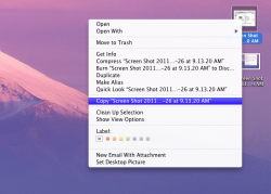
...Finder ever let me CUT and PASTE a file?!?!

Instead of this lame-ass drag and drop crap to move something.

I'm sorry but I have been able to cut and paste files for a long time now?
 

Attachments

  • Screen Shot 2011-02-26 at 10.27.47 AM.png
    Screen Shot 2011-02-26 at 10.27.47 AM.png
    424.7 KB · Views: 114
  • Screen Shot 2011-02-26 at 10.28.07 AM.png
    Screen Shot 2011-02-26 at 10.28.07 AM.png
    153.1 KB · Views: 96
Last edited:
Eh, the UI looks pretty rough to me. I like the new invisible scrollbars, but the 'sliding' toolbar buttons on the finder are hideous. The current toolbar icons are perfect to me.

I have faith that the final UI will look polished, but as of now, it seems like they're throwing a lot of iOS mechanics into Lion without any practical reasons. But it's important to keep in mind that this is just a dev preview.
 
Register on MacRumors! This sidebar will go away, and you'll see fewer ads.
Back
Top