Become a MacRumors Supporter for $50/year with no ads, ability to filter front page stories, and private forums.
...Finder ever let me CUT and PASTE a file?!?!

Instead of this lame-ass drag and drop crap to move something.

Cut and paste is dangerous. Seriously! for small files and moving to/from the same hard drive - it is ok. But moving between networked computers / drives (especially large files) is a big big no no. You would not believe how many times (when performing moves / upgrades on MS SQL server) someone used cut /paste and the network connection was broken or you get that nagging "Stop Responding" Guess what, since it is physically moving and not copying - you just corrupted the file. I prefer that you make everyone do copy/paste; then delete the original after verifying the copy is good. This way, your original is safe should the copy get corrupted.


I was looking for another post to quote, but can't find it now. Has to do with categorizing files. For some things I like the idea as I am forever sorting by type to quickly find something (spot light is slow sometimes and does not always return the correct results - making me do multiple searches). If it is a pages document - then I can quickly sort by type and scroll down. I can see the benefits of the old and new ways.

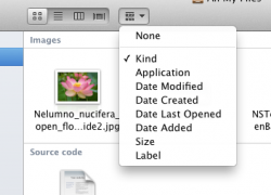
In one of the screen shots, it appears there is a new button , the looks similarly to the way to change views on Windows (thumbnail, list, details) Is this the same or does it do something different?
 

Attachments

  • Screen shot 2011-02-26 at 11.21.48 AM.png
    Screen shot 2011-02-26 at 11.21.48 AM.png
    4.1 KB · Views: 811
Performance Improvements?

Reshuffling the GUI and adding "eye candy" is ok, but I would hope a major OS upgrade includes performance optimizations.
 
I hope there are some more serious good "Innovations" (speed, core use etc.) because what I see until now does not need a complete new OS....resizing a window from all sides? wooooow! :rolleyes: what a great "innovativ" feature....maybe next year we get OS Camel with another great "innovations" such as a "Shut down" Button on the desktop! WOW coool! One year later maybe a restart button....
 
Wirelessly posted (Mozilla/5.0 (iPhone; U; CPU iPhone OS 4_2_1 like Mac OS X; en-us) AppleWebKit/533.17.9 (KHTML, like Gecko) Version/5.0.2 Mobile/8C148 Safari/6533.18.5)

I really like less color in the finder. The stuff I'm working on should be the stars of my screen and I don't want the fiddley bits of my OS taking visual attention away from them. There are few lists we read that have different colours for each line item. I also love resizing from all corners. In my opinion, this was always one of the problems with Mac OS. Now if we could just get the Windows Snap feature (I use Cinch on the Mac to emulate this behavior) that would be awesome. Windows' behavior when you mouse over dock icons, where it shows thumbnails of that application's windows is also awesome. Not every Mac user agrees on everything so we weren't "all" saying resizing from just one corner was best.
 
As someone who prefers working in the finder by icon rather than text, I still miss 10.4's finder sidebar that allowed me to show icons only. Now that some new apps like Sparrow and Reeder are offering iconic sidebars Apple makes the finder sidebar even less appealing to me.
 
Since older Macs Core Duo or Solo aren't supported. I hope Core 2 Duo is supported for a long time. I have the 2010 white Macbook Unibody. I hope I didn't get screwed over.
 
I agree with this. I have a friend who just bought a Mac for the first time. He keeps alternating between double clicking on pictures to view them and pressing space. I keep telling him that all he needs to do is press space, but he keeps on mixing the two. He doesn't seem to realise that double clicking opens an app to view while space will simply show you the file contents.

Download a little app called Cinch :)
 
I'm not too convinced on this file categorisation. It just looks messy and inconvenient. I cannot imagine that I would use it in its current state.

this view is only used when you click "all my files" in the sidebar. for viewing regular folders, it uses whatever view you set it to.
 
I'm always curious about why people would complain that the Mac doesn't do any/every thing like Windows when there is already an OS that behaves in exactly the way they want. It's called Windows.

*shrug*

Jim

I'm always curious about why people think it should be Steve Jobs' way or the highway. Or yours for that matter. In this single instance every other OS offers an option. Mac OS does not. I realise there are tons of people who thoroughly enjoy dragging and dropping through countless spring-to-action folders or love having multiple windows open for one action but I like to keep things simple. CMD-X where I start, CMD-V where I end. It works in Adobe Bridge on OS-X and the world still hasn't ended.

And again, this matter will not move forward while Steve still breathes.

I use Mac OS for 1. stability, 2. simplicity, 3. ease of use – the Finder fails most of these but the rest of the OS makes up for it.
 
Quick Look

Can anyone who has this beta tell me what all has changed with Quick Look. Specifically does it automatically right size the view window? Currently, it right sizes the first photo opened in Quick Look, but wen you use the arrow keys to look through a folder of photos, the window is stuck in the dimension of the first instead of right sizing to every photo. Thanks.
 
has anyone with the new mail app tried it out with gmail? does it work better than the current mail app?

(please say yes)

TIA!
 
I'm sure someone will come up with a Terminal command to make them sticky or even similar to Snow Leopard's.

you don't need a terminal command you go into the appearance tab in system preferences and theres a section where you choose how you like the scroll bars. iv also noticed that the aperance setting is greyed out, i wonder if theres a new ui hidden in that menu?
Edit: if you hold the mouse over the appearance setting it says "blue only for lion seed" would it have been hard to add the graphite theme into the seed?
 
Last edited:
Cut and paste is dangerous. Seriously! for small files and moving to/from the same hard drive - it is ok. But moving between networked computers / drives (especially large files) is a big big no no. You would not believe how many times (when performing moves / upgrades on MS SQL server) someone used cut /paste and the network connection was broken or you get that nagging "Stop Responding" Guess what, since it is physically moving and not copying - you just corrupted the file.

How can this happen when windows only deletes the file after the transfer has gone through? And if this is a problem, is it really that difficult to write an exception to the action so that in case of the network connection is broken, the action is aborted.

What I'm saying is, do you think Apple engineers are incapable of producing a simple Cut-Paste action with safeguards? Or could it be possible that it's just become a religious issue – a Mac Way Of Doing Things that shall not be changed?
 
Hmm. It's not like Apple to offer people "choice". They must be turning a new leaf. First the lock/mute switch on iPad, now classic view in Mail (and scrolling toggle, and scrollbar toggle etc).

It's a bold new future! And I can't wait!

Also, Cut+Paste is a feature I really want. On top of any-edge resizing and folder merging.
Although for large files I use FTP for transferring over the network. I do not trust Finder to not have a cow half way through a 20GB transfer. I've been burnt one too many times. Hopefully new Finder is a bit better under the hood.
 
Marble was never a new UI, it was the codename for Xcode 4.

The grey "aluminum" look has been updated (it's lighter, matching iTunes) so it's not going anywhere.

You don't know that. To be honest when using it for over 2 days now i'v noticed so many things that point to a new user interface. but I do agree with you that it probably won't be called marble.
 
so it is not manipulative that for 15 years the resizing on every corner is bad (because it is from windows) and all of a sudden they impement it and - hey - it's a brand new feature!

the quick look may not be as fast on windows, but at least it can do something the mac can not do: you can double click a photo, fullscreen it (WITHOUT BORDER - iphoto can't do that) and watch the NEXT photo by pressing the cursor key. you can even delete a photo in fullscreen.

quickview is nice in theory, but not good if you want to show people photos in a row. you are forced to put it into iphoto.

btw: facetime is a great feature in osx? sorry, but who needs it? skype does the job way better - across all plattforms. btw: i use pc AND mac. but unfortunately there is a lot i miss on mac os, so i don't see any point in switching completely. both systems have advantages.

Many of the things you are saying can be done natively with Quicklook on Mac. Take a closer look.
 
Yes I'm with you!! I think this is a big step backward. Is this a sign of things to come with Jobs having less influence? I don't want Windows Apple! Bring back one corner resizing!

Huh? You realize the NeXT could resize from each edge. This has nothing to do with Jobs' influence.
 
I wish mail would become more creative/customizable. Like ability to use animated gif in signature, ability to build and edit custom wallpapers as background. I have always felt Apple mails was a little "vanilla".
 
I am liking a lot of these things also the woaaaaaah... just noticed that Safari has auto correct built into it now :O One more feature.... type in alot and teh they auto correct, but anyways back to the point I really don't like 4 finger and three finger gesture changes, i would rather have
4 finger up-show desktop/ i really miss this feature, and I can't find any way to change it back
the current method for 4 finger down just brings the same type of windows into expose, I would rather have 4 finger down = mission control, With safari, I personally do not use new windows (who needs more windows when you have tabs) and the new 4 finger down doesn't seem to cut it.

And... the four finger pinch seems very unnatural, maybe Apple just hasn't gotten the software right yet, but, four finger pinch in seems to work flawlessly, and while your in launchpad, 4 finger pinch out seems to work too, but I am getting lots of problems with 4 finger outward pinch when I am not in launchpad, it seems to get confused with mission control... or just doesn't respond...

3 finger for navigate/animation for safari/notice animation only works with 2 fingers

but anyways... I am loving this build. :)

ps: sorry for bad grammar...

you can change it in system prefs. back to the old one. one thing i dislike is the new way of scrolling if you want to scroll up you pull you fingers down on the trackpad (similar to the way you'd do it on the ipad)
 
In the beginning it looked like there were only 12 apps in that folder... How are you supposed to know if there is more than what can fit in the window if the scroll bar disappears??? Stupid move if you ask me. This isn't a phone OS where screen realestate is lacking.

My sentiments exactly. Potentially a giant step backward. Steve is going to get eMails about this.
 
whats the Finder button next to the four view buttons?

it lets you to organize the files, its the same as going to view and arrange by in SL but it adds some choices.
 

Attachments

  • Screen Shot 2011-02-26 at 9.13.20 AM.png
    Screen Shot 2011-02-26 at 9.13.20 AM.png
    38.9 KB · Views: 101
Register on MacRumors! This sidebar will go away, and you'll see fewer ads.