I don’t understand this unity/consistency argument. You need to be specific about what aspect of consistency you’re referring to.
Is it the visual one? Because if that’s the case, there’s no reason to believe that this alone creates a good experience.
Consistency is beneficial when the user experience is positive; visual design isn’t specific to this. Apple could make iOS, iPadOS and macOS consistent without trying to make the visual style identical.
Consistency can simply mean excellence. I fail to see how taking inspiration from an AR headset’s GUI makes logical sense across a notebook, smartphone and tablet - three distinct experiences.
Consistency between Apple’s platforms, as I have said multiple times now. When I pick up a project on the Mac, I don’t have to use an entirely different UI for the same app in Tahoe with the updated Liquid Glass UI. At least with most of Apple’s apps. Which is much better. Apps don’t need completely different UIs between iPad and Mac for many of Apple’s apps. All that does is add more friction and make me far less likely to even bother with wanting to touch a Mac for anything. The Mac would have become irrelevant and died out if Apple didn’t continue to actually modernize it, and bring it more in line with Apple’s other platforms. And Tahoe makes a great leap in this area. And it’s actually becoming a more appealing platform for those who are new to the Mac. They don’t have to completely relearn how to use basic apps just because “it’s a Mac, it should be different” arbitrary thinking, or whatever…
You and many others over-emphasize the idea that they’re “completely different or distinct”. Yes they are separate product lines, but no, they are not so meaningfully different everything must be entirely different and nothing should be similar or consistent between them… 🙄. They’re computers. There is no reason for basic utilities to have completely different and inconsistent UIs… This reeks of arbitrary difference for difference’s sake…
And visual consistency is also beneficial. Same button design for same functions. Same general layout with some minor platform specific optimizations where they make sense. These points of consistency all make moving between devices far simpler and more intuitive.
It blends more nicely with content than solid-color toolbars. And is more visually pleasant to me with Liquid Glass’s light refraction properties. I love the way buttons can partially match background colors. It looks nicer to me than solid black or white buttons. Like the way these buttons blend nicely with the green behind them, while still retaining clear enough delineation to see and use them. 👍🏻. In the prior design language, this would be a long black or white bar along the entire top of the app that would waste a ton of space and make less of my image visible. And would look quite bland…
This, I can’t agree with. I think it’s clear and obvious that LG adds more complexity, with more lines, shapes, use of effects; often for no practical reason.
Well, that’s just your opinion. The design has the very practical result of my screen space not being wasted by empty dead space in solid colored bars… Liquid Glass doesn’t tend to hoard as much screen space, using only about as much as is actually required by buttons and UI elements.
Early-Aqua achieved this better, in my opinion, because the
use of different materials achieved depth. LG is fundamentally flawed because Apple is trying to use just one material to solve countless UI concerns.
View attachment 2602727
View attachment 2602728
Notice how the 3D effect of the Aqua bubbles sit on top of a flat metal-like surface? The contrast of the materials is as good as perfect and makes it clear that the two materials have different purposes.
Again, that’s also your opinion. 🤷🏼♂️. I think that design looks antiquated and rather hideous… 🤷🏼♂️. I personally wouldn’t really characterize anything about that design as “perfect”, at least not to my standards. It looks very dated and antiquated. So glad they didn’t go back to that…
Fun is subjective, of course. So I have to ask why you believe LG is fun?
It feels fresh, adds some layer to the visual design, and does away with the boring flat design of prior versions. I enjoy the colors of background content, say, in my browser, refracting in the buttons. It’s pleasant and fun. Same with the transition effect when swiping the notification center on my iPhone.
This is another argument that I don’t understand.
For instance, what benefit is there to a semi-transparent control panel that floats over the user’s content? You say there’s less between you and the content, but this problem has been solved for decades by integrating control panels into windows or allowing the user to move them.
A control panel and said content are distinct; so if, for instance, I am working on a poster in Pixelmator and have zoomed into an area of the image, why do I need a semi-transparent view of the surrounding content underneath a control panel? What benefit is there to it blending in more with the poster? I would want it to be distinctly different, not similar in nature. And if I want to see that area, I simply zoom out.
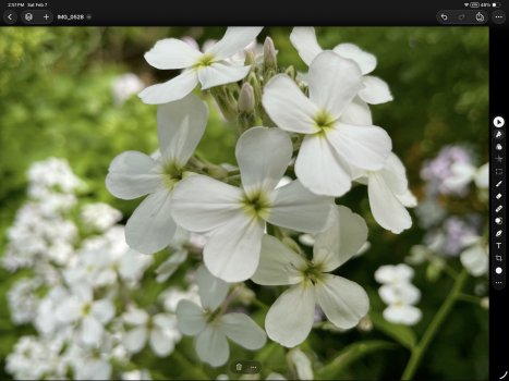
It’s actually very simple… More of my image is visible than would otherwise be with previous design language. I will demonstrate with two pictures.
This is what old design would have looked like. It cuts of the top of the flowers in my image and makes them non-visible. And then you have all that space on the side that is not visible as well. And the solid color is more distracting to me.
Where with the new design, the tip of the flower is visible. And I can see more content at the side as well. And I find the toolbar items less distracting.
This is where I feel like you’re an Apple apologist because, in all honesty, the iWork suite of apps have been proven to have less visual information and controls on the same windows area of the title bar than the prior version.
Other than this, the formatting side bar is near enough identical, which to me says that you’re not serious about your critique if you’re arguing that it’s “even better”. You’ve got to be specific.
The toolbar includes all of the same tools I was using before, and just is less distraction to me. And it’s customizable, you can add basically whichever tools you want… 🤷🏼♂️. And no, me liking a new design and finding it to be less visual distraction doesn’t make me an “Apple apologist”… 🙄. That’s an old and tired “argument”. “You like x new thing Apple did, you must be an apologist”… 🙄. I’ve seen it far too often in this forum…
As before, controls should be distinct from content. If you find it distracting that a control area does not blend with the content, then I’m not sure that you’re using the software correctly.
And controls with Liquid Glass
are distinct from content, yet
also allow more content to be visible. They strike a great balance of both. And I’m using the software correctly, thank you very much. It’s just like how I find Pages design less distracting than Word’s gaudy ribbon menu. Yes, I can work productively in Word, but I find the writing experience to be more pleasant in Pages because it can stay more out of my way and more minimalist…
Affinity is based on a tried and tested formula that has been used, trusted, and continues to be popular to this day. There is a reason it is designed this way: to clearly separate the content from the controls.
Affinity’s UI is okay, but it’s just a bit more in the way of content than Pixelmator Pro. I’ve used Affinity for many years now, I’m very familiar with its UI design… It’s just that some more screen space can end up being wasted. At least the iPad version of Affinity, which is better in many ways than the Mac version, is better on this front, though I would still say Pixelmator Pro has a bit of an edge in this regard.
Perhaps you just need to learn to use the software better? You claim you’re a designer, I’m suprised that this is an issue.
Excuse me? I can use the software just fine. I know how to use the software… 🤦🏼♂️. And it isn’t an “issue”, it’s a preference… I find Pixelmator Pro’s UI to be a bit less distracting, screen space hoarding, etc. Just as I find Page’s UI to be a bit less distracting than Word’s layout… This is a preference thing, not a matter of “not knowing how to use the software”… 🤦🏼♂️🙄. That’s comes off as very condescending and dismissive…
This is no different to any other general OS release. A new design language is introduced and developers follow.
Again, I am talking about the greater consistency in UI and design between mostly Apple’s own system apps across the platforms. It makes picking up tasks with Apple’s different devices more consistent, intuitive, and smooth in my experience since upgrading to 26 vs the prior versions.